
It might seem strange for a word guy like me to get all indignant about numbers. But I like numbers and I see the importance of numbers. I was pretty good in math, too. It just made my head hurt, and I made a decision a long time ago to try to avoid having my head hurt.
But what also makes a collector's head hurt is organizational difficulties. Like most collectors, I like to organize my cards in a certain way. A long time ago, trading card companies realized this and assigned a card number to each card. They put that card number on the back. Collectors used that card number to prioritize and chart their collection. "How many cards do I need to complete the set? Well, the checklist says I need card numbers 47, 323, 517, 618, 720 and 755."
Numbers make it easy to figure out which cards you need and which you already have. They make it a hell of a lot easier than letters:

I'm not saying collectors can't figure out how many cards are in the Across The Years insert set in Allen & Ginter this year -- give us a little credit. We can be resourceful. But why does it have to be a hunting expedition? Replace that ATY-GS alphabet soup with a number! There's too much work here.
Numbers are very important to a set collector like me. I kind of obsess about them. Although there are a lot more numbers on the back of a card than just the card number, the most important one for me is definitely the card number.
This is why I went on a little rant about 2013 A&G's insert "numbering" and why I'd like to address something that collectors mention from time-to-time: the readability of the card number.
I never realized until a few years ago how important this was to collectors. But it is. And the older I get, the more important it becomes to me. My eyesight is still pretty good. But it's not good enough to read the tiny type at the bottom of some of those late 1990s sets.
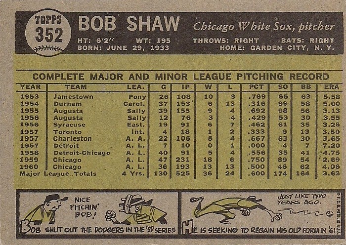
I thought I'd go through each of Topps' flagship sets, decade by decade, and pick out the set with the most readable card number and the least readable card number for each decade. This doesn't have to do with where the number is on the card, etc. Just the readability.
I'm just sticking to Topps here, too, because they have the longest timeline. But I'll mention a couple of other sets here and there.
1950s

Most readable, 1953 Topps: The most readable card numbers of ALL-TIME. If that card number was a pill, you'd have a hell of a time swallowing it. That takes up a good tenth of the card space. I used to work in a drug store and you'd see these poor elderly people with almost no vision, all kinds of devices on their eyes. I'm confident all of them could read this number.

Least readable, 1958 Topps: "Least" is a relative term with 1950s cards. This was the golden era for readable card numbers. Every set features a bold, large card number, often set-off with a baseball drawing. It's easy to find and appealing. Although the "baseball head" card number caricature in '58 Topps is fun, it's slightly less readable than the number in other '50s sets.
1960s
Most readable, 1961 Topps: There is very little variety in card numbers in 1960s Topps. Topps went with a bold number inside a baseball and stuck with it, much like 1980s Donruss, except more readable. The '61 card number is probably the most distinctive of the bunch.

Least readable, 1969 Topps: The 1968 and 1969 sets both go with a slightly smaller card number. The '69 is the smallest of all in the '60s and it's kind of burrowed inside the old-school Topps logo. It's not too bad, but noticeably different from the rest of the '60s sets.
1970s

Most readable, 1973 Topps: I know some people don't like vertical card backs (I'm not crazy about them either). But '73 Topps has one of the best-designed backs ever. The card number is part of that. It's prominent and simple to read.

Least readable, 1979 Topps: I almost went with 1975 Topps with the green numbering. But 1979 Topps is the first time I ever remember anyone complaining about the readability of card numbers. The type face is thin and small. Not a good combo.
The least readable card numbers of any set in the 1970s, might be the Kellogg's sets. They stuck the numbers down at the bottom in small type. I remember having to search for those things.
1980s

Most readable, 1981 Topps: The 1980s is a good decade for readable card numbers. 1981 doesn't stand out much from the rest, but it's probably the best. You can't go wrong with the baseball.
But it can't match another set from the same year.

The first time I can remember admiring a distinctive card number was when I first turned over a 1981 Fleer card. That card number just jumped out at me. As did the career major league average, stressing again the importance of decimal placement.

Least readable, 1988 Topps: There isn't much to whine about with '80s card numbers. The numbers in '88 Topps aren't bad. I just get a little distracted by the line of baseballs in the background. The vital statistics are definitely a little tough to read.
The honors of the least readable card backs of the '80s might go to 1988 Score:

Yeah, the number is red, but good gosh it's tiny.
1990s

Most readable, 1992 Topps: One of the cleanest and easiest-to-read card backs ever. The number is no exception. 1992 collectors had no trouble sorting their collection.

Least readable, 1998 Topps: Sideways numbering. Ugh. It's a little on the tiny side, too. But '98 Topps is generally difficult to read, from the name on the front (with the logos in the background) to the tiny stat type on the back (with the logos in the background).
The 1990s were not an eye friendly decade in regards to card backs.

As card backs grew busier, organizing became more difficult (and I'm not even talking about the multitude of sets). Adding things like gold foil card numbers and card number subsets (thank you kindly Topps Finest and Flair Showcase) didn't help either.
2000s

Most readable, 2002 Topps: You can't miss that large white-on-black card number. As ugly as the gold color is, it's an easy-to-follow card back.

Least readable, 2009 Topps: Very nice card fronts. But I was blogging when people were hollering about the numbers on the backs. It might have been the first time I ever thought about "card number readability" as a key element of collecting. Tiny type on a colored background isn't good.
As for this decade, I think 2011 and 2012 Topps have the most distinctive card numbers. None are all that difficult to read -- perhaps learning from the 2009 Topps incident.
This is just another example of how important card numbers are to this hobby. And why I hope the goofy "letter numbering" that's been going on with insert sets is just a phase.
As I've often said right here on this blog, I have a job already. I'm looking for simple in this hobby, not complicated.
Comments
But on the flip side, they have found a way to mess us up with the ones that ARE numbered. An example is the Golden Moments from last year. There is a set of them in each of the two series, both numbered GM1 through GM25. So now you still have to have the checklist because if you need #GM-15 for series one, you need Ryan Braun. But you may find GM-15 Yaz in the same box because both series are mixed together.