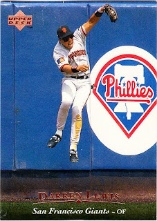
Dayf pretty much obliterated my 2010 Topps want list today. If I can believe that want list, I am down to needing just two cards to finish series 1 of the base set.
One card, No.183, which features the very low-key Jonathan Papelbon, is being sent to me.
That would leave one card left. No. 120. That card happens to be Jorge Posada. Arrrrrgh. I can't tell you how many times the last card I needed to complete a set has been a Yankee. I'll have to do the research and get back to you on it. But I do know this: they're doing it on purpose. The Yankees don't like the fact that I live in New York and I'm not a Yankee fan. Sorry, Yankees, it's my obligation to stay as close to you as possible to keep updated on all of your nefarious activity, so I can remind everyone just how evil you are. But that's no reason to withhold cards of your whiniest players from me.
Anyway. Posada. Anybody got (gasp, wheez, guuuuhhh!) one to spare? Emphasis on one.
Meanwhile, in appreciation for dayf getting me so close to finishing off the set so early, I thought I'd take some of his suggestions for the Define the Design series. You might remember that he recently posted some of Upper Deck's sets from the 1990s and gave them names. I decided to take three of them and officially enter them in the DTD category in the sidebar. I'll do that after I get home from work tonight.
Here are the three that I chose:
1989 Upper Deck: The running to first set.
I was tempted to call this "the night card set" because there are so many of them and it's really the set that got the whole night game photos thing going. But that doesn't have anything to do with design.
1992 Upper Deck: The fastball set.
Unlike others, I prefer this set to the previous three that Upper Deck put out. I like the team logos. The 2010 Topps logos don't bother me as much as it does other people, but the '92 UD logos are nice and understated in comparison.
1995 Upper Deck: The foil minimalism set.
I am way beyond the "all-photo-and-no-design" trend. Unfortunately, Upper Deck is not. But in 1995, it really looked good.
I may consider some of the other names that dayf picked, although I have ideas of my own for a couple of them.
While we're at it, how about if we come up with a name for this set?
Hey, look it's 2010 Upper Deck! Why do I keep showing this thing on my blog?
Anyway, what shall it be? The "sideways players set"? The "no logos, sort of, set"? The "green bar set"? The "teeny, tiny black & white photo set"? "The set that killed Upper Deck set"?
And just for kicks, let's name this set, too:
Swoosh set? Binoculars set? Monster logos set?
I'll be happy to read your suggestions. I'll need something to do while I'm waiting for that midnight Olympic women's figure skating story to come across the sports wire tonight.
Also, crappy weather may be delaying some card packages I planned to send out tomorrow. But don't worry, I'm on it.


Comments
'10 Topps - The Tsunami Set (catch the wave!)
"Wave of the Past" for the Topps Set.
I am going with "Green Eggs and Spam" for the 2010 edition of UD.
I guess you could also call it the "bad angles" set because most of the photography seems to be shot at bad angles in order to obsure the wordmarks on the uniforms.
2010 Topps = the zoomed to close set.