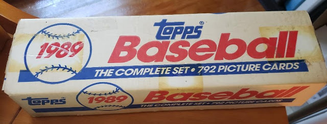
Since today is a day off that, at least for most of my life, was set aside to recognize the discovery of something that had already been discovered, it goes nicely with my recent discoveries in 1989 Topps.
This is all stuff that has already been unearthed by someone else. Long ago. And it's common knowledge for a lot of collectors, probably most of whom were kids at the time.
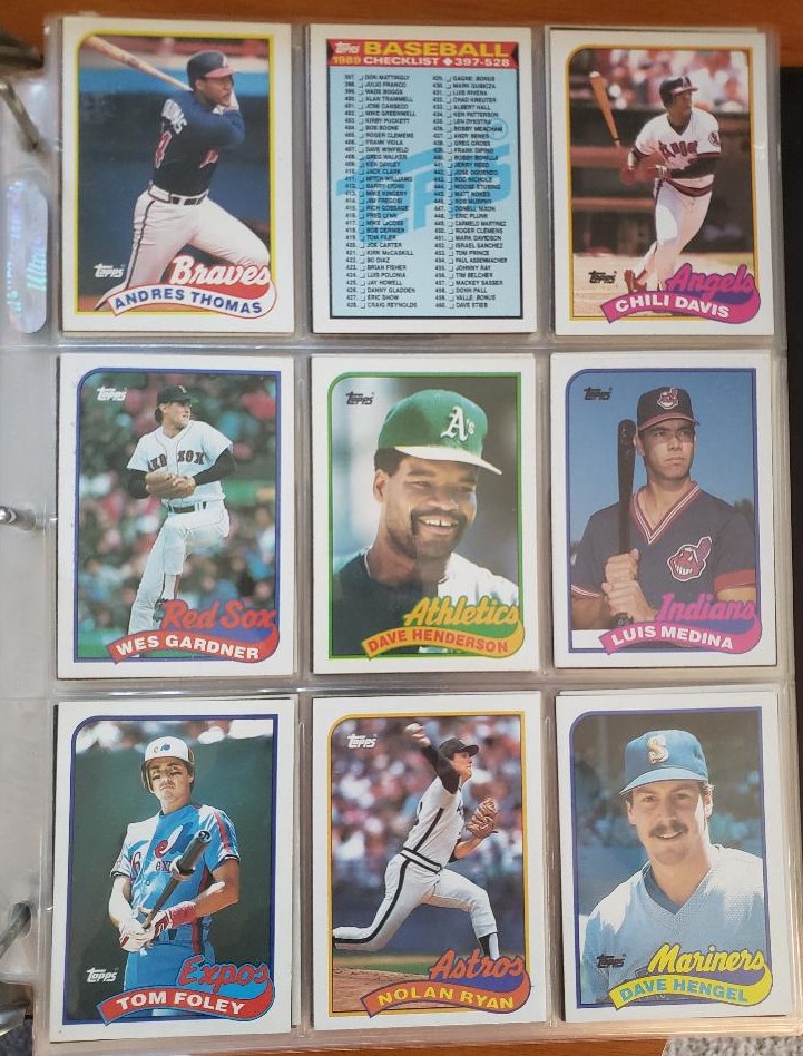
But although I opened so many packs of 1989 Topps, a trip or two every week to the drug store to buy a pack or two or three or six, I missed all of these discoveries. I'm just not the exploring type, I guess. Or the observant type. Maybe it was all the beer that year. I don't know.
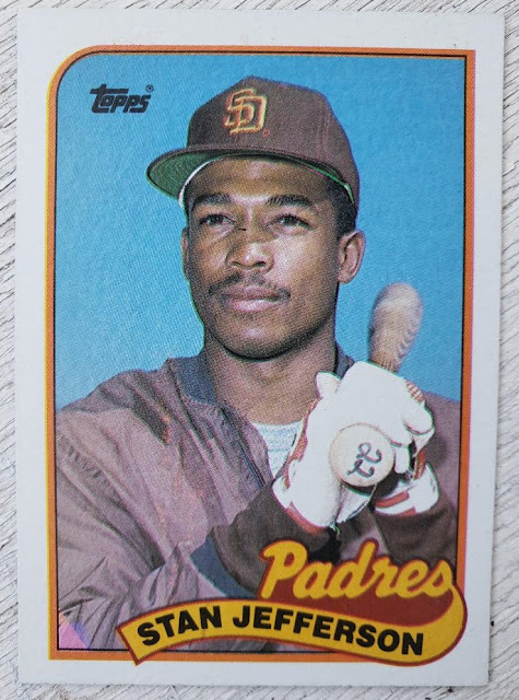
Stan Jefferson's card has a pink-and-violet triangle at the bottom left corner of his card. Huh. Didn't know that in 1989.
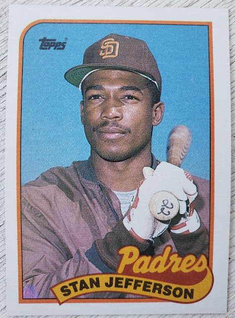
He also has just a violet triangle on his card in the bottom left corner (or maybe this is the pink-and-violet version and the one above is the pink version -- this stuff can get confusing).
I didn't know this in 1989 but I have come to know it since and have known it for quite awhile. I also am aware of the "differences" on the back, variations in the number of asterisks next to the copyright symbol and such.
I wrote about such minute variations in that article on 1991 Topps for Beckett. There are collectors very dedicated to pursuits such as this and I often wonder, what about them was different than me when I was a kid collecting back in the late 1970s? Because I don't think I would've caught stuff like this in a million years as a kid.
This explains why I'm still discovering things about 1989 Topps to this day.
I'm continuing to add my collection to Trading Card Database and as I mentioned in my earlier TCDB post, that site really focuses on the variations. I suppose that's what you have to do to offer a complete database for every collector. I just know if I was creating something like this, I probably wouldn't have even bothered with many of the variations you see in late '80s/early '90s junk wax sets.
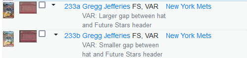
Apparently there are a bunch of cases with the Future Stars cards where there's a difference in space between the top of the player's head and the bottom of the "Future Stars" header. Who knew?
Yeah, I know YOU knew. But I was pulling card after card after card of Gregg Jefferies and never had a clue.
I still can't get fired up over variations like this, but it did cause me to open up the second set of 1989 Topps I own to see what I had.
I didn't have a Jefferies Future Stars variation, but I did have a couple of others.
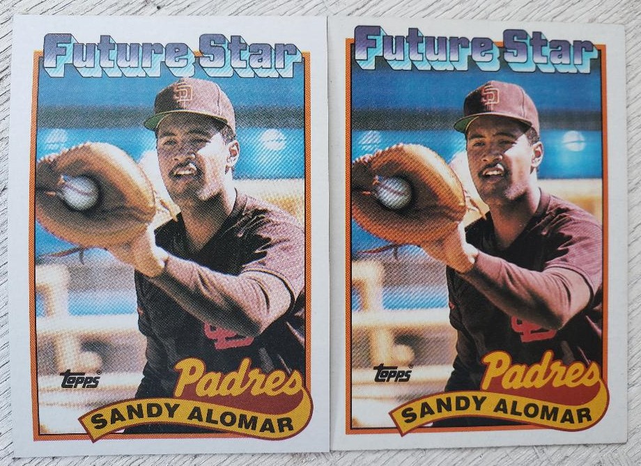

Perhaps you can't see the difference -- and I feel ya -- but it's there. Just stare really hard -- I guess like the late '80s kids did.
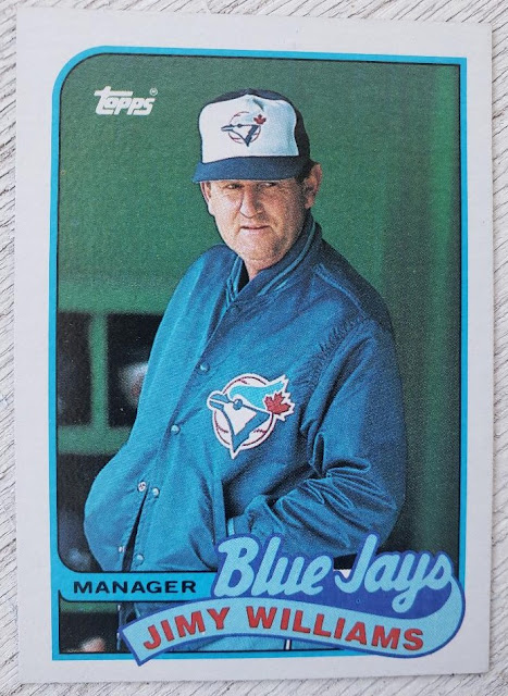
After TCDB informed me that Jimy Williams' card featured a variation -- there is a white space between "Blue" and "Jays" that is filled in with blue on the second version of the card -- I went looking for that one. But I just found another card with a white spot.
Again, this was under my nose for 30 years and I had no idea. Silly me, I was wondering why there was only one "M" in Jimy.
But the one that stunned me involved a Dodgers card. So many years and I didn't know.

Here is Franklin Stubbs' card. Apparently this is the white team name version. I'm so clueless.

This is the gray team name version.
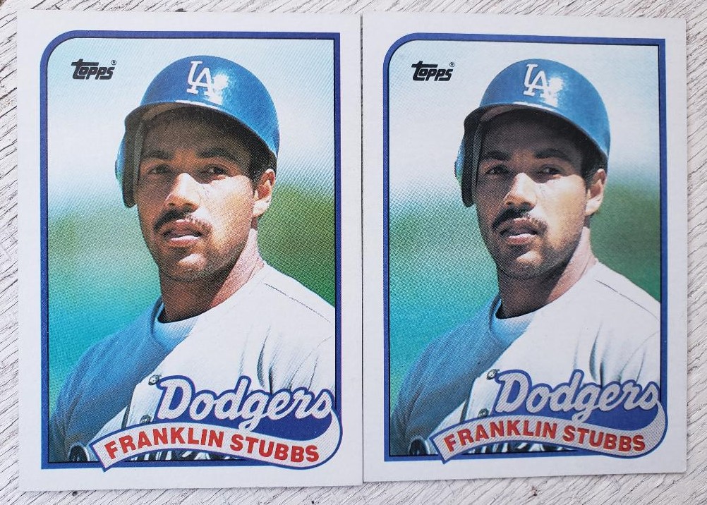
Here they are side-by-side so you can tell the difference. I can't be the only one who never bothered to notice. Right?
Before I went through my dupes to find the different Stubbs cards, I checked my Dodgers team binder that has the 1989 Topps set and -- more stunning news -- the Stubbs card wasn't there! I somehow never added it. (I hate when this happens because how many other commonly available cards from team sets that I completed long ago are missing from my binders?).
But now that's been rectified and the variation card has been added.
Still, I'm a bit suspicious about the whole thing.
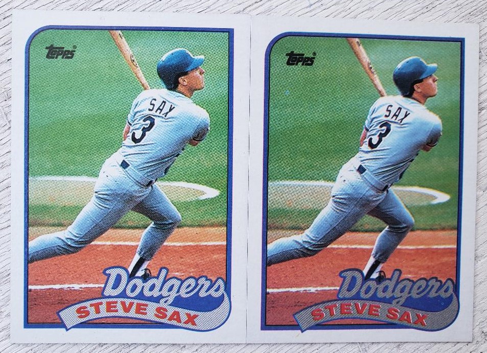
There is no variation listed for Steve Sax in TCDB even though I found a color difference with the team name much more drastic than the Stubbs cards.
(I am aware that this is a random printing difference while with the Stubbs card there are lots of examples of the white-gray variation. At least that's what a printer would tell me).
So what do I do with this new-found discovery?
Well, I'm not declaring 1989 Topps as a new-found land or anything. It's just new-to-me stuff and since my collection is very personal, I'll pick and choose what variations mean something to me.
I'll add the Stubbs variations to my Dodgers binder. But the space difference on the Future Stars cards? I probably won't bother to add it to the variation portion in the back of the 1989 binder like I do for more prominent variations, like the 1979 Bump Wills in the '79 binder.
And those copyright differences on cards like Orestes Destrade and Felix Fermin, I won't bother looking. These variations aren't valuable and they're certainly not interesting to me. And it's kind of a pain looking for which one you have so you can fill in the proper box on TCDB. (1989 Donruss will drive you batty as for most of the cards, there are four different back variations all in super-tiny type).
Still, I do like discoveries after all these years -- even if everyone already knows them.
Comments
I've been slowly updating my tcdb collection to reflect the variations I actually own, but am already approaching the age at which I won't see the difference between a card with 'INC' or 'INC.' in 3pt type on the back, much less will I care about owning either or both.