
I come across a lot of names in my line of work. I'm not in the business of studying them. But like teachers, pediatricians and others who deal with kids with any frequency, I'm very aware of how parents name their children.
I'm sure you know, but some of the names are bizarre. And the spellings? "Matisyn" is not "Madison" no matter how much you're trying and believe me you're trying because there is nothing that says "trying too hard" like "Matisyn".
But even though odd spellings and names that seem like they originated from a different galaxy never fail to produce a chuckle in the newsroom, they are not the names that puzzle me the most.
No, I reserve the most quizzical looks for what I call the indistinguishables. Other people would call them "gender neutral," but that phrase annoys me. The king (or queen) of indistinguishable names is "Taylor." It could be a boy's name. It could be a girl's name. Who knows? Weeeee! Isn't that fun?
I don't know why this happens. But there appear to be parents who delight in the fact that their kid is going to confuse every single person who doesn't see them in the flesh for the rest of their lives. It must be like parents of identical twins who dress their kids exactly alike and then make everyone play a game of "guess who I am?"
I don't know why people name their boy or girl Taylor, Peyton or Cameron when William or Sophia would do just as well, but there definitely seems to be an appeal.
And the same could be said for card sets, too (you thought I'd never get there).
There have been a few posts about sets that are indistinguishable from each other. I've done a couple of them. You all know about all the Bowman sets that look alike. There's 1996 and 1997 Fleer and a host of others.
Another one you could add is Topps Tribute. To me, it is the "Taylor" of card sets. No, card sets aren't "male" or "female," but they should have enough of their own identity that you can tell them apart.
I received some 2014 Tribute Dodgers from Max of Starting Nine. Here they are:


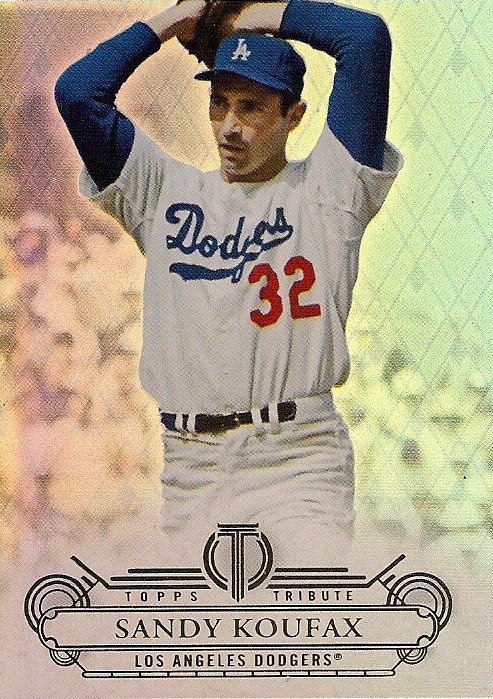
They are as thick, shiny and fancy as Tribute has always been. But to me they don't look much different from 2013 Tribute.

That's a 2013 Tribute card. And, if you're a fan of Tribute you're saying, "there's a difference. The 2014 card has little diamond patterns in the background. And there are circles and boxes and a stylized 'T'."
Yes, I agree with you there. But in person, it's basically indistinguishable from 2013. If I had a lot of these things -- and I don't because I can't afford 6 cards for $60 or whatever Tribute is going for -- I'd be mixing them up all day long.
Here is a 2012 Tribute Dodger I also got from Max:

A tiny bit of difference there, but basically the same thing.
Why ruin a good thing, you say? Well I say, have the courage to change it up a little. As the old saying goes, I love spaghetti, but I ain't eatin' it every day.

There is 2011 Tribute. It's a little more distinctive because of the black nameplate (by the way, this card is fantastic). But it's also basically the same.

Here we have 2010 Tribute. Also slightly identifiable because of the sideways team name. But also too same for me.

And this is 2009 Tribute, which marked the return of Tribute after a six-year absence. But even though '09 Tribute looks quite a bit like the Tribute sets that came before it, it doesn't resemble the Tribute sets from 2001-03 quite as much.

The sets from 2001-03 had a theme. They were true tributes. One year, the set paid tribute to players' uniform numbers, another year to milestone numbers, another year to seasons. It made sense and the sets were distinguishable from each other.
Now? Tribute is just like any other set. A player's picture with his name and team name. Nothing special.
I know that people don't buy Tribute for the base cards. They're looking for the "hit" in every box. But I'm a base card guy. Maybe because I like cards that look different each year.
I like William and Sophia. Not Taylor and Cameron (quick, guess which one is the boy and which one is the girl!)
But then again, I grew up during a decade when card sets varied from year to year like this:


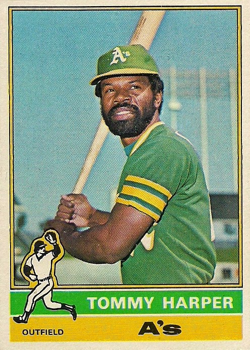
I guess I just prefer my sets distinguished.
Comments
...And I'm also amused that one of the examples of a distinguishable Topps card features a guy named "Ellie".