Man, it got busy again. So there was an extra day to vote on the Cardboard Appreciation Hall of Fame poll for the second straight week.
The poll pulled in the best turnout in weeks and in the end the 1970 Topps Seattle Pilots card was the runaway winner.
The tally after 49 votes:
1970 Topps Seattle Pilots team card: 31 votes
1992 Pinnacle Jackie Gleason/David Cone Idols subset: 18 votes
So, the only Pilots team card from a major-release set takes its place in the Cardboard Appreciation Hall of Fame.
As a refresher, here are the others already enshrined:
The Pilots card may not measure up to the previous four in the eyes of some, but I welcome a little bit of variety in the C.A. Hall of Fame. Cards are notable for many reasons, and plays at the plate and stadium scenes and smiling faces are just three of many, many attributes that make up a Hall of Fame card.
Team cards get a bad wrap. I really like them and I've grown to like them more as I've gotten older. As a kid I wasn't terribly observant about my cards and team cards require you to be just that.
In past blog posts I've pointed out such team cards notables as:
The Padres posing with elephants.
The Rangers posing as Senators.
Reggie Jackson as an Oriole.
Dick Allen as a Cardinal.
Boog Powell as a Dodger.
Joe DiMaggio as an Oakland A. (I didn't circle him but you can find him).
And an absolute masterpiece.
I'll show you a few more of my favorites. Yes, yes, I know some of you are bored, but you can always click away. Meanwhile I'll be greatly entertained.
All of these are from the '70s, because it was the best era for team cards. The '50s and '60s team cards are fine and all but most are far too blurry for identifying players or really anything.
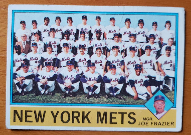
The '70s team cards (I apologize for the crooked picture) got you closer to the action than ever before. I really appreciate this Mets team card from '76. Yup, there's Yogi Berra and Willie Mays right there where I can see them.
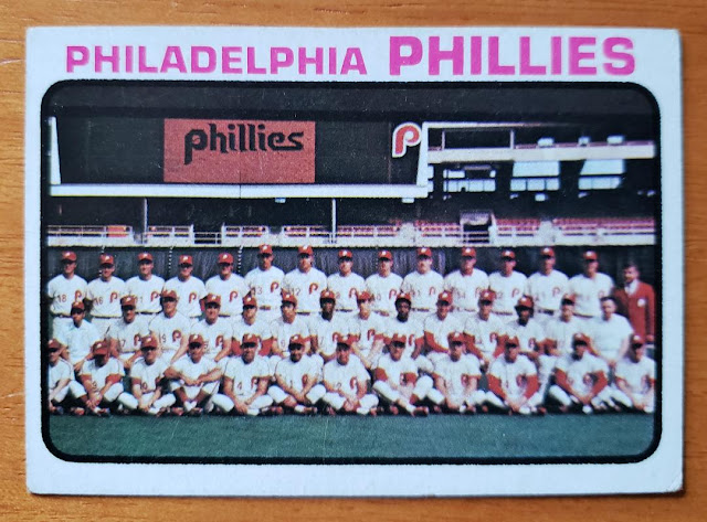
Team cards were pretty proud of '70s technology. Scoreboard graphics were a big deal back then, when graphics consisted of dot matrix logos.
Here is some much more impressive '70s innovation. Get that dome in the picture! It's a lot more identifiable than anyone on the 1978 Mariners!
The Astros made their dome the star of the show in 1979. The Astros players themselves are hanging out in what I'm guessing are stadium tour trolleys, but they're so distant you'd even have a little trouble picking out 6-8 J.R. Richard (but not really).
Here are the Astros for the first time collectively on cardboard in the tequila sunrise uniforms.
I loved this card as a kid, even though I didn't really know why and I certainly didn't know who Karl Kuehl was (still only have a vague idea). But as an adult I like it even more as "retraits" in French baseball terminology means "outs," which gives the impression that everyone in this photo is an "(easy) out."
The Cubs were the masters of the floating heads in the 1970s (except for '70, '73 and '75). I prefer the floating heads team cards where they truly look like they're floating, like here.
I mean this is abysmal. They took a picture of a sheet of paper and called it a team card.
Not exactly floating heads here. You've got necks and some shoulders.
While on the topic of Chicago teams, the White Sox were a team in uniform flux in the 1970s and the team cards show exactly how chaotic. Here in 1971, the team is wearing blue.
Here in 1976, they've moved onto red. And I love the lounging-in-the-bleachers look.
Then we have the famous shorts-wearers in 1977.
Finally, in 1979, just about everyone has found their pants.
Staying in 1979, this card contains Lou Whitaker, Alan Trammell, Jack Morris and Kirk Gibson. At least I think it does. But Les Moss wouldn't be around to see their high point.
It was nice of the photographer to fit in the Brewers' beer barrel and mug.
Some more distinctly '70s uniform moments. I'm sure I've shown the blood clot team card before.
The Padres' all-gold uniforms can be found on the '73 and '74 team cards and this one fits in the Swinging Friar, too.
The '79 Red Sox team card isn't the only '70s team card to show off the too-brief Red Sox red-themed uniforms, but it is one of the few from the '70s that doesn't have missing players hovering above the team photo like ghosts.
Classic unis. The photo cropper appeared to want to get the Pirates logo in up top but cropped out "Pirates '77".
I like this card because it's the first with Billy Martin as the Yankees manager and nobody really knew here how wild it was about to get.
All right, that's all I've got for you. Thanks for voting along on the Cardboard Appreciation HOF polls the last couple of months. Cardboard Appreciation will continue periodically with the usual single-card posts, probably as sporadically as it's been the last several years.
I'll try not to go five years before another C.A. Hall of Fame induction, but no guarantees.


.jpg)


Comments
I had forgotten that on the Pirates 1978 Topps Team Card Miguel Dilone had his head turn and was not looking at the camera.
I think there are a couple of other head turner players out there on Topps team cards.
Some of my favourite team cards would have to be the '71 Cubs in the horizontal format, the '79 Giants with Bob Knepper leaning on the team trainer, and several Phillies team cards where they're all hatless, especially the '81 where they're wearing those batting practice T-shirts.
Oh, I know: https://75topps.blogspot.com/2010/08/276-white-soxchuck-tanner.html
Yes.