Mention "1973" to someone who lived through it and a number images may come to mind: Watergate, gas lines, the Night the Lights Went Out in Georgia.
I was a kid in '73, as blissfully unaware as I could be, watching cartoons and Sesame Street and eating Spaghetti-O's. I missed out on the '73 "angst," and instead remember it as that time immediately before I became aware that the wonderful game of baseball was also played by men on television and you could collect picture cards of them.
I am now aware of just about everything '70s when it comes to cards. And the 1973 Topps set is a special look into the decade that is as unvarnished as anything issued back then. There is no wild design to divert from the photo. We get a front-row seat into exactly what was going on in baseball that year. And every element is delightfully obvious.
I recently received a handful of '73 cards for my set from Mark, who is on Twitter. They arrived in exchange for an extra '72 Topps high number that I had.
I decided to rank those 1973 cards in terms of '73ness.
Here is the points ranking system that addresses various '70s card elements:
1 point - typical head shot
1 point - tilted background
1 point - shadows
1 point - gum stain
1 point - centering issue or miscut
1 point - obvious spring training site
2 points - typical 1970s pose (swinging/pointing bat, hands on knees, pretending to throw, pitchers in set position, catcher squatting, etc.)
2 points - player looking up
2 points - palm trees
2 points - scoreboard or ads
2 points - batting cage or fence
2 points - players in the background
2 points - horizontal card (1971-74 was one of the golden ages of periodic horizontal cards, which were pretty darn cool, I'll have you know)
3 points - airbrushing
3 points - 1970s action
3 points - awkward action
3 points - nonplayers in the background (coaches, fans, umps, etc.)
5 points - blatant airbrushing (so blatant that even I would notice something amiss when I was a kid)
5 points - featured player obscured or overshadowed
OK, we're ready to rank the cards, from the one with the least "73ness" to the one with the most.

10 - Lerrin LaGrow, 2 points
(head shot, centering)
Not a very exciting card for someone who had a bat thrown at him in the previous postseason.

9 - Whitey Lockman, 3 points
(horizontal, centering, heck, lets throw in an extra point for Ernie Banks)
Managers don't fair well in rankings of 1973ness. Too much association with previous decades.

8. Vicente Romo, 4 points
(head shot, airbrushing)
Romo was with the White Sox when this photo was taken. So the art department went to the break room fridge, got out some mustard and painted away.

7. Don Money, 6 points
(head shot, blatant airbrushing)
That way-too-bright painted cap stands out so much Money practically looks 3-D. And what do I say about those stripes?

6. Larry Stahl, 7 points
(head shot, centering, blatant airbrushing)
This airbrushed cap could have fooled me as a kid, but not with that gold trim on the uniform (a Padres uniform).

5. Tom Haller, 7 points
(head shot, gum stain, blatant airbrushing)
Who knows how old this photo is? Is he with the Tigers here (with whom he spent one year) or with the Dodgers?

4. Bob Montgomery, 8 points
(typical '70s pose, hat in background, nonplayer in background, spring training site)
I should add a point for the wrist watch.

3. Norm Cash, 8 points
(typical '70s pose, batting cage, tilted background, equipment in the background, spring training site)
The tractor makes an appearance on another Tigers card (see 1972 Jim Northrup)!

2. Carlos May, 10 points
(typical '70s pose, fence, equipment -- oh, the equipment, nonplayers, spring site)
If I could know for certain that May was harboring some tobacco, I'd add another point or two. Just a wonderful photo and the kind you don't see anymore.

1. Dave Rader, 16 points
Get out your adding machine.
(1970s action, awkward '70s action, featured player obscured or overshadowed (it's Davey Concepcion!), coach/ump in photo, shadows, centering)
This is what 1973 Topps is all about. I once owned this card and then traded it away. Now that I'm collecting the set, I'm so glad it has returned to me.
This is an exercise that I might do with future 1973 acquisitions. I think many collectors are aware of the greatness of the 1973 set. But they need to know exactly why.
These were the cards kids were pulling while waiting in the back seat in a gas line.
I was a kid in '73, as blissfully unaware as I could be, watching cartoons and Sesame Street and eating Spaghetti-O's. I missed out on the '73 "angst," and instead remember it as that time immediately before I became aware that the wonderful game of baseball was also played by men on television and you could collect picture cards of them.
I am now aware of just about everything '70s when it comes to cards. And the 1973 Topps set is a special look into the decade that is as unvarnished as anything issued back then. There is no wild design to divert from the photo. We get a front-row seat into exactly what was going on in baseball that year. And every element is delightfully obvious.
I recently received a handful of '73 cards for my set from Mark, who is on Twitter. They arrived in exchange for an extra '72 Topps high number that I had.
I decided to rank those 1973 cards in terms of '73ness.
Here is the points ranking system that addresses various '70s card elements:
1 point - typical head shot
1 point - tilted background
1 point - shadows
1 point - gum stain
1 point - centering issue or miscut
1 point - obvious spring training site
2 points - typical 1970s pose (swinging/pointing bat, hands on knees, pretending to throw, pitchers in set position, catcher squatting, etc.)
2 points - player looking up
2 points - palm trees
2 points - scoreboard or ads
2 points - batting cage or fence
2 points - players in the background
2 points - horizontal card (1971-74 was one of the golden ages of periodic horizontal cards, which were pretty darn cool, I'll have you know)
3 points - airbrushing
3 points - 1970s action
3 points - awkward action
3 points - nonplayers in the background (coaches, fans, umps, etc.)
5 points - blatant airbrushing (so blatant that even I would notice something amiss when I was a kid)
5 points - featured player obscured or overshadowed
OK, we're ready to rank the cards, from the one with the least "73ness" to the one with the most.

10 - Lerrin LaGrow, 2 points
(head shot, centering)
Not a very exciting card for someone who had a bat thrown at him in the previous postseason.
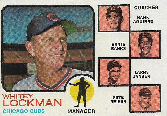
9 - Whitey Lockman, 3 points
(horizontal, centering, heck, lets throw in an extra point for Ernie Banks)
Managers don't fair well in rankings of 1973ness. Too much association with previous decades.

8. Vicente Romo, 4 points
(head shot, airbrushing)
Romo was with the White Sox when this photo was taken. So the art department went to the break room fridge, got out some mustard and painted away.

7. Don Money, 6 points
(head shot, blatant airbrushing)
That way-too-bright painted cap stands out so much Money practically looks 3-D. And what do I say about those stripes?

6. Larry Stahl, 7 points
(head shot, centering, blatant airbrushing)
This airbrushed cap could have fooled me as a kid, but not with that gold trim on the uniform (a Padres uniform).

5. Tom Haller, 7 points
(head shot, gum stain, blatant airbrushing)
Who knows how old this photo is? Is he with the Tigers here (with whom he spent one year) or with the Dodgers?

4. Bob Montgomery, 8 points
(typical '70s pose, hat in background, nonplayer in background, spring training site)
I should add a point for the wrist watch.

3. Norm Cash, 8 points
(typical '70s pose, batting cage, tilted background, equipment in the background, spring training site)
The tractor makes an appearance on another Tigers card (see 1972 Jim Northrup)!

2. Carlos May, 10 points
(typical '70s pose, fence, equipment -- oh, the equipment, nonplayers, spring site)
If I could know for certain that May was harboring some tobacco, I'd add another point or two. Just a wonderful photo and the kind you don't see anymore.

1. Dave Rader, 16 points
Get out your adding machine.
(1970s action, awkward '70s action, featured player obscured or overshadowed (it's Davey Concepcion!), coach/ump in photo, shadows, centering)
This is what 1973 Topps is all about. I once owned this card and then traded it away. Now that I'm collecting the set, I'm so glad it has returned to me.
This is an exercise that I might do with future 1973 acquisitions. I think many collectors are aware of the greatness of the 1973 set. But they need to know exactly why.
These were the cards kids were pulling while waiting in the back seat in a gas line.
Comments