
I've been in a bit of a 1990 state of mind lately, which isn't the greatest place to reside if you're talking cards. It's possibly the pit of all baseball card years.
But I recently completed the 1990 Topps set and that's allowed me to see that set and the year in cards in a somewhat new light. I certainly won't claim it was one of the greatest years to collect, but I do have enough strength, finally, to determine the best set issued those 12 months.
In 1990, a new decade mind you, the number of card sets grew at an even greater rate than the pace of the late 1980s. We were now up to seven major sets, and a host of other minor sets, such as Classic and Sportflics.
For the sake of brevity -- and my sanity -- I'm keeping this post to just the seven major sets. It's still two more than I've covered in any previous edition of this series. And it will keep me in good practice for the 1990s insanity yet to come.
Because the number of sets to cover is getting so large, Topps doesn't get the benefit of going first anymore. I'm going to go in alphabetical order just to keep some decorum.
And now, here is a look at the 1990 card year. Let's see if there is anything salvageable:

1990 Bowman -- the front
Plusses: After the return of Bowman in 1989 and the experiment with the larger sized cards, Bowman shrank to the standard 2 1/2-by-3 1/2 size and applause could be heard across the collecting universe. ... Names and team appear on the front after going without in '89. ... The card is all about the photo. ... Rookie cards for Frank Thomas, Sammy Sosa, Larry Walker and Bernie Williams.
Minuses: Achingly boring. There's lots of space for the photo, but Bowman does absolutely nothing with it. ... Yellow-dominant borders should be outlawed, they almost always make the set unattractive. ... Without the larger size, Bowman now had nothing to offer. ... I am constantly confusing 1990 and 1991 Bowman.

1989 Bowman -- the back
Plusses: The best part of the card. Bowman backs ruled during the brand's initial re-emergence. ... In the days before baseball-reference this was valuable information, stuff I never saw outside of The Sporting News. Rick Honeycutt's ERA against the Twins was 6.75? Fantastic! ... The card number is bold and beautiful.
Minuses: I admit I did wonder where the year-by-year stats were when I first saw Bowman's backs. ... It's slightly tough to read.
1990 Bowman -- overall
Plusses: Bowman expanded its set from the 484 in 1989 to 528 in 1990. ... Bowman didn't place anywhere near the emphasis on rookies as it does today, but there was some focus on rookies, which I'm sure excited collectors at the time.
Minuses: I never saw these cards in stores in 1990. How were they marketed? ... I look at these cards now and I cannot come up with a reason why anyone would buy them.

1990 Donruss -- the front
Plusses: Uhhhhhhhhhh ... well, the set certainly is bright, I'll say that. ... Some of the photos are pretty good. ... I like a clearly defined border separated from the photo. 1990 Donruss does that. ... The script, I think, was an attempt to classy up Donruss. I have often accused Donruss of pandering to kids with its primitive designs, so I appreciate this. ... Players from teams like the Reds and Cardinals look good in this set.
Minuses: It's not known as the "red menace" for nothing. Who decided the whole set should be red? ... The script can also be difficult to read. ... The speckles sometimes make you think there's dirt on the cards when there isn't. ... The set is easily dismissed based on the design.

1990 Donruss -- the back
Plusses: Same stuff as before: full name, contract information.
Minuses: Same stuff as before: only 5 years of stats. ... "Salmon" might not be the best color to use for your card back.
1990 Donruss -- overall
Plusses: The photos are an improvement from 1989, although it's difficult for anyone to notice, or care. ... Card-back errors galore (if you like that kind of thing). ... Rated Rookies for Sandy Alomar Jr., Juan Gonzalez, Marquis Grissom, Steve Avery.
Minuses: Possibly the most dismissed set of the entire junk wax era. It's a good bet more cards of this set have been thrown out than any other set ever made. ... Mysterious things like the "Aqueous Test" set just lend more attention than this set deserves. Same goes for the Tom Glavine-John Smoltz error. ... Too-thin card stock. ... Donruss was just starting a three-year period that is my least favorite of the Donruss era.

1990 Fleer -- the front
Plusses: After the oppressive gray pinstriped look in 1989, Fleer returned with a much cleaner design. ... Ribbon designs on baseball cards almost always work. ... This is the most prominent team color-coding that Fleer had displayed since 1985. I like it. ... I still enjoy when the photo image cuts into the border.
Minuses: After I said all that, it's still boring. I stopped caring about 1990 Fleer the first moment I saw it.

1990 Fleer -- the back
Plusses: Fleer is still numbering its set by team. Yay! ... Fleer continued to liven up its factoid area in 1990 by adding some graphics and additional stats (good grief, a .251 OBP, Cory?) ... Instead of leaving a blank space as earlier years of Fleer would do, 1990 Fleer adds a "Did You Know?"
Minuses: It's getting better, but this is still the same Fleer back that had appeared since 1983.
1990 Fleer -- overall
Plusses: I know 1989 Fleer gets a lot of attention -- mostly for gimmick reasons -- but I appreciate 1990 Fleer getting back to basics (although there still are plenty of card back errors). ... Still going with the always popular team logo. ... Cool Players of the Decade subset.
Minuses: I remember the first time I saw 1990 Fleer. It wasn't opening a pack in a store. It was at a card show. There was a row of 1990 Fleer at a table and it was my first taste of them. I couldn't believe how boring they looked. ... I pulled far more cards of players like Randy McCament than anyone should. ... Fleer lost almost all of the buzz it created in 1989.
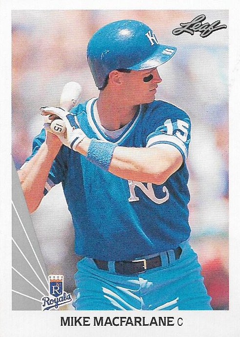
1990 Leaf -- the front
Plusses: Super clean design. Your eye goes right to the photo. ... Top-quality photos. ... Just a classy, almost elegant set.
Minuses: The team logo is too small and is weirdly jammed up against the airplane tail-fin design.

1990 Leaf -- the back
Plusses: The back is well-designed, too, attempting to offer an element of elegance. ... Nothing but full stats there, baby.
Minuses: I'm not a fan of gray/silver in automobiles or card design.
1990 Leaf -- overall
Plusses: This is considered the first premium card set, which paved the way for sets like Stadium Club and Ultra. ... The card stock is sturdier than anything else issued in 1990. ... For the rookies who were big at this time -- Frank Thomas, Sammy Sosa -- the Leaf card is the one to get for a lot of collectors. ... If I could have found these cards, I might have collected them.
Minuses: Even to this day the cards don't seem all that available. I own precious few of them. ... Because of this I feel like I can't give a complete review of the set. I just didn't get to immerse myself in 1990 Leaf.

1990 Score -- the front
Plusses: A very bright set. You can't help but notice it. ... The logo coin in the corner is fun. ... After some of the dark photos in 1989 Score, the brand seemed to pick up its game in 1990.
Minuses: I think the yellow inner border detracts from the appeal of the cards. I just don't like that yellow. ... Red, blue, green, red, blue green, red, blue, green (hey, look there's a white border!) gets very repetitive.

1990 Score -- the back
Plusses: Card bio-writing for the gods, people! You could spend an entire day on Score write-ups. ... Inset photo continues to be nice and large.
Minuses: Really can't think of any.
1990 Score -- overall
Plusses: I believe the general consensus is that Score rebounded in 1990 after 1989. ... The team logo on the front was new for Score. ... The set went over 700 cards for the first time (704). ... Score appeals to the basic collector and has from the start. That is evident here.
Minuses: I don't really like this set. In fact, I like 1989 Score better. ... This set seems susceptible to chipping. Maybe it's just the way I store them. ... Red, blue, green, red, blue, green, red, blue, green.

1990 Topps -- the front
Plusses: Wow, man, it really grabs your attention, good or bad. ... For years I had no idea what Topps was going for here and then I realized the design was riffing off a comic book and I think that was the moment I decided "yeah, it's not so crazy to want to complete this set". ... Some of the color combinations are cool. ... It's the Lichtenstein set!
Minuses: Some of the color combinations are not cool. They're the opposite of cool, as in: OW! Make it go away! ... Orange, pink and green don't go together. ... The photos get lost in the design.

1990 Topps -- the back
Plusses: It's clean and readable and I like the player font. Otherwise not much to say.
Minuses: Yellow backs went missing from Topps for a long time until they showed up again in 1987 Topps. Then, three years later, they were back. I could have waited longer. ... The monthly scoreboard doesn't feature the most exciting stats.
1990 Topps -- overall
Plusses: As far as design, Topps really shook things up. Nobody but nobody expected something like that after 1989. ... The four-card Nolan Ryan opening is pretty cool and the tribute to the late commissioner A. Bartlett Giamatti is one of the few examples of a commissioner appearing in a set. ... Once again, a nice, healthy 792-card set on good, old-fashioned cardboard. ... The Frank Thomas "blackless" error card got people excited.
Minuses: It was very apparent at this time that Topps was stuck in the past and struggling to keep up. Sets like Leaf and Upper Deck were leaving Topps in the dust. ... This is considered one of the ugliest flagship sets of all-time and with good reason. I now think it's a bit misunderstood, but I was totally in the other camp for years.

1990 Upper Deck -- the front
Plusses: Another design that makes way for the photo, even more so than 1989 UD. ... Some terrific photos in this set. ... The photo quality is even better in 1990 than in 1989. ... The design, which is restricted to the stripe across the top, is preferable to me than the first-base line that was used in 1989.
Minuses: As I've mentioned many a time, I got 1989-91 Upper Deck confused constantly and only recently can tell the cards apart without squinting at the year on the front.

1990 Upper Deck -- the back
Plusses: The photo on the back is where Upper Deck made its name if you ask me. ... I appreciate the hologram being set apart from the photo, which didn't happen in 1989.
Minuses: I didn't mention this in the 1989 post, but these card backs force you to either tilt the card or tilt your head depending on what you want to view. That's a pain. ... Limited stats.
1990 Upper Deck -- overall
Plusses: This set stands out to me over 1989 and 1991 Upper Deck. 1989 is too dark and the quality control just isn't there. 1991 is too similar to everything before it. I think 1990 UD gets it right. ... 800 cards, man, you can't beat that.
Minuses: UD was probably missing its Ken Griffey Jr. hype right about now. ... I still say this cardboard that UD introduced is the problem with Topps flagship to this very day.
All right, we finally got through all seven.
Ready for the winner?
Here we go ...
....
...
...
...
...
...
...
...
...
...
...
...
...
...

UPPER DECK!
Upper Deck wins again.
I can barely believe it. But that's 1990 for you. I would've gone with Leaf if I ever saw any of it in 1990.
Ranking: 1. Upper Deck; 2. Leaf; 3. Score; 4. Topps; 5. Fleer; 6. Bowman; 7. Donruss
Total Ranking: Topps - 6; Upper Deck - 2; Donruss - 1; Fleer - 1
Comments
I bought a hand-collated set of 1990 Bowman at the time and I remember liking the set well enough, so I will attempt a quick defense of this set (without the benefit of flipping through my binder).
I didn't *love* the rainbow borders, but when compared to 1990 Topps, Score and Donruss it was relatively low-key and old school... emphasis on "relatively". The statistical "splits" on the back were cool, something you couldn't get elsewhere. I liked the posed photos and portraits, but I freely admit it was overdone.
Finally, if I remember correctly, it was released later in the year so there are Spring Training photos of players, making this something of an update over the other major sets... at least until the Traded/Update sets came out.
I'm not going to call 1990 Bowman an overlooked classic, but I think I would've ranked it above the snoozefest which is 1990 Fleer.
Mostly because I wasn't actively collecting then, I LIKE 1990 Donruss. Since there are plenty of variations, and it's so easy to get, I find it fun to try to get the whole set, the Best Ofs, Rookies, Aqueous tests and everything. And they're bringing back and improved version in the current baseball and 2016 football.
I also think Fleer should be higher because of the clean design. Built that one in a few days in 2013 or so. It holds up far better than a lot of their other designs from that period or those of other companies.
1. UD 2. Leaf 3. Fleer 4. Donruss 5. Bowman 6. Score 7. Topps And I just built 1990 Topps last year too.
But i have to disagree, that Leaf set is awesome. But yes any I own came after the fact, i dont remember opening a pack of these ever.
Would say 1. Leaf 2. UD 3. Score 4. Bowman 5. Fleer 6. Donruss 7. Topps