Have you voted in the latest round of Cardboard Appreciation, the review (part 5)? To select which card from this week's group should advance, cast your vote in the comments or copy-and-paste to vote in the poll with this link: https://vote.easypolls.net/62ab88285617e80062b60897
If you search around enough on my blog, you'll find a post or two or three of me saying I don't care much for sets from the early 1960s.
I didn't -- for a long time. Nothing from that time period spoke to me. Unlike a few '50s sets that snuck in and connected despite me not being around to collect them originally, those '60s sets, I couldn't be bothered with them. Photos too boring, designs too plain and not much of clue about who was on the card.
But things are turning around a little bit. I'm not trying to complete the sets or anything. But something in me decided it's right to have at least a small sampling of cards from this time, like I do for, say, 1957 or 1968. They look almost as nice as any other set when there's a few of them grouped together in a binder.
So I've been making up for lost time lately, although mostly it's to try to show myself that I can find affordable vintage in these days of dumb prices.
At least one collector has noticed me wandering into the time of JFK and the Jetsons. Reader Ken sent a selection of cards from 1960-62 after finding a lot or two himself. A couple of the cards have small issues but overall they're in rock-solid shape, better than what I usually find.
Here are some of the cards from 1960. Honestly, Ken doubled my total of non-Dodgers from this set. Previously, if it was 1960 Topps in my collection, it was either a Dodger or someone had written on the card.
I can't do much about the thumb tack holes (honestly, I had a giant bulletin board in my bedroom as a kid, not once did I think, "hey, I want to pin baseball card on it"). But I did try to fiddle with the wax stains. Stay tuned.
It's 1960, still very close to the '50s, so the cartoons are still fun. Bob's mistake was leaving college.
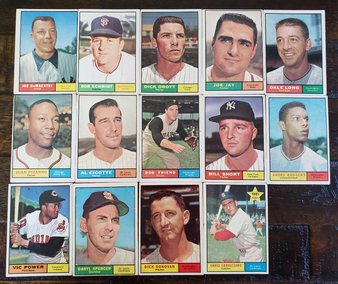
The most cards from Ken were from 1961 Topps, which is great because I'm somehow gravitating to these cards more than any others from this time. It's very weird, I am on record as saying this is one of the dullest sets Topps ever made.
Here, this is a quote from me when I ranked all of Topps' flagship sets in 2015. 1961 landed 50th out of 64 sets:
"1961 Topps might put me to sleep quicker than any other set."
Well, I haven't fallen asleep yet. Sure, most of the images aren't exactly stirring, an expansion year had something to do with that. But I like the presentation of the photo even though the design is something I could make in 5 minutes.
One of the cards from Ken was not Topps but a 1961 Post card. Weirdly, all my Dodgers from the early '60s Post cards are Yankees.
Here are the cards from the Original Wood Border set. Where were Topps' tributes to this set in 2012 or, heck, this year?
A couple of notable names here and one very airbrushed-all-over Mack Jones card. I think some of these, like the Jones, Don Lee and Pete Richert, may be green-tint variety. It's tough to tell without the regular and green-tint card to compare side-by-side. I do have a Richert in my collection already so I'll be comparing those two.
And speaking of that, the Gene Conley card gave me the opportunity to pose the regular card of Conley next to the green-tint version as I own that. I've always wanted to do this. It's cool.
OK, now, a few of the cards arrived with abundant wax stains from 60 years ago.
I can give a lot of condition issues a pass when it comes to pre-1970 cards but wax stains bug me just a little -- not so much the stain, but the fleck bits all over the card that make the player seem like he should see the team medic.
Here is ol' Hank with the Wax Disease.
And here he is somewhat cured.
All I did was apply a disinfecting wipe and rub gently in the waxy areas. I know some collectors would recoil at this method, fearing that dampening the card would warp it or remove paper from the photo. But these are off-condition '60s cards for my collection, nobody is selling these.
The wetness briefly curled the card when I was working on it, but it's back to its normal shape and looks so much better. I rarely have any luck with the nylon treatment that some collectors do (although sometimes a tissue works), especially with stains that have been on the card for decades.
Here is the most drastic fix up:
Can't let a future Dodger go around with the plague!
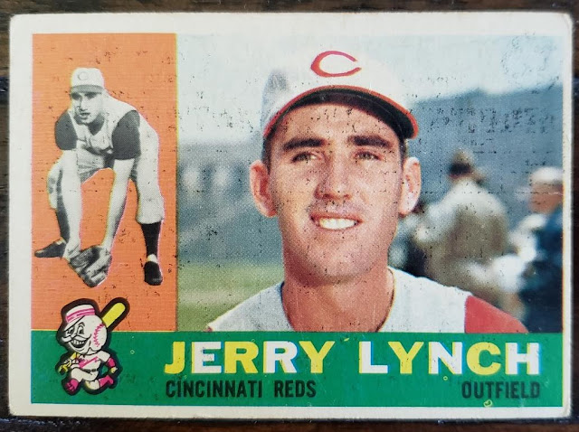
But sometimes there's no hope no matter what I did. The wax marks on this Jerry Lynch card just seem too imbedded:
That's the before-and-after, or maybe it's the after-and-before.
But it doesn't matter much. The Lynch card and all the others will be going into my growing binder of '50s and '60s cards, a binder where I thought everything in it was cool, but didn't have a lot of inspiration to add to it.
I'll be adding cards from these sets -- and stuff I like even more, like '65 Topps -- in the future, and I'll probably need a second binder for it. But it's a heck of a lot better than needing a binder for something like 1990 Donruss.


Comments
I'll have to dig out some waxy cards and test out your disinfecting wipe method.
Of course Fuji would like the two-tone lettering on the '60 Topps set! It's similar to the way he colors text on his own blog!