
I've hassled Donruss pretty good over the life of this blog, slagging them for childish '80s designs, repetitive card backs with just five years of stats, and burying every man, woman and child in sets from the late 1980s.
But there is one element of those old Donruss days that no card company can match. Not Fleer, not Upper Deck and certainly not Topps. Through one, small gesture, Donruss endeared itself to a generation of collectors and still does to this day, if I am any example.
See if you can tell what it is. It's right here on this card:

It's on this one, too:

And on this one:

Surely you have figured it by now ...

DONRUSS PUT THE YEAR THE SET WAS ISSUED ON THE FRONT OF THE CARD!
Right there on the front. Where every collector could see it instantly. No questions, no wondering, no confusion, it's right with the logo. 1984!! This set was issued in 19-EIGHTY-FOUR! I've never been more confident about a card fact in my life.
You would think this would be a common tactic for card companies, a small gesture to collectors: "See? We're one of you. We collect, too. (Or at least we pretend to)."


Every year for the rest of the 1980s and into the 1990s, Donruss placed the year of issue on the card. It often incorporated it into the logo so it didn't have to worry about where it was going to place two elements. It's a simple idea, but so helpful and in 1990, other card companies picked up on it.


Some collector must have started a letter-writing campaign. In 1990, Fleer, Score and Upper Deck each placed the year of issue on the front of their respective cards, just like Donruss had been doing, and each did it for the first time.
Topps? Pssh. As usual it thought it was too good for that. In 1991, the biggest hint it gave to collectors was to place a 40th anniversary logo on the front. Do some math, mere collecting mortals.
Fleer actually stayed with the practice of putting the year on the front all the way through the '90s, at least until Fleer's flagship set morphed into Ultra and Tradition and the like.
Score helped out collectors again in 1991 and 1992 before ditching it for a couple years and then coming back with "Score '95" on its '95 set and '96 again on its '96 set. But in 1997 Score was back to nothing.
Upper Deck filled in collectors with years printed again in 1991, 1992, 1993 and 1994. Then the years disappeared in 1995 in the sea of chaos that was to come in the late '90s.


Donruss kept chugging along in the '90s, issuing sets to a chorus of "thank yous" from collectors from the future who didn't have to search around for when a Donruss set was issued.

Then 1995 came and for the first time in its existence, Donruss did not put a year on the front of its flagship set.
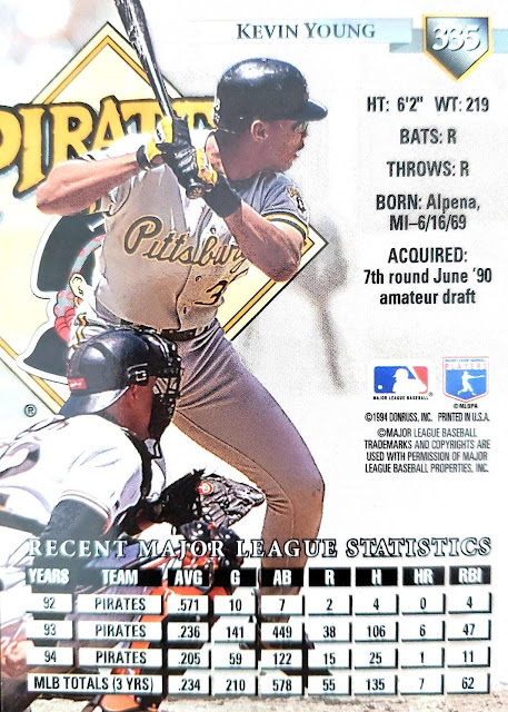
In '95, it dropped collectors into the quagmire of card backs, like the other card companies had done. As this set illustrates, the stats seem to indicate that this set was issued in 1995, yet the copyright says "1994." Many an experienced collector will tell you that card copyrights are NOT your friend. Sets were printed the year prior to being issued all the time in the '90s.
The '90s have been a disaster as I've continued to update my Dodgers collection on Trading Card Database. I've had cards issued in 1997 filed with my 1996 cards, cards made in 1998 sitting with 1999. I have two large stacks of cards pulled out of binders ready to be filed properly. But I can't file them until I get through the rest of the years to see what other cards are misfiled thanks to the thoughtlessness of card companies.
This all could have been avoided with a simple gesture.
I will give that to another card company I don't think much of, Panini, which has taken on the Donruss name.

Its retro inserts give me confidence about a set that I admit I don't pay much attention to -- but I know what year it was issued! That card is from 2017!!! (Or could be 1917, I suppose).
So much confusion eliminated, so many disoriented binders avoided.
With just one single year added on the front.

It all began with 1981 Donruss. Issued in 1981. That, I am absolutely sure, is an indisputable fact.
(Note: I am aware there are other sets that preceded Donruss that placed the year of issue on the front -- such as 1973 Kellogg's. But no set can match my admiration for Donruss' consistency).
Comments
But, yeah, Donruss did a very good thing by putting the year prominently on the front. Topps did actually do it at least once--2002.
I have the biggest problem trying to keep my Capitals hockey sorted in the right groups. I don't know the (largely Upper Deck) hockey designs very well at all (even when they're the same as the baseball), and have to keep consulting the database. I even tried to make a visual guide by putting a picture of the fronts of all the major sets for each year in the late 90's on a printout, but between the variances between base and rookie cards and deciding which ones were major sets, I gave up after the first couple years.
For kids that information just doesn’t pierce the memory bank generally. But these days, one of my more common clicks over to Baseballreference.com is to see “Contract Status,” and often I do that while I have a baseball card in my hand.
I don’t have examples from anywhere near enough sets to puzzle out how often Donruss included that info or if anyone else has _ever_ included it, though I am pretty sure Topps never has.
Of course the information can fall out of date just 6 months after a card is issued, but I think that’s OK. And still interesting years later - can you believe the ——— signed ——— for only — years and then let him walk away?