
Yes, it's not over yet. I'm jumping into the 1990s for this series.
This series is beginning to take the form of a long-distance run -- "another half mile and I'll see how I feel. ... OK, another half-mile and I'll see how I feel." I expect to be passed out and sprawled on the ground part way through the '90s.
I actually don't expect to get past 1995. Right now, instead of going five years at a time like the previous posts, I'm covering only the first three years of the '90s. The number of major sets ballooned as the '90s began (remember, I'm covering only major sets in this exercise to conserve energy).
Once more, this is where I try to find the "best" or "most notable" on-card design element, front or back, for each set.
Some of these sets make this attempt impossible but I'll do my best. Let's go:
1990

1990 Bowman
Best on-card element: I'm cheating a bit already, 1990 Bowman is so damn boring. The best element is Bowman shrunk its card size to the standard 2 1/2-by-3 1/2, making it much more manageable for collectors.
Best on-card runner-up: If you're a stickler for what the definition of "on-card" means then I guess it's the rainbow-ish border. I would've preferred if the yellow bar wasn't much larger than the other colors.

1990 Donruss
Best on-card element: I believe it's Junior Junkie who calls this set "the red menace." I love that moniker and that's what is the most notable element of this set by far, the pervasive red borders.
Best on-card element runner-up: This is definitely not "the best," because who doesn't love team logos, but Donruss scrapped the logos that it had used for every set since 1985 in 1990.

1990 Fleer
Best on-card element: I wish I liked this set more than I do, because I really enjoy understated card sets, but my brain considers this one most forgettable sets Fleer made. The most notable element is the Topps-esque ribbon treatment. Fleer figured Topps liked it so much, maybe it would try it out.

1990 Leaf
Best on-card element: As one of the first-known "premium" sets, Leaf is very minimalist. I've always considered the team logo too small.

I'm not going with the "tail fin" on the front for the best element. I'll turn it over to the back for what I consider one of the classiest-looking card backs to that point. Super-clean, which is 1990 Leaf's overall theme.

1990 Score
Best on-card element: While Donruss was scrapping the logo on its card fronts, Score was displaying the logo on the front for the first time.
(Station break: I just realized a design element that I should have mentioned earlier because it rules, but I think I'm going to make a separate post about it).

1990 Topps
Best on-card element: It's easily the comic-book-page-inspired treatment. I'm sorry for every bad thing I said about 1990 Topps.

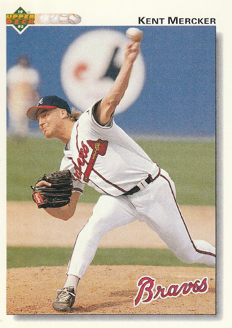
1990 Upper Deck
Best on-card element: It's placing the baseline at the top of the card instead of down the stupid side like '89 UD did. It looks so much better in this configuration and combine that with the improved photo production and 1990 UD crushes its debut set.
1991

1991 Bowman
Best on-card element: Ugh, we're back at Bowman again. I have nothing.

I sort of like how the team-by-team stats are the first thing you see and the name and vitals are relegated to the bottom, but that's grasping.

1991 Donruss
Best on-card element: Hey, the logos are back! Donruss must've received phone calls.
The only thing I have for this set is half the cards are blue-bordered and half are green-bordered. I was not a fan of the blues and the greens are a welcome relief. But it also makes it seem like it's two different sets so I don't know what I'm talking about.

1991 Fleer
Best on-card element: Most notable again because I am definitely not advocating for every card to show up in all-yellow borders. That's a health hazard.
Also, note that Fleer went without team logos for the first time since 1982. Maybe all the yellow was a distraction tactic.

1991 Leaf
Best on-card element: The photo corners!

1991 Score
Best on-card element: 1991 Score's devotion to the subset should be recognized here, even though I'm trying to avoid set content for this series. But I love the look of some of the subsets in Score so I'm sticking with it.
Best on-card element: Score's cutting-edge use of the color teal, which would become all the rage just a year or two later.

1991 Stadium Club
Best on-card element: It's all about the back baby. You could go with the "BARS system" and it is fascinating, but not as much as placing the player's rookie card on the back in full color. I loved this so much.

1991 Topps
Best on-card element: There is a lot to love about this design. For me, the most distinctive element is using the team "word mark" instead of the traditional logo or simply listing the name.
Best on-card element runner-up: The 3-D treatment of the image as the player often breaks through the sets of bars running the perimeter of the card.
Best on-card elemente runner-up, runner-up: The position notification shows up for the first time since the 1986 Topps set! Welcome back.

1991 Ultra
Best on-card element: Not much to cover on the front for Ultra's debut, but the back certainly stands out with not one, not two but three different pictures of the featured player. So you have four different pictures of the player on a single card and that's gotta be some kind of record.

1991 Upper Deck
Best on-card element: Upper Deck is stuck in a rut with its design borders by this point, but the home plate background for the logo is a nice touch.
1992

1992 Bowman
Best on-card element: I'm a traditional cardboard kind of guy but there is no disputing that '92 Bowman's use of white, glossy card stock was a step in the right direction. Those first three Bowman designs were putting me to sleep. Everything about this design, front and back, is lighter and brighter than what it had previously done.

1992 Donruss
Best on-card element: I'm on record as disliking this set's look intensely. However, it's to be applauded for being the set that moved Donruss into the adult world. Just about every Donruss set between 1982-91, except for maybe '84-'86, looks like something that would be issued with a kid's toy. I suppose that might make sense for those who think "cards are for kids" but I always dismissed Donruss because of that. It was good to see Donruss take itself somewhat seriously.

1992 Leaf
Best on-card element: Leaf doesn't make it easy with a third straight year of silver borders but let's turn it over to the back:

Leaf went with much larger photos on the back, graduating from head shots to torso shots or even full-body action photos!
Best on-card element runner-up: This gets away from the base set, which is why it's not the first thing I chose, but the black gold parallels in this set are probably the best thing Leaf ever did.

1992 Pinnacle
Best on-card element: Speaking of black-border elements, here is my favorite black-border set after 1971 Topps. A daring move and super sleek. I think the "sleekness" on top of the daring black border theme is the best element.
Unfortunately Pinnacle didn't figure out how to make chipping stop.

1992 Score
Best on-card element: I dislike '92 Score almost as much as '92 Donruss. I guess the best element is the player image crashing through the design on every card, which isn't difficult to do because ... WHY IS THERE SO MUCH EMPTY SPACE ON THE FRONT OF EVERY CARD?

1992 Stadium Club
Best on-card element: I can't freak out over the rookie card photo on the back again, although I want to. But let's turn it to the back again anyway.

For me the best on-card element that is not the rookie card photo or the BARS chart, but the wonderfully huge and magnetic card number in bright white, fat-font numbers on a black background. You could spot that card number in a power outage. That's what I want from my card number.

1992 Studio
Best on-card element: It's the Up-Close category where you get to see how thoroughly boring ballplayers are -- although some do surprise.

1992 Topps
Best on-card element: New white cardboard? Naww.

It's the panoramic stadium pictures.

1992 Triple Play
Best on-card element: The best part of the debut of the "kid-focused" set were "kid-focused" photos, which just happened to be photos that collectors of any age likes.

1992 Ultra
Best on-card element: Early '90s Ultra is a mystifying product. I don't know why so many collectors took to a set in which just about every card looked the same -- batter batting, pitcher pitching.

The back doesn't provide much else new. Heck, there's one less player image on the back than 1991 Ultra!
So you'll have to come with your own "best element" for '92 Ultra.
1992 Upper Deck
Best on-card element: Upper Deck scraps the baseline theme of the first three years. This is my favorite 1992 UD set until 1993 UD came along (OK, so it was a favorite for one year). I like the team word marks, I like the baseballs speeding across the top, I like the 3-D effect on the photo frame. It's a good look.
And that'll end it.
That was long and I felt like I wasn't spending enough time on each set to really delve into what was the best. That's what happens when you're deluged with sets. Not enough time to spend with all of them.
Will I do 1993, 1994 and even 1995?
Maybe.
I will not do anything beyond that though. This post took me two days!
Comments
The other thing I noticed at some point with 90 D is that I always thought red. Then I thought it’s red, black and white. But I actually like that there’s more color in the splatter than I remembered.
'90 and '92 Upper Deck were some pretty awesome designs, but the cards were EVERYWHERE those years. You didn't buy packs of those cards, you were issued them. They're right up there with '87 Topps as packs you can still find at your local card shop for fifty cents.
The less said about '90 and '91 Donruss, '90 and '91 Fleer and '90 Topps the better. '90 Topps hasn't aged well in my eyes.
I think it's interesting that many of these sets from this era were both forgettable and unforgettable at the same time.
I started collecting in '87 and as a kid I was always annoyed at the uneven shapes of the photos caused by designs. I was always using my fingers to "cut off" the extra parts of the designs so the shape of the photo was square or rectangle. So I remember being thrilled with the '90 Donruss, and then '91 Fleer sets, which actually featured a square photo in their design.
'91 Score is a favorite of mine as well because of all the different border colors. The black-bordered cards in that set are some of the best-looking ones of their time.
Great call on 1991 Topps and the wordmarks. That's something that Topps consistently messes up with Archives reamakes of that design.
And 1992 Ultra would be the computerized marble/beveled edges except that it does the exact same thing in 1993 plus Leaf and Donruss started doing the same thing that year.