
This is a series that will probably run once a week over the next six or seven weeks, depending on how much tolerance I have for the sets of the past 30 years.
As I mentioned back in this post, I want to list what I find to be the best on-card element of each major set since 1950.
This exercise has solely to do with the physical card, front or back. It's not about who is in the set or how large the set is or anything like that.
Unlike my other posts, I'm using online images for this. Taking photos of my cards the last few months has been all right but we're heading to the dismal, dark days here in the Northeast, which does not produce bright images. Also, it'll be kind of nice to show some cards that are a little different on this blog.
I don't have a lot more to say about it, so let's start with the first episode in the series, the major releases of the 1950s:
1950

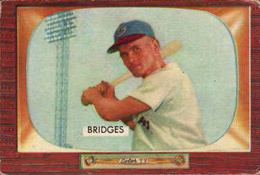
1950 Bowman
Best on-card element: Artistic quality
This is kind of a general statement and relative to what was happening in cards at the time (a lot of the on-card elements will be related to how notable it was at that particular moment).
The images on the '50 Bowman set were a significant improvement over the 1949 Bowman images. For 1950, Bowman used actual photographs and made colored art reproductions of those pictures. This allowed for actual ballpark backgrounds, etc., and the illustration part of the images are well-done.
1951

1951 Bowman
Best on-card element: Names on the front
I know some collectors would say the names are a drawback to the set, they prefer the "pure-card" look. I can see that and often I would agree. But a lot of the sets that don't feature names on the front from this period drive me crazy because I don't know who I'm looking at. ... I guess I need to familiarize myself with more '50s players.
Runner-up best element: The larger size compared with 1950.

1951 Topps (Red Backs/Blue Backs)
Best on-card element: You can play a game with them.
The game aspect downgrades this set in many collectors' eyes, it's considered inferior because it's a game set. I don't even pay attention to the game element, but it's probably the most notable aspect, along with the rounded corners.
Personally, I would say that the best aspect of this set is that they're so-darned cute (nifty size, rounded corners, happy head shots). But I suppose that's a bit too subjective.
1952

1952 Bowman
Best on-card element: Combining some of the best aspects of 1950 and 1951 Bowman.
The '52 Bowman set is essentially 1950 Bowman with a larger size and facsimile signatures. It's a beautiful set and the signatures help tell me who it is.

1952 Topps
Best on-card element: I'm torn with this one. The most obvious one is probably MASSIVE CARD SIZE compared with what was being issued at the time. I'm sure the kiddies loved it.

But I am going with "full statistics on the back," which was new at the time and very helpful for those who wanted to know exactly how good these guys were.
Runner-up best element: Larger size
Runner-up to runner-up best element: Team logos on the front
1953

1953 Bowman (color)
Best on-card element: I'm not addressing the black-and-white set, the color photographs are by far the best on-card aspect of '53 Bowman. On-card photographs of current players was a first in the hobby.
This is also possibly the best on-card indication that Bowman and Topps were going at it tooth-and-nail at the time. One year after Topps debuted a new larger size, Bowman issues cards in the exact same size for the first time and, oh yeah, actual photographs, buster.
There's a reason that this format was duplicated for numerous sets to follow, including multiple TCMA sets. You just can't beat the look.
Runner-up best element: Stats on the back for the first time for Bowman.

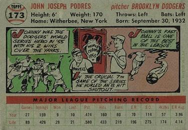
1953 Topps
Best on-card element: The quality and detail of the player paintings.
I don't think I'm alone in saying I am conflicted by art cards, specifically ones that feature painted likenesses of players. Many fall off the mark for me and because of that I don't want to collect them.
It took me awhile to warm up to the '53 Topps set and I still prefer my cards to feature photographs, but you can't deny the quality of the player paintings in this set. Topps' current Living Set (at least I think it's still current) pays tribute to this set and I don't think it gets it as spot-on as '53 did.

Best on-card element runner-up: Card numbers that you can see from space.
1954

1954 Bowman
Best on-card element: I'm not clear on what the images are on '54 Bowman. It seems they returned to their early '50s ways with some artistic renderings of photo images (perhaps in response to Topps' 1953 set?) Because of the look of the '54s, it's difficult for me to pin down a "best" element. What I like most about the '54s is the dream-like vibe I get from the images.
It's either that or that on the back each player's name is featured within a baseball bat.

1954 Topps
Best on-card element: The double images of the player, one head shot, one action shot; one in color, one in black-and-white. It's the first set to feature two player images on the same card. Topps liked this technique so much it repeated it for the next three years.
1955
1955 Bowman
Best on-card element: No searching this time. At the height of the home-television craze, Bowman placed each player inside a television. Genius. And what a way to go out as this would be Bowman's last card set for a long time.

1955 Topps
Best on-card element: I'm fudging a little bit here, but it's Topps' fault for using the same damn presentation, just in a wide-screen format. The best card element is this is the first all-horizontal Topps set. Maybe "notable" is a better descriptor than best. I know some collectors hate horizontals.
Interestingly, both Bowman and Topps issued horizontal sets for the first time in the same year.
1956

1956 Topps
Best on-card element: The '56 set is so freakin' cool and its presentation is the reason. But it's very much like the '55 set and it's a bit difficult to point out why the '56 set is vastly better. But I think I know what it is:
Backgrounds.
This is something that modern sets still have a problem with (especially high-end sets). Backgrounds almost always improve a card.
Best on-card element runner-up: The three-strip cartoons are the most intelligent, interesting and humorous cartoons to ever appear on baseball cards.
1957

1957 Topps
Best on-card element: I'm torn here, but the best on-card element of 1957 Topps is the new 2 1/2-by-3 1/2 size that has been the cardboard standard for the last 65 years.
Best on-card element runner-up: Neck-and-neck with the card size is full-color photos for the first time. It really gives you a window into 1950s baseball that other card sets can't match.
Except, that is, 1953 Bowman. Which is why I went with card size.
1958

1958 Topps
Best on-card element: This is not the greatest card set and if I didn't know any better I'd say Topps was resting on its monopoly laurels already. For me, the best on-card element is the fluctuating bright colors for the background. Some -- like the pink behind Shaw here -- really speak to what the late 1950s was all about.
I imagine seeing all the cards in a binder is a terrific, going from green to yellow to orange to black, pink and blue.
1959

1959 Fleer Ted Williams
Best on-card element: The set isn't much to write home about but what I do like about it (aside from a whole set about my dad's favorite player) is on the back.

You get a complete history of Williams' career with write-ups on every big moment. That kind of complete biography is not something card sets are good at -- except this one.
Also, I get a kick out of the photo caption description on the bottom.
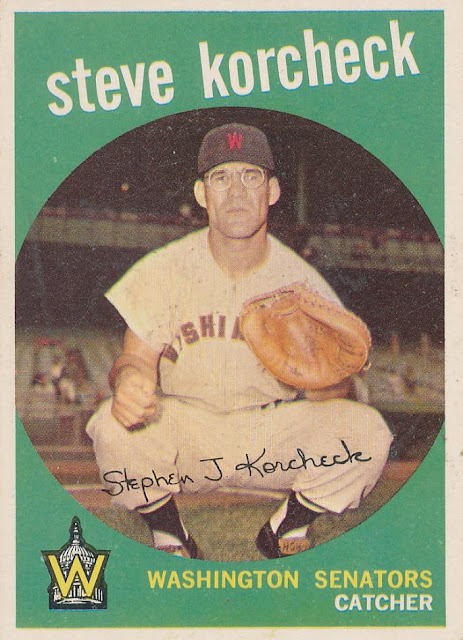
1959 Topps
Best on-card element: The portal design, of course. I know this limits what you can see in the photo. But sometimes a design is so good and so memorable that it's OK if the picture is sacrificed a little. This is probably the most '50s card set of all-time and the reason is that collectors could peer into the knothole for a look at their favorite players.
That brings to a close the major sets from the 1950s (Sorry, 1952 Berk Ross, I'm not very familiar with you so I skipped it).
As you can see, this might get to be impossible once I reach the 1990s, so I may just pick out select sets or something.
Next up: The 1960s.
Comments
You really nailed the fact that Topps was mailing in the 1958 design.
After a classic in 1957, the 1958 is a real disappointment.
(Looking forward to the rest of this series!)