
I recently received a handful of Dodgers from the 2021 version of Topps Fire from Cards On Cards a week or so ago.
Topps Fire is one of those products that I can take or leave. It wouldn't bother me if it disappeared tomorrow, yet it is an art-focused set so I always find it somewhat interesting from year-to-year.
Also, since it's an art set, it is highly polarizing and I can just hear the comments to this post in my head as I write it ("Anonymous: those cards suck"). But artists are used to that. In fact all creative types are used to it. People feel like they can throw whatever uninformed criticism they want at artists, photographers, writers and designers, but would be highly offended if you critiqued their office job (if they have a job).
So, we press on, knowing somebody out there somewhere likes it.
That said, I'm stunned that Topps Fire is still a thing after five years.
That's right, this is the five-year anniversary of Topps Fire. In fact, it's been going on for six years if you count the 2016 Update insert that kicked off the Fire brand.
These cards were originally designed by card artist Tyson Beck (he does other stuff but that's all I know him for). I don't know if he still supplies the designs, the overview of the 2021 set says that the design is "Tyson Beck-inspired."
I thought it would be interesting (yeah, I know I'm the only one) to go through each year of Fire and "critique" what I like and don't like about them. Come on, it'll be fun. After all, design is about the only thing this set has going for it. The photo images aren't exactly thrilling, pretty mind-numbing actually.
OK, we'll start with the 2016 Update version of it, even though that's not actually when the product began as its own stand-alone set.

2016 Update insert
The 2016 design, unlike the others, utilizes team colors. For the Dodgers, that means a extra heaping of blue. And because of that, the design looks less like a "fire" and more like a snowstorm white-out.

2017 Fire
The first official Fire set. I'm on record as enjoying the 2016 insert cards, as a one-off. I still think Fire works best as some sort of insert. But here we are. The 2017 set I didn't like. It does seem to continue the "storm" theme. It looks like Bellinger and Seager are caught in a tornado or other kind of weather vortex. Urias seems to have escaped but he's dodging some lightning bolts.

2018 Fire
OK! We have actual fire! (Well, not actual ...). There seems to be an explosion behind Kershaw. Verdugo's card looks like they're throwing water on a rager. I don't know what that is behind Turner. Some ghostly eyes peering out of that fire.

2019 Fire
2019 looks fairly different than the previous versions. I like the look, it's a bit more mellow. There's also quite a bit of sameness to it, which is both good and bad. More uniform, but not as exciting.

2020 Fire
Yeah, we're definitely not about fire anymore. But despite no reference to the brand name this is my favorite design look because of its massive '80s theme. There are '80s references all over these designs, especially with the Kershaw and Seager. I would love if Fire morphed into a decade tribute each year.

2021 Fire
Conversely, I don't like 2021 Fire at all. There's a lot of sameness between the designs and the angular stained-glass window shards aren't doing it for me.
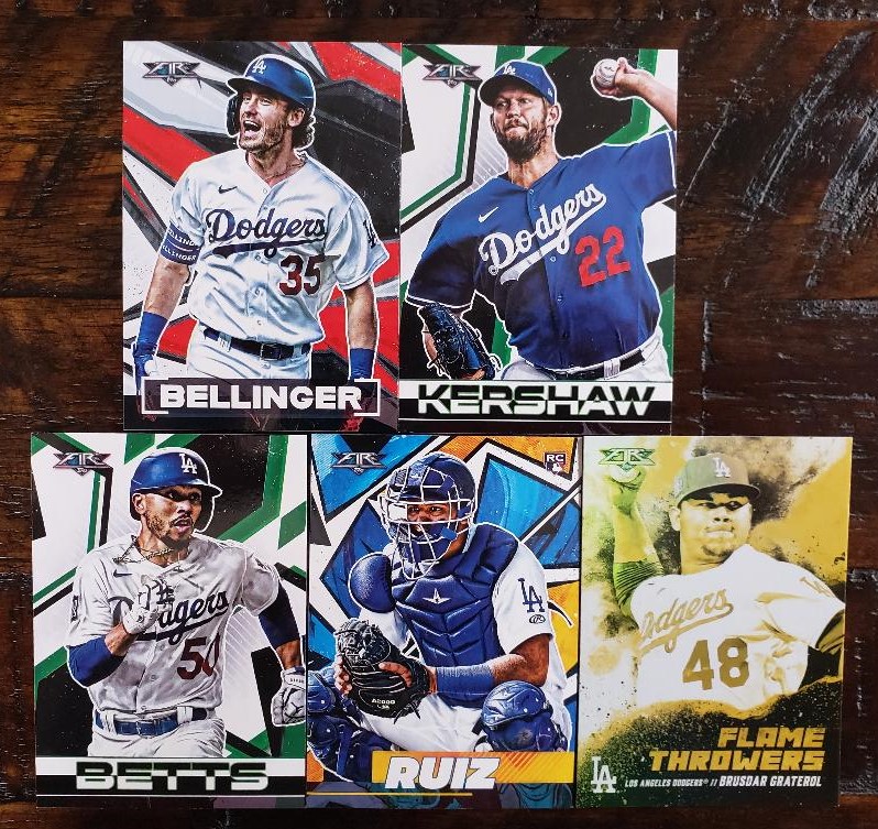
Here's a look at all the Fire cards Cards On Cards sent. There's one of those gold-minted parallels that are pretty meaningless to me. But, as a team collector I must have them all. Heck, if I wasn't a team collector, I wouldn't be adding these cards to my collection period.
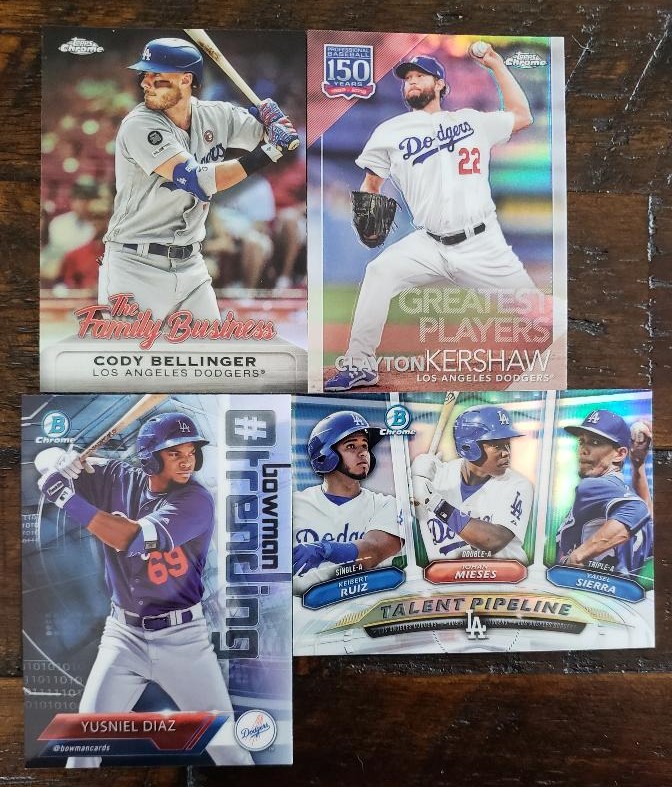
These are the other cards from Kerry. Some Chromie-ness needs off of my want list. Cards going back 2 or 3 years! Really appreciate that.
I've moved past the stage where I would pick up a pack of Topps Fire from Target (it's a Target-only product). Unless the designs really speak to me.
However, like every art-based set, it is in the eye of the beholder. What I find interesting or collectable, others wouldn't buy with a gun to their head. Also, something like Fire definitely has collectors who grew up in the '90s in mind. They don't seem to be bothered by those unnatural backgrounds, while collectors from the '60s or '70s point to this as a reason why they don't collect modern cards.
Me?
It's better than that Topps Gallery reboot.
Comments