
We here at Define the Design do not shy away from the tough questions. After all, anyone can come up with a descriptive set name for 1987 Topps or 1982 Donruss.
Finding design answers for a few other sets is a lot more challenging. Score, when we get to it, will be a bear. Some of the Upper Deck sets out there are almost indefinable.
And then there's Bowman. The early days of Bowman produced some memorable sets and nobody is going to have much trouble coming up with a name for some of those '50s cards. You plaster a giant wood-panel TV set on each card and you've named the set, too. Done and done.
Even when Bowman returned in 1989, it at least made the look of its sets relatively different from year to year (1990 and 1991 excluded).
The problem arises at the turn of the century.

Here is the 2001 Bowman card. Bowman went with a very cool black-and-red design. You can't argue with black and red. It always looks great, as the Atlanta Falcons have shown for years.
So, Bowman had something here. Oh, and there were the Pujols and Ichiro rookie cards, which actually had no red, because rookies featured blue borders.

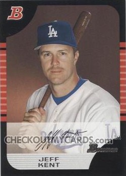
Then 2002 Bowman arrived. The color scheme was the same. More black and red. That was cool. After all, it worked the previous year. Bowman tweaked it a bit to display the red a little more. Can't complain about that, even if it does resemble 1985 Donruss a lot.

2003 Bowman. OK, now you're starting to wonder what is going on with the Bowman guys. Three black-and-red schemes in a row? Did something get stuck in the production cycle?

2004 Bowman. Heh. At this point, I'm starting to think that black-and-red is less a color scheme than a philosophy of life down at the Bowman plant. Are all the workers required to wear black and red? Are all the cars in the parking lot black and red? Do the elevators only play the White Stripes?
Also, by this time I'm definitely having trouble distinguishing one year from the next.
More black and red on 2005 Bowman. I will say this -- the design, which features a brick wall feel, does stand out more than the rest. (I had to filch the image as all my '05 Bowman cards are first-year, blue-and-black cards).

2006 Bowman displays a lot more red than black, but the chipping leaves no mistake about the border-color. Bowman goes with the high-maintenance black borders for a sixth straight year.

2007 Bowman. At this point, I've changed my theory to thinking it's a financial thing. Consider all the cash Bowman saves by purchasing only red and black ink!

2008 Bowman. This set has a bit of a 3-D effect going on with the border. Beyond that, I've got nothing.

2009 Bowman showed just how many things can be done with the border. When everything else is the same, go nuts with the border!
Also, I have 2009 Bowman cards that are chipped already. A year old and they're chipped. That is so uncool.
I've yet to see any 2010 Bowman in person but I have seen the Ryan Howard and David Wright cards online about a few 100 times. You can tell it's pretty much the same deal. Bowman added a team logo, which was nifty in about 1983.
Bowman has beaten the black border look to death. Chipping issues aside, the 1971 Topps set always was the epitome of cool because of its rare black borders. 1985 Donruss and 1986 Topps also seemed cool at the time because so few sets used black borders. But I have now lost interest in black-border cards.
Design doesn't mean a lot to Bowman or its collectors since design isn't what sells Bowman cards. But I'm not going to let that stop me.
Am I up to the challenge? Let's see:
2001: the blue diamond set
2002: the 1985 Donruss rip-off set2003: the black-and-red tombstone set
2004: the really wide Pizza Hut logo set
2005: the brick wall set
2006: uh, uh, the isoceles triangle set? The scalene triangle set?
2007: the border that looks like the neon tube outline of a seedy, Vegas motel set
2008: the border that looks like a metal piece to a variety of kids' outdoor play contraptions that WILL NOT FIT INTO THE ADJOINING PIECE I DON'T CARE WHAT THE INSTRUCTIONS SAY set
2009: the repetitious gray lines with the fun house mirror border set
2010: the team logo set
OK, that didn't work well at all. Maybe two of those, at most, are useable.
Bowman, you play hardball.
Any creative types who can come up with anything -- anything at all -- the floor is open.
Comments
2001 - name on top of name
2002- Square Box
2003 - Tombstone set
2004 - The Bridge set (red lines look like bridges)
2005 - I'm a B (song by Black eye peas)
2006- What is the word for a five sided figure
2007 - Roller Coaster (dip set)
2008 - Vertical 1955 Bowman
2009 - The car set, (the 2 baseballs at the bottom look like wheels and the photo is just about to drive off the card).
In 2009, Bowman went to a thinner stock (this is why the corners are dinged), Unfortunately, the use the thin stock again in 2010.
wait... you still wouldn't be able to tell which one that is....
2009B - the Party Trailer set.
It looks like a booth on wheels (the number and position forming the wheels and the photo the "booth" part). I don't know if you have them there, but here there is a glass or plexiglass booth with girls dancing around inside it. The booth is set on a trailer towed by a truck around parts of town as an advertisement for local bars.