The trouble with me and O-Pee-Chee cards of the '60s, '70s, 80s and early '90s is that I am so fascinated with the differences from the Topps sets from the same year that I ignore OPC cards that look the same as the Topps cards.
I mean what's the point of collecting another card that looks like the Topps card in every way? This is particularly true for OPC sets that don't note that it is an O-Pee-Chee set on the front. And, yes, I know there are always differences with the backs -- because there is French -- but as much as I emphasize how you must read your card backs, backs are backs.
So, I'm in danger of never completing an OPC set as much as I like them because the cards that are different from their Topps counterparts are SO fascinating that it makes everything else boring in comparison.
For example, the 1977 O-Pee-Chee set, which I think is the greatest of all the OPC sets because of all of the variations from Topps, is on my radar. But the only cards I end up buying are ones where the player is featured with a different team than in the Topps set, a different pose, or maybe the player isn't even in the Topps set. The difference is the decider! I don't need that same-old, same-old.
I acquired seven 1977 OPC cards recently. All seven are different from the Topps cards. I'm going to go through each of them and decide which one I like the best. I expect OPC to blow the doors off of Topps, but let's see.
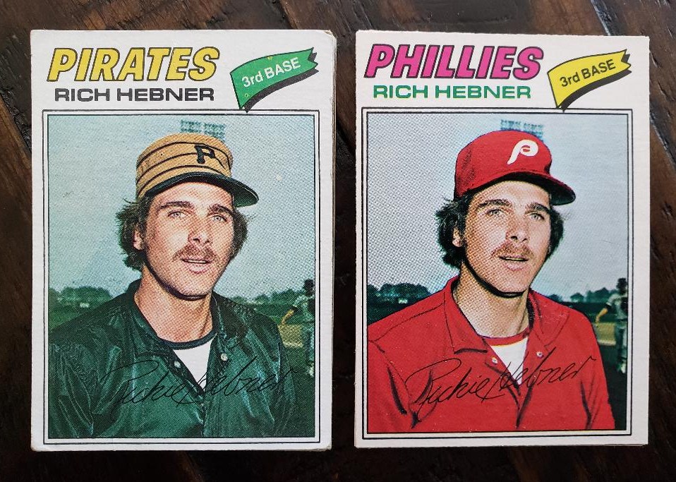
I'll start with the cards in the photo at the top. (By the way these are in order by card number in the OPC set).
Topps card on the left and OPC card on the right (obviously). As much as I really, really like the wild color difference with the OPC Phillies card, I feel required to pick any card that shows the Pirates' pill box hats. No airbrushing wins points, too. Also, I looked closely to see if the player in the background was airbrushed, but it appears he is untouched.
Topps 1, OPC 0
Weird one. My knee-jerk expectation with OPC is that it will do a much better job updating the player than Topps will, such as the Hebner card. This, however, shows Falcone in an actual Cardinals uniform with Topps while OPC Falcone is obviously airbrushed.
Falcone had played for the Giants in 1975 and is with that team in the '76 Topps set. Oddly, OPC apparently chose a Giants photo of Falcone and painted him into proper colors instead of picking Falcone in a real live Cardinals uniform. I can't explain this. Topps wins this round, too.
(I even went to the source for all things OPC, oh my o-pee-chee!, for an explanation. Jim speculates OPC didn't like the shadows on Falcone's face on the Topps one).
Topps 2, OPC 0
I remember quite clearly being very disappointed in Topps' Dave Cash photo in 1977. I was a Cash fan, based solely on his 1975 card, and now we had nothing but a head shot with a painted hat? Look at the electric aqua brim! Where had you ever seen that in a ballgame, prior to the Florida Marlins?
The OPC card is a significant improvement. Standard batting pose here, but you get to see more of the guy and in his actual Expos uniform, too.
Topps 2, OPC 1
As fascinating it is to see -- look, I can spot a little more of Harrah's left elbow! -- an All-Star logo always makes a card more interesting.
More fascination: Harrah is a shortstop on the Topps card and a third baseman on the OPC card. Harrah made the All-Star team in 1976 as the starting shortstop and played the vast majority of the season at that position. But by 1977, Harrah was spending all his time at third base, so that's a nice update by O-Pee-Chee.
Still ...
Topps 3, OPC 1
Gee whiz, this is starting to look like a rout. Topps just clinched a victory with this card.
The Chip Lang Topps card is one of the best one-year wonders (player with only one card in a major set) in Topps history. I remember pondering how in the world a pitcher's arm bent like that. Also, is that a train in the background? Perhaps a boat?
The OPC card meanwhile is as standard as it gets, although you do get to see more of his face.
Topps 4, OPC 1
The Manny Sanguillen card was the most expensive of the O-Pee-Chee purchases of this lot. That's OK, though, I love obtaining Manny Sanguillen cards.
Manny isn't featuring his trademark smile on either of these cards. He seems a little bothered in each one. The airbrush job for the OPC card doesn't look as realistic as the the Topps one, but Sanguillen's helmet is propped up much too jauntily for me and I like seeing the logo even if it is airbrushed.. It's O-Pee-Chee for me.
Topps 4, OPC 2
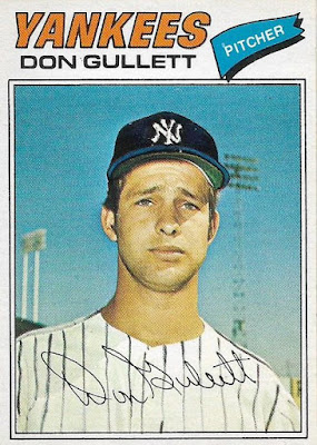
Final comparison. Both are airbrushed examples, but the OPC card is not as obvious. Gullett is much too close in the Topps card and although Gullett's airbrushed uniform is starting to look like prison gear in the OPC card, it looks more real than whatever is going on with Gullett's Topps cap.
OPC also gets the name color right.
Topps 4, OPC 3
Well, OPC almost came back but Topps pulls out a rare victory.
I know some of you are dying to see some French after all of that and I haven't forgotten you. Here are the backs for all seven cards.
Who knows, I may try to complete this set someday, or I may just spend all my time looking for all the OPC differences, acquiring only those and shouting "vive la différence" to nobody but myself.
Bonne nuit.


Comments
...But I do love 1977 variations, whether they're OPC or Burger King or Cloth Stickers
To throw something at Brett Alan (should he see this), Tony Perez also had three photos / one design in 1977... Topps (with the Reds), Topps Cloth Stickers (airbrushed Expos) and O-Pee-Chee (actual Expos)
Have fun working on it!
One of the differences I'm familiar with is the Thurman Munson in these sets. Like Harrah, there's the lack of the All-Star banner on the bottom of the OPC card... but his facsimile signatures are also different.
Good observation on the All-Star banner being left out of the Harrah card. OPC did the same thing on their hockey cards back then, too -- at least for the 1978-79 set. I wonder if they just didn't feel like changing "All-Star" to "Etoile".