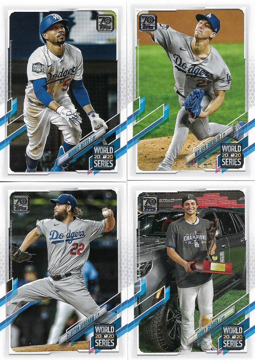
As of Monday I had the complete set of 2021 Topps Series 1 Dodgers in my possession, inserts and parallels excluded of course.
Thanks to buying into a Nachos Grande break, I received most of the Dodgers from the set. Then the other two -- Cody Bellinger and Gavin Lux -- came to me from reader Kyle.
I've babbled enough about the design issues in previous posts, and I'm as sick of looking at them (and trying to read them) as you are. But I'll go through the cards very quickly just to have them all in one place.
First the World Series cards, which has been a staple for Topps for the last dozen years, one card for each World Series win by the winning team.
Even with those four extra cards, there is still a whopping 16 more Dodger cards in the Series 1 base set. Here they are:
I'm not sure if I have a favorite card out of that crew. I'm probably going to have to give it time and see what ends up in Series 2.
Among the notable items are the "Hands Up, Masks Up" checklist card and the Dodgers team card with the Dodgers broadcasting crew looking on from the stands with all of its cardboard cutout friends. Those two cards at least acknowledge the weirdness of the 2020 season.
The team card also gives us what could be the last card sighting of Kiké Hernandez and Joc Pederson in a Dodger uniform, although Topps very well could squeeze in another Dodger blue Hernandez into Series 2. Joc Pederson gets his own card is Series 1 (is that a spring training shot?)
Other than that, just way-too-close-crops and another needless rookie card inclusion (Mitch White or Keibert Ruiz, take your pick), which Topps added after sacrificing yet another relief pitcher to the rookie card volcano gods.
The jagged design slashes poking into the photo still irk me. I was reading the blogs yesterday and I noticed that P-Town Tom called them "razor blades" and I think that's the perfect name for this set. I haven't done a "Define the Design post" in a looooooong time but that's what I'm calling the 2021 Topps set from now on, "The Razor Blade Set."
I think the name works with the probable intent from the design team, always looking to be on the cutting edge of baseball card design, "the razor's edge." I know my patience for the design is razor-thin.
I was shut out on any inserts in the Nachos Grande break until the silver pack was opened at the end and I probably got the best one of the bunch here. I've said many times that I don't ever need a new Jackie Robinson card again, but then I get one and I'm still a bit giddy.
All right, that's more than plenty for 2021 Topps. Hopefully, you won't see anything else on it until Series 2 arrives.
Meanwhile I've signed up for the Dodgers for breaks of Heritage, Opening Day and Panini Donruss. That should keep me away from the card aisle for a good while.
(More Nachos Grande group break goodies in the coming days).


Comments
Thanks for joining in the breaks! I'm looking forward to starting the next round of Breaker's Club in a couple of weeks.