
All right, yesterday's post received a lukewarm response, which is about what I expect for research posts these days.
But I can't be "a here-are-my-goodies" blog every day, so I'm pressing on with part two of how cards have represented the baseball on its cards.
Nick, who is just as obsessed with this idea as I am, noted that I didn't include the 1961 World Series cards in the previous post. That's because I didn't have one at my disposal. I did all my research through my Dodgers binders, since those represent the widest range of sets in my collection, and the Dodgers weren't in the 1960 World Series.
But this is the subset that got Nick wondering whether other sets had no idea what the stitching on a baseball looks like. Please note that all the stitches are moving in the same direction, which is not the way a baseball looks:

I'll show a couple of other cards that should have landed in the yesterday's post. I didn't feature them because the baseballs are pretty damn small and it's too difficult to read the seams.


I believe in both the '78 and '81 case the seams are correct.
All right, let's move on to the 1990s and the years that followed. Since there are way too many sets created in the last 30 years, I stopped looking at the backs of cards for baseballs (except in a couple of cases). I'm also going to use fewer words because, again, many too many sets.
1992

Upper Deck used a baseball in its design for the first time. UD rarely relies on the baseball design, but I've always liked the moving ball in the '92 set. Don't ask me about the stitching, though. It's too small.

In '92, Fleer returned to a baseball design for the first time since that 1981 debacle. The Fleer Ultra wording over the baseball makes it difficult to read the stitching.

Even a closer look doesn't clear things up, although, I THINK, it's wrong again. It looks like both sets of seams are pointing in the same direction.
1993

Fleer Ultra was back with the baseball design again and the stitches are right there for all to see.
And I think Fleer did it again. The seams are still wrong! They're both traveling upward.

The other interesting baseball design in '93 comes from Stadium Club. I never noticed this until doing this post, but the baseball is not positioned the same on each card. Take a look at the four cards, the seams on the ball are in different spots each time.
1994


Here are two of the backs I turned over, one for '94 Ted Williams Company and one for '94 Pinnacle.
I can't make out the seam direction on the TWC card but the Pinnacle baseball appears to orient the stitches correctly.
1995


Topps Dimension III and Pacific, both with a baseball with seams pointing in opposite directions as is correct. I'm going to guess though that those DIII baseballs weren't drawn.
1996

I don't give '96 Stadium Club enough credit. That's a nice-looking card, and a nice-looking baseball, with the seams all going in the correct direction.
1997

The baseball is looming in the background, which will be a common design trick in the coming years. You don't have to squint to realize one side of stitches is pointing down and the other is pointing left as is accurate.
1998

Another pleasing Stadium Club design with a super-subtle seam theme in the corners. I would've collected a lot of this stuff if I was collecting at the time. And the stitches are pointing correctly.


Topps Stars' stitches are difficult to read, especially the bottom one with the word "STARS" plastered over it. But I think they're going the right way.

I don't think Pacific Omega got it right though, notice how each side is pointing up.
It's possible, I guess, that this represents two baseballs side-by-side with the right seams of the left baseball on the left and the left side of the right baseball on the right. That's what Pacific would tell you anyway. But actually, they just screwed it up.
1999

Upper Deck unleashes Ovation with the most in-your-face baseball stitching ever committed to card. Gary Sheffield is situated in the sweet spot portion of the ball and the seams travel downward on the right and upward on the left as you'd see on a proper MLB ball.

Pacific also used a baseball in its design that year, not nearly as large or as clear. Your guess is as good as mine on whether the stitches are accurate.

2001
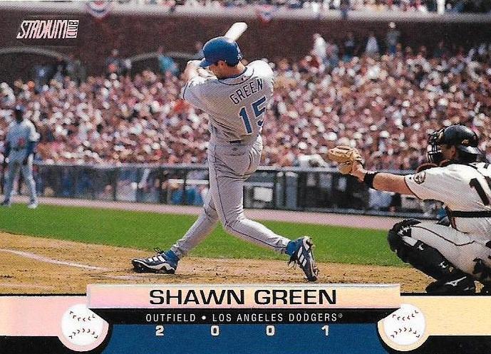
The Stadium Club baseball-as-wheels set! As the wheels go round and round, the seams are pointing correctly!

And what do we have here? On Fleer's 20th anniversary, it finally represents a baseball accurately! Good for you 2001 Platinum!
2002

Fleer full of confidence now with correct stitches on its Fleer Greats set.

Meanwhile Donruss says, I had it all along.

Upper Deck's super realistic black-and-white baseball seems accurate in its Sweet Spot set.
2003

Topps used a baseball with its Season Highlights cards in 2003 and ever since its 1952 and 1961 goofs, it's been perfect with the stitches.

And Fleer is getting so good that it made its Hardball set like actual baseballs with stitching you can't ignore. Good thing they got it right.
2008

Another subtle background design with '08 Sweet Spot. Up on the left and down on the right is correct.
2009
This however is not:

The 2009 UD OPC set is one of my favorite Upper Deck sets ever. But look closely at the baseball and you'll notice that the top and bottom threads are each pointing to the right.

Oops.
2011

This is the last time a baseball has been so prominent on a Topps flagship design, harking back to 1979 and 1975. It's one of the best flagship looks of the last 10 years and orienting the stitches in the right direction is part of that.
Also in 2011, Heritage tackled the 1962 Topps set, which features baseball seams on its card numbers on the back. But only the first series shows both sets of seams (the later cards show a larger baseball with the word "Topps" and the card number obscuring one row of seams).

It's difficult for me to make out both sets of seams on the 1962 cards, probably because what I have is so old and faded. But with Heritage it's no problem to see.
And it's not correct. Both seams are pointing left.
2013


Panini Hometown Heroes' baseball threads have been stitched correctly.
2016

Much like the case of the original 1951 Topps cards where it's too hard to read the stitches, this Heritage replica is easier to read. The stitches are right.
2017


Same with Honus Bonus. It might have been a short-lived card/game company but at least the stitches were right.
2018


Topps slipped in 2018 with both Big League and Heritage's Then & Now insert set. The stitches on both show both rows pointing the same way.
2019

But in 2019, A&G's Ginter Greats shows a baseball with proper seams.
And that's the history of baseball seams on cards. The major offenders would be: 1952 Topps (back), 1961 Topps (World Series subset), some of the 1962 Topps cards (back), 1987 Jiffy Pop, probably 1992 and 1993 Ultra, 1998 Pacific Omega, 2009 Upper Deck OPC and some present-day subsets/inserts.
All right, I'm sure I missed a few but nobody else is pulling half their cards for stuff like this. And my curiosity is satisfied.
I need to give my eyes a rest.
Show-and-tell post is coming next.
Comments
These 108 red threads are carefully applied to each baseball by hand. The stitches on a Major League baseball are called virgules. The stitches on a baseball are simply referred to as a seam. 88 inches of red waxed thread are used to stitch each baseball.
I have a far out hypothesis: I think the 2009 OPC (and 1981 Fleer) may have purposely made the stitching go in the same direction to avoid any type of copyright infringement with Topps and their designs.
1981 Fleer may have done that way for their first set (as you showed in the last post) because Topps use the Baseball on the front of the card designs prominently in the proceeding time period on the 1975, 1978, and 1979 sets. I also think in a my minds eye for what major Topps design uses a Baseball prominently on the front - The 1979 set is the first one that pops in my head. Fleer by having the stiches go the same way could used as an adherent for Topps to go at them any way legally for any copyright infringement based on Topps recent designs.
I think that might also be the case for 2009 OPC - Upper Deck had its Vintage line that seemed to blatantly copy 1971 Topps a few years before and I think Topps sued them. So it is possible when Upper Deck debuted (the one and only set) OPC in 2009, they could have purposely made the stitching go in the same direction as a defense against any copyright issues on the front design that Topps could muster.
Of course, these are Far Out theories and of course, Fleer and Upper Deck could have just screwed up.
Love the Ovation and '09 OPC cards.
Anyways... I'm just happy that I learned something new about baseballs this week.
I did know that the stitches faced in opposite directions but I had never thought to look at the baseballs shown on the cards.
Kudos for the tremendous amount of research and examples you provided.