
It's time. Not even the Hall of Famers are immune to the standards of the 1975 Topps countdown.
You wear an airbushed hat and/or uniform, you've received a grace period due to your on-field ability. But a bad card is a bad card. We're not star worshiping here, there's enough of that in the hobby. This countdown is looking for cardboard excellence, or at least cardboard notoriety and amusement.
So, get ready, there will be a couple of HOFers in this countdown -- yes, before we've even gotten to most of the team checklists. That's because Topps could have done so much better with those stars.
More airbrushing to cover here and lots and lots of head shots as we plunge into the 500s.

600. Giants team (card 216)
Here's a team checklist. We're starting to get to the team checklists where there's nothing drastically wrong with them, but do I like the team? OK, it's a little muddled when you see it in hand. But I believe that's Garry Maddox standing off to the left side.

599. Bill Travers (card 488)
The photo here is just weird. Travers' wistful stare seems strange on a ballfield, he almost appears as if he's going to cry. To make matters worse for Travers' card history, his 1976 card is practically a repeat. Travers' opponent in each card case is the Oakland A's, which tells you all you need to know. Yes, Travers is terrified of facing the A's.

598. John Doherty (card 524)
This is not the 1990s John Doherty of the Detroit Tigers with whom I conversed many a time when he was in the minors. This is an earlier John Doherty. It's his only Topps card. It was not a favorite when I was a kid. He looks like he's wearing a Little League helmet, he looks like he's constipated.

597. Darold Knowles (card 352)
The first card I ever pulled out of a pack I bought myself. The countdown's been cutting this card some slack for awhile because of that, but can do so no longer. That is not a realistic Cubs hat, that is obviously Oakland-Alameda Stadium and Knowles finds the whole thing quite amusing.

596. Joe Torre (card 565)
I was too young to know what kind of reception Joe Torre received when he was traded to the Mets. Torre had been a star player for a long time and although he was over his best years, he was still a regular when he was traded. Torre has one of my favorite cards from the 1971 Topps set but this card is a long way down from that one.

595. Tom McCraw (card 482)
My first acquaintance with Tom McCraw was this card, his final one. Not a good impression. McCraw has been left in his Angels uniform but someone has painted a "C" on his hat, and that doesn't stand for "California."

594. Bobby Heise (card 441)
Bobby Heise, in his obviously airbrushed Angels hat, wins some points for toting a bat and for a signature crawling up his jersey. He also never played for the Angels. But I don't really know much else about him.

593. Vic Correll (card 177)
Vic Correll's overly high hat barely fits in the frame and it's always annoyed me. Just too tight on the head shot, although I do enjoy Correll's "what in tarnation" look.

592. Fred Holdsworth (card 323)
Fred Holdsworth looks grim, even a little ghostly. The undertaker is here. To me, this was the creepiest card in the entire set. Poor Fred, I had an active imagination.

591. Tom Hilgendorf (card 377)
Tom Hilgendorf is 32 in this photo and don't think I didn't notice as a kid. He looked 47. And this was a few months before he was hit in the head with a steel chair and suffered a concussion during the famed Ten-Cent Beer Night promotion in June of '74.

590. Tom Buskey (card 403)
Tom Buskey's sad-sack look isn't related to what appears to be his airbrushed uniform, he looks that way on almost all of his baseball cards. When I was writing the '75 Topps blog, one of his relatives contacted me to update me on some information about him, they were very nice.

589. Larry Hardy (card 112)
Another card in which I thought the player was much older than he was, though now I think he looks quite young. We've finally reached the point where Padres are actually wearing Padres hats, but in this case Larry Hardy looks like he should be working at McDonald's.

588. Tim McCarver (card 586)
The only card that I know of that shows Tim McCarver with the Red Sox, he played just 23 games for them. Obviously, it's not a real Red Sox hat in the photo. But those sideburns are very real.

587. Dave May (card 650)
Not the most flattering photo, Dave looks downright worried, and both my brother and I noticed. We weren't fans of this card. Neither of us were Braves fans, which would have made sense because May had just been traded for Hank Aaron, leading to this major airbrushing.

586. Danny Cater (card 645)
Another player involved in a major trade, this time trading Sparky Lyle to the Yankees. Danny Cater wears an impressive mustache and has always looked British to me, as if he just popped onto the piece of cardboard to offer a spot of tea.

585. Dave Pagan (card 648)
This is Dave Pagan's first card and the hat is real, which is unusual at this stage of the countdown with the Yankees players. He also looks nothing like he does on his one other Topps card.
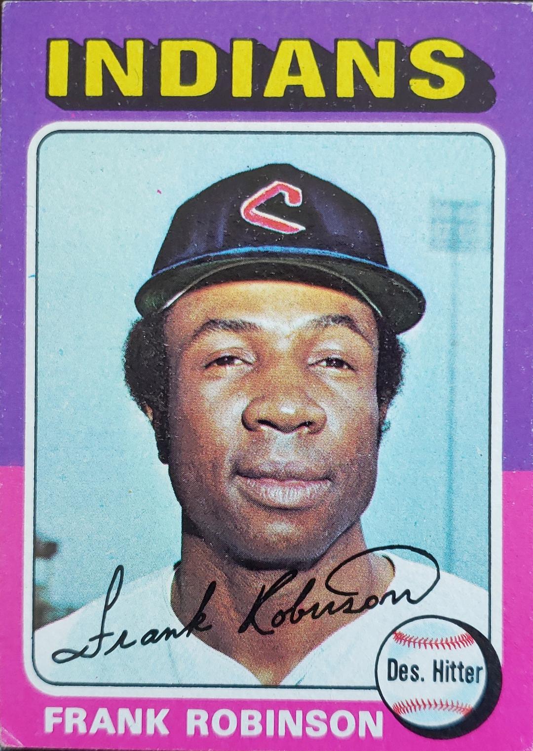
584. Frank Robinson (card 580)
Yeah, it's Frank Robinson but this might be the worst-looking card during his playing career. Topps created two airbrushed cards of Robinson in '75 as he was a player-manager for Cleveland and appeared on the team checklist. But that photo is tiny. This is not. It should be.

583. Hank Aaron (card 660)
Could be the most disappointing Hank Aaron card of all-time. The '75 set is all about recognizing Aaron's epic home run achievement in 1974. Thank goodness the Highlights card is there because an intentional profile shot that looks like it belongs in a Panini set is not proper representation of the Home Run Champion. Also, poor Brewers fans, this is what they waited for?

582. Billy Williams (card 545)
Another airbrushed Hall of Famer. Billy Williams was painted into an Oakland A's uniform using colors that matched the border color, which can't be by accident. Still, his 1976 Topps card is much more enjoyable. I loved that card and love that card.

581. Bobby Bonds (card 55)
Another airbrushed Yankee, but not even that fake Yankees hat can diminish the coolness of Bobby Bonds cards. His son Barry can't even compare, I mean that '76 Topps card? C'mon.
Bonds was traded from the Giants to the Yankees in a deal that produced another memorable airbrushing in the '75 Topps set.
We haven't seen that card yet, but that's because it's such a conversation-starter, it deserves a higher ranking.
But that's the end of the fourth installment of the '75 Topps countdown. I have a feeling you'll be seeing a fair number of team checklists next time. There's your warning.
Comments
I often wonder if adults from about 1950-70 aged way quicker than any other era. To think Tom Hilgendorf was all of one year older on that card than I am now is frightening.
As for the few non-airbrushed photos, Pagan creeps me out. I'd move him way down. And I actually like the Larry Hardy card, as far as bland head shots go.
He was so ineffective for Baltimore that he was claimed by Seattle in the expansion draft in 76 only to finish his career in Pitt.
Paul t
Tim McCarver does have an oddball card with the Red Sox, which I talked about here:
https://redsoxfaninnebraska.blogspot.com/2020/04/the-1975-team.html
B. Was flipping through the latest issue of Beckett Vintage and noticed the Aaron Highlights card with the All-Star star. I wonder why Topps didn't put the star on his base card. Had they done it, I'm betting this card would pop up a little later in the series.