
OK, I'm feeling a little better about the Dodgers' off-season doings than yesterday. Sure, Dee Gordon's gone, but that whole love affair was probably going to end badly anyway.
But I'm not writing about trade stuff today, I'm sure you're all as worn out by that as I am. Instead, I'm going to write about anachronisms. Yep, anachronisms.
Why not? Nobody reads this thing in December anyway.
An anachronism, as I'm sure you were taught in high school, is a chronological placing of a person, object, event or custom incorrectly within a depicted time period. Anachronisms pop up most often in literature and art. And these days, it's probably most often referenced in movies or video games. Spotting an electronic watch in a movie about the Civil War. Stuff like that.
There are anachronisms in baseball cards, too. The first one I discovered was this 1982 Donruss card that I wrote about a few years ago that shows Carl Yastrzemski wearing a Red Sox uniform that was last worn in 1978.
I know there are other examples from the '60s and early '70s, probably during when Topps re-used photos four years after the fact (1969 would be a primary culprit) or when it used three-year old photos during the 1970s. Topps tried to cover up old photos by airbrushing the player shown into their new cap and uniform. If the background didn't show monuments in center field or Seattle Pilots in the bullpen then everything was cool.
After awhile, with Fleer, Donruss, Score, Upper Deck increasing the competition for collectors, a premium was placed on getting the most recent photos. Pictures on cards had to be as up-to-date as possible or the card would look foolish when another company had the player in the correct uniform.
Then something happened in 2003. Topps issued the All-Time Fan Favorites set.
I love this set, all three versions. I've written about it many times and pointed out many inconsistencies in the set. Yet I still love it.
One of the inconsistencies which I've only touched on a little, is that the set is filled with anachronisms.
Maybe they're not as definitive as the 1982 Donruss Yastrzemski -- after all we're talking about a bunch of different past card designs being issued all in one year -- but I still find it interesting and kind of humorous.
For example:

There's Yastrzemski wearing the red cap and red-trimmed uniform that the Red Sox wore between 1975 and 1978, on a design that is from 1967.

Here is Carlton Fisk on a design from 1976, wearing a uniform that the Red Sox stopped wearing after the 1974 season.

Here's a card that doesn't have to do with the uniform because the Tigers -- good for them -- rarely change their uniform. But I'm sure you know what's out of place here.
Kirk Gibson did indeed play for the Tigers in 1995, which is when this design was issued. But Gibson was in his final season in the majors that year. This photo looks like it was taken during his rookie year 15 years earlier.

Back to the uniforms. This is the 1972 Topps design. That uniform Wilbur Wood is wearing the White Sox stopped featuring after 1970.

Yep, Jim Bunning was a Phillie in 1967, and this was Topps' design that year. But the big "P" didn't start showing up on Phillies uniforms until 1970.
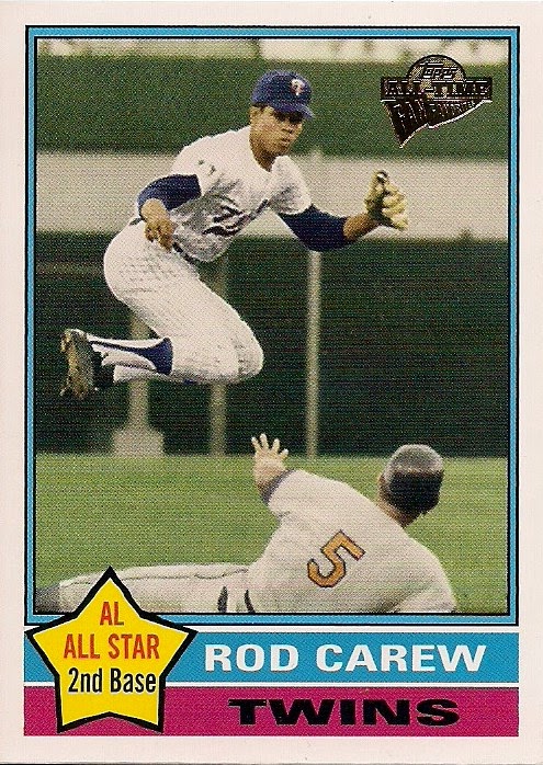
I knew this one was out of kilter the second I saw it. Not only is Rod Carew wearing a uniform on a 1976 design that the Twins stopped wearing in 1971 but Carew was 31 in 1976. He's not 31 in that picture.

More uniform hijinx. Luis Aparicio is featuring the laughing Oriole on his shoulder on a 1966 design. But the laughing Oriole disappeared off the shoulder of Orioles unis in 1964.

As a lover of everything 1975 Topps, I winced when I saw this. The beloved chocolate-and-mustard uniforms with the bubble letters did not appear until 1978.

Everything about this one is wrong. This is the 1964 design. On Robinson's real '64 Topps he's practically wearing a crew-cut, not long '70s hair and sideburns. Robinson was quite a bit skinner in '64 than he is here, too. And the cartoon bird on the cap didn't show until 1966. In fact, I don't even think they had cumulus clouds in 1964.
Another interesting thing about these Fan Favorite sets is they helped spawn all kinds of copy cat versions, both within Topps and outside of it. Now it was cool to be anachronistic. The anachronisms were intentional.

In 2006, Topps issued a Walmart set featuring famous players on various Topps designs, almost all of them out of place and out of time. Here, Tom Seaver appears on a 1995 Topps design even though he had been retired for nine years at that point.

Also in 2006, Topps issued an insert set of Mickey Mantle on past designs. Every single one is an anachronism because not only had Mantle stopped playing in 1970, but he had died in 1995.

Topps pressed on. Here are a couple of cards from the Vintage Legends insert set from 2010. This is Rogers Hornsby and Honus Wagner -- both long dead before the last decade of the 20th century -- appearing on respective set designs from 1996 and 1990.
Making cards like this has had such appeal that there is an entire set (Archives) devoted to these kind of anachronisms. None of the cards of players showing up on a 1989 or 1980 or 1973 design are realistic because none of them played or were even born those years.
And bloggers themselves have made their own anachronistic cards. I even have a few and enjoy them a lot:

(Andre Ethier was two years old when Topps created this 1984 design).
There's nothing really wrong with these, I don't have much of an opinion about them. But I do find it interesting that, like error cards, Topps went out of its way to make cards that were anachronisms. So instead of trying to find the anachronism or being surprised when one showed up -- much like a flubbed statistic on the back -- Topps has made them obsolete by intentionally producing them.
If the card company is intentionally creating error cards or anachronistic cards, then the "Ah-HA!" moment is gone.
The error card is dead. And now probably so too is the baseball card anachronism.
----------------------------------------------------------------------------------------------------------------

So long, Dee. I enjoyed collecting your cards.
Comments
And for the guy that doesn't like the prospects with Photshopped MLB uniforms - who the hell signed the players in the first place? It's the MLB teams who signed the prospects in the first place, so as far as I know I'd rather have a Topps/Bowman card of a guy who doesn't make the major leagues yet is pictured in an MLB uniform.
If the minor league teams were independent of the MLB team - then I'd have a problem seeing those players wearing a Photshopped MLB uniform.
To round it off, I'd like to see prospects pictured with their parent MLB teams' uniforms on all sorts of old Topps designs - that would breathe some new life into the typical prospect cards.
Besides, I don't want to see *anybody* on a 1995 Topps design.
The older anachronisms is a case of Topps being cheap and not wanting to replace old photos. The modern anachronisms is more of a case of Topps beating their old designs to death. They don't really bother me that much though.