
The number of colored parallels reached a new high (or low) in 2014. Just in Topps retail alone there was Target red, Walmart blue, Toys R Us purple, hanger pack green, hanger box yellow, hanger box orange, any-kind-of-pack red foil, and good-luck-finding-any pink, black and camo.
It's really gotten out of hand and I'm not the only one to have said this fifty eleven times. But I'll say one thing for all the parallels: at least cards are colorful again.
There was The Dark Period -- some call it the 1990s -- when cards weren't all that colorful (Finest and Circa were exceptions). Oh sure, the pictures were full-bleed and the photographs were as clear as all get-out, but I grew up in a land of colorful photography. I need more than a picture. I need crazy multi-color borders. I need electric graphics.
Some '90s sets tried to entice collectors with over-the-top names that implied glorious color. One of those deceivers is the 1994 Stadium Club parallels. They were called "golden rainbow" parallels.
"Golden Rainbow"
Doesn't that sound magical? I'd pay any amount of money to go to a land of golden rainbows. Why a golden rainbow would feature every color of the ... um ... rainbow and illuminate the entire world with light because it was golden! Where is that golden rainbow card? Let me see it!
Well, we just saw it. It was the Mike Piazza card up there.
The "golden rainbow" part is the background for Piazza's name. It's gold foil. And if you move it around under the light, you might see a rainbow effect, kind of like looking at a puddle after it rains.
Meh.
That ain't color in my book.
Yet, these were pretty popular parallels back in the day. For poor, poor collectors who didn't grow up in the '70s.

Here are some more of those '94 Stadium Club "golden rainbows". They were all pulled by Adam of ARPSmith's Sports Obsession. He was kind enough to send a bunch along after breaking a box of '94 SC.
They're OK, for what they are, but you know me and Stadium Club parallels. All they do is set off a lot of puzzled expressions.
They just aren't colorful enough.

Now, this -- this is COLOR.
This is also from Adam.
Panini isn't my bag either, but they sure do know how to make their parallels stand out. I don't think I have another card that is this color. And, yeah, it's taking my mind off the fact that the top of Kershaw's head is gone.

More Panini color brilliance. An electric American flag is surrounding Matt Kemp!

More color! More parallels! This time from Finest from a couple of years ago.
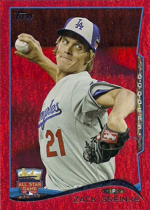
And, of course, this year's foil-type parallel. I was quite happy when Topps scrapped the gold stuff for COLOR in 2013.
All of this color reminds me of the good old days of the '70s, which featured the most colorful sets of all-time.
In fact, two cards from one of those sets was in the same package with all those colorful parallels:


Nineteen Seventh Twooooooooooooss!!!!!!!!!!!
Back when every last base card was a color-coded trip!
As someone who first started collecting when the super bright, super garish 1975 set was in packs on store shelves, I gravitate toward sets that aren't afraid to use color.
I'll be dedicating myself to those sets in the coming year.
But I'll also be keeping my eye on the 2015 Topps set, which appears to have the makings of one of the most colorful sets in recent years.
I'm glad cards know how to be colorful again. Even it does mean 47 different colored parallels.
At least we're not being promised an electric rainbow.
Comments