I don't know why I get so obsessed with time appropriateness when it comes to baseball cards. I guess I do it with music, too. I can't stand it when Alexa or some other programmed entity responds to orders to play '70s music and then six songs in you hear "Jessie's Girl".
I've pointed it out in passing on several blog posts and it's been the subject of a few others. Usually it's related to retro sets. Upper Deck was a big violator when it was putting out baseball cards. One of my favorite UD sets is the UD Decade '70s set from 2001, but it contains a bunch of time-inappropriate photos.

That is 1960s Tom Seaver, not 1970s Seaver.
But Topps isn't immune either and again it shows up in one of my favorite retro sets, All-Time Fan Favorites. Just one example:

Rollie Fingers was not in full mustachio mode at this point when the 1973 design made its appearance.
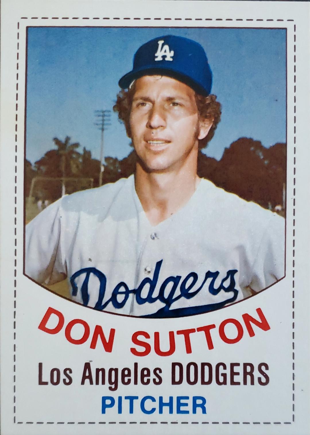
These missed connections continue to this day and I came across another one when I picked up a long overdue card of one of the most well-known Dodgers from my childhood.

This is how I knew Don Sutton when I first because aware that Sutton was the ace of the Dodgers in the mid-1970s. He got himself a perm and he continued to wear it from that point all the way through the rest of his Dodgers career and then beyond, to the end of his playing career.
When the card retro trend began around 1999-2000, Sutton cards appeared among all the card companies from time to time and the photos used would be a mix of pre-curl Sutton and curly Sutton.
But then Sutton showed up on exclusively Topps cards beginning in 2013, and tell me what you see:

Nothing but Sutton from early in his career, from the mid-1960s to right around 1973. This is not the Sutton that I knew. If I'm remembering the late, great Sutton, I would like a card of him as I saw him on my TV set.
So, finally -- FINALLY -- one of those showed up in a Topps set in 2020. It took me awhile to land it.

There we go! Sutton displaying that White Man's Afro that showed up in Dodgers pictures repeatedly in the late 1970s when he was at his peak.
That's another thing that bugs me about using all those early photos. It's an arguable point, but Sutton was at his best for the Dodgers from around 1974 until he left via free agency after the 1980 season. We need more card pictures from those times!
So we finally get one. But I'm sure you've been waiting for almost three paragraphs now to note what is Extremely Time Inappropriate about this card.

Yes, it says "1960s" while using a photo from the 1970s, probably from the 1977 or 1978 postseason. Oof.

Topps continues to write about the 1960s on the back, so it clearly intended to focus on the '60s with this card, mentioning his 209 strikeouts in 1966. If that's what the card meant by "Decade's Best," OK. But his best decade was the '70s.
I wonder with the photo mix-up though if this is a case of "time out of mind."
Maybe the '60s and '70s are so long ago for the youthful editors at Topps that it's difficult for them to tell the difference? I know I'm getting older and workers are getting younger, but really all you got to do is compare dates.
Also I'm wondering if there is some sort of weird stipulation in the licensing agreement with Sutton that says Topps needs to use photos of young, straight-haired Sutton. If that's the case, I'm grateful for the 2020 card slip-up.
I'm hoping if there are more cards of Sutton in the future, we get ones of the Sutton I saw. That would be time appropriate for me.
Comments
And if you ask me to describe Sutton, I'll mention the curly hair.
Then there was the time that a programmer thought a good choice to spotlight a female artist was Jane's Addiction.