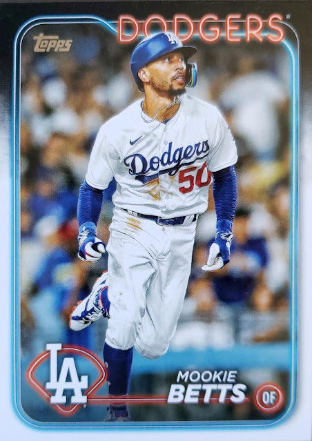
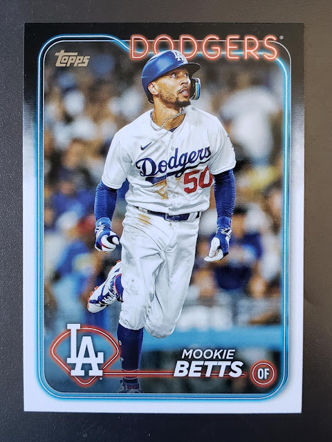
(Hello. Holiday Insights says today is Card Reading Day. I had no idea there was a day devoted to reading the backs of your baseball cards. This world isn't so bad after all. It's time for Cardboard Appreciation. This is the 334th in a series):
I received my first 2024 Topps flagship card in the mail yesterday. It arrived from Jeremy of Topps Cards That Never Were.
I expect I'll find some 2024 packs for myself by the end of the week, if the stores cooperate, but this is an excellent start, might I say a phenomenal start.
I was captivated right away by the 2024 Topps design. A neon lights theme for a card set is sure to be popular but I've explained my fondness for lights at night and built my blog look around it (in several iterations) since the very start of this blog more than 15 years ago. This set is built for me -- what took you so long, Topps? -- so, please excuse the love letter that starts now.
I know it's not cool online to like new things, especially cards created by Topps. I've done my share of ragging on their cards -- more than my share some (ex) readers would say, and they're right -- so I can like something a lot if I want. I like this look a lot.
How much? Well, at first I thought it was the best-looking flagship set since 2015 Topps. That's the most recent set that I wholeheartedly enjoyed, and collected. But I like it more than 2015. I like it more than all the other 2000s Topps sets that I've liked -- 2013, 2011, 2009, 2005, 2003. I definitely like it more than anything that Topps flagshipped in the '90s.
So we're at the '80s now. This set looks most like 1986 Topps with the black on top, white on the bottom (with just about the same amount of both) and the team name in color at the top. I was not collecting in '86 but I was fascinated with it back then. Once again, bright lights/words on a dark background. And when I got back into collecting, it's one of the first sets I finished.
I like the 2024 set more than 1986.
So that brings me to 1983 and that's where 2024's streak ends. But still, I like 2024's design better than every flagship set for the last 40 years. This is why I can't comprehend folks I've read online saying "maybe it will grow on me." OK, I'm going to assume you're color blind.
Like others have said, the cards look even better in person. This is because of the "neon lines" on the card that glisten under light when the card is tilted. Yes, I know I've said I'm sick of tilting cards. But this isn't like those '90s-'00s cards where you had to tilt it to read the damn card, You can already read it. But the neon "tubing" -- the team name and the home plate outline and the position circle and the inner border -- all have a sheen to them. I don't know what they did to treat these cards, I'm sure there's a term for it.
The effect is impossible to capture with a camera -- at least with my phone camera -- so it's best viewed in person.
That's Betts lit up at night, I guess you can see the red parts shine a little better.
Anyway, aside from personal preferences that attracted me to this, I'm interested in it because there haven't been a lot of instances where Topps has altered its flagship set in some way (excluding on parallels). There are plenty of other Topps off-shoot sets that have some kind of effect on it, but flagship's changes can be boiled down to:
1. Shrink the card size (1957)
2. Change the card stock from gray to white to gray to white (1963, 1971, 1992)
3. Add the Topps logo (1979)
4. Add foil to the front (1995)
Probably forgetting something there, but that's what jumps out to me. And now we have this subtlety, which is so much better than foil.
Some online folks have wondered how this design will hold up in the future. Yeah, I suppose that's valid. For me, the foil years have not held up very well in many case. But as for this design, we'll probably have to wait just as long -- 25 years or so -- to evaluate it again. And it's very possible I won't be around for that. So I'll just enjoy how wonderful it is right now and be happy.
This doesn't mean I plan to try to complete the set. There are an avalanche of rookies and City Connect uniforms in this set that will turn me off if I see them all together in a binder (though if my sister-in-law revives her habit of sending me a full set for Christmas, I won't mind). Also I want my set bidding -- outside of 1970 Topps, etc. -- to go toward 2024 Heritage.
I like these so much that I know I'm going to be annoyed by any inserts that get in the way of my pack-opening experience. Inserts haven't done it for me for years and now they will be even more irrelevant.
Jeremy sent me a few other cards along with Betts.
A few more 2023 Heritage High Numbers SP cards plus a Dodgers combo card (these things are as lame as ever).
And a sepia parallel of former Dodger/Free Agent in Limbo J.D. Martinez.
So, that was a lot of words about one 2024 Topps card. Expect a bunch more when I land a blaster/hanger boxie thang, hopefully soon.


Comments
I think the problem is that it reminds me of a throw away card. I can't place the year but late 00s possibly early 10s there was a black bordered flimsy stocked almost paperlike insert in every pack that 24 Topps reminds me of and I can't not see it.