
As I get down to the end of counting down all of Topps' flagship sets, it's time to reveal how I ordered the sets from worst to best.
A few people have commented on how this is a task they could not undertake, that they wouldn't be able to decide, say, which set is No. 27 and which set is No. 26. But I don't approach it that way. It's too daunting that way.
I merely put the sets into mini mano-a-mano battles. Card set against card set and see who comes out on top. I do that repeatedly until there is a winner -- or in this case a loser, since the last set left is the least desirable. It's like holding a bracket tournament among all of the sets, with tiny matchups going on all the time.
I find if I boil it down to these mini faceoffs that the enomority of 60 years of sets doesn't overwhelm me. If I just think of the two sets, then it doesn't matter whether I believe set No. 26 is really better than set No. 27. The matchups said they were, I trust the matchup system, and there you go.
I don't know how scientific that is, but all I know is it works. The sets that are left are undoubtedly my favorites. It checks out.
Now that I'm in the final eight, it's obvious that I like vintage sets the most. The reasons for that could be varied, but I think it's probably merely that I'm old enough that I've learned to appreciate the whole spectrum of someone's work. I'm not biased against sets that came before me like I was when I was younger. And I don't favor "now" sets like I did then either. In fact, I'm probably a little more biased against current sets than I should be.
I just know that I like the classics. Old cars, old songs, old cardboard. You can't beat it.
And with that in mind, here are sets No. 8 through 5. Vintage sets all:
8. 1953 Topps

In years past, even as recently as this blog, I have considered the 1953 Topps set overrated. I've said so right on Night Owl Cards.
Although I still believe it's slightly overrated -- the reason why it's at No. 8 rather than in the top three like I imagine it would be with some collectors' rankings -- I've come around almost 180 degrees on this set.
The reason for that, I think, is a re-reading of a magazine article from 30 years ago.

This article appeared in Baseball Cards Magazine in the August 1984 issue. It included an interview with artist Gerry Dvorak, who painted some of the cards in the 1953 set.
Dvorak estimated he painted 50 of the cards in the set. He said Topps would give him black-and-white glossies to work from and that it wanted exclusively head-and-shoulders shots. It was supposed to be a portrait set.

This is one of the cards that Dvorak painted. He said the backgrounds were created by the artists. They were allowed to put in fences or trees or buildings. He said it was his decision to place a Topps ad behind Labine.
Out of all of the sets that Topps has produced, this set gives you the feeling that you are holding paintings in your hand, that you are holding art in your hands. It's like shuffling through pictures on the wall.

The more I acquire 1953 Topps -- and I own precious few -- the more I appreciate how unique this set is in the annals of Topps sets. There aren't many times these days where a card company specifically wants to create a portrait set and wants the pictures to be paintings. That's why this set will remain one of the most memorable of all time. It is one-of-a-kind, and not only that, it is very well-done. The paintings offer a realism that few baseball card artists can match (I am thinking of National Chicle from a few years ago).

The backs are nothing special, other than the largest card number ever created. But keep in mind this is Topps' second effort with a full-fledged card set.
And instead of painting itself into a corner, it painted itself a legacy.
7. 1959 Topps

1959 Topps features something that on any other set would be considered a flaw.
That is the beauty of 1959 Topps.
The set devotes precious little space to the photograph. Most of the photos are head-and-shoulder shots. The relatively few full-body pictures reduce the player down to a speck of his actual size.
But it doesn't matter. The cards are so pleasing, so colorful, so distinctive, that you don't even notice the modest amount of space dedicated to the image.

The '59 set is delightful. It's fun. And it may do a better job of reflecting the period in which it was issued than any other Topps set. The colors are wonderfully '50s -- bright blue and yellow, hot pink and seafoam green. I could see these cards positioned next to the jukebox at the soda fountain down the street or used as color swatches for painting someone's home.
But the best element is its most 1950s element: the circle framing the photo. It could be a host of things: the fade-out technique used in old movies and cartoons; an homage to '50s toys -- the hula hoop and the frisbee. It could be a 45 rpm record, those were quite popular in the '50s. Or it could be a knot hole that kids used to peer at ballgames when they couldn't afford the admission.

The set evokes the time -- even if I never set a single foot into the '50s. I can see it.
I don't know what the e.e. cummings-inspired player names have to do with the '50s, but it's just another style element that makes this one of the best Topps sets of all-time.

These were the first cards to truly feature the Dodgers and Giants in their new west coast duds (the '58 cards were paint jobs). 1959 Topps also featured a Baseball Thrills subset of action shots, the first Rookie Stars subset and some wonderful combo cards.

The cards backs? Well, they're not so great. I don't have much love for '50s card backs. And '59 came in a few different flavors, from the almost unreadable green-and-red, to the somewhat more pleasant black-and-red.

The 1959 Topps set, at 572 cards, was the largest set that Topps had issued at that point. It was an ambitious set and you can see the ambition in the cards, from the careful graphic treatment (after the rather sloppy 1958 set) to the extra features.
I imagine kids had more enjoyment collecting this set than kids in most other years. Just look at the cards all together:

Imagine that coming out of a pack.
6. 1972 Topps

Although I am trying not to play favorites in this countdown, I can't help it. I know I am playing favorites.
But I have at least some decorum. And here is the set that explains why.
I have an irrational attachment to sets that I am trying to complete. When I am in the process of completing the set, it's the greatest set of all-time. I appreciate every nuance and quirk. And this is where I am with the 1972 set. But I'm restraining myself and ranking it at No. 6 instead of No. 1.
In my quest to finish off this set, which is taking the years that I knew it would take, I've come across everything that makes this one of the most interesting -- if not the most interesting set -- that Topps has ever made.
I'm invested in 1972 Topps because of the time period, the design and the wild colors. But it's so much more than that.
The 1972 set is an exorbitant 787 cards, the most cards that Topps had issued in a set to that time. Given the growth rate of Topps sets in that period, from 664 in 1969 to 720 in 1970 to 752 in 1971 and now 787 in 1972, collectors must have been going out of their minds: how big are these sets going to get?
The '72 set is filled with "extras," maybe what some would call fillers:


From top to bottom, that's the leaders subset, the postseason subset, the Boyhood Photos of the Stars subset, the Traded subset, and the inexplicable awards plaques and trophies subset.
Most of these were firsts. The boyhood photos certainly. The Traded set was the first of its kind. The random plaques and trophies was a first (and thankfully a last).

Add to that an incredible number of "In Action" cards, as Topps really dialed up the amount of action in its set. These had to be extraordinarily popular with collectors. Some of it seems like padding (did we really need extra cards of Bob Barton and Ed Kirkpatrick?). But I'm sure kids didn't mind.

Now let's get to the reason why I love this set -- the psychedelic tombstones.
Perhaps this set is better situated in the 1960s -- 1968 or 1969 in particular. But I still think flower power was alive in 1972 and there is so much I love about what you see before you. The Expos, Bill Buckner trying to knock the little guy off the trophy, mutton chops, bats piled as if they were kindling, and pink Indians and Cubs cards.
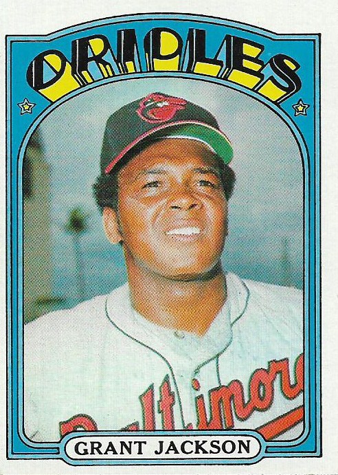
The color combinations are bright, bizarre and wonderful. Each card has its own color personality, and I gravitate toward Orioles, Cardinals, Pirates and Astros cards in this set, just as I am repelled by Reds, White Sox and Red Sox cards.
The '72 set isn't perfect. There is airbrushing all over the set and some strange photos. Some of it appears very rushed.

This is the bottom row of a group of semi-high numbers in the set. Tell me that every one of those cards couldn't have been executed better.
But, like the '59 Topps set, it doesn't matter, because the personality of the '72 set is so strong and memorable.

(If we don't look at the backs, we'll keep loving the '72 set as much as we do.)

A personal reason why I enjoy this set so much, and one I've mentioned before.
When I started collecting, I was surrounded by the cards of the day, 1975 and 1976 Topps. Every once in awhile a '74 Topps or '73 Topps would wander into my world and they had a certain ancient charm.
But the '72 set was different. It was the template for "a baseball card." I'd see the cards around once in awhile or the design likeness on an advertisement. Because of that, for a long time, this is what I thought a baseball card should look like. Bright. Loud. Like a marquee blaring its message into the night.
I still think that way. Baseball cards should be bright. They should be colorful. They should be fun.
As someone who is collecting 1972 Topps, I can tell you: 1972 Topps is a hell of a lot of fun.
5. 1967 Topps
I know there are some collectors who aren't impressed by 1967 Topps. It's boring, it's plain, it's blah, blah, blah.
They're wrong. Way wrong because this is one of the greatest sets ever made.
You might be asking: How can someone who loves colorful sets so much like something that is so plain?
And my answer is: I don't know. I like what I like. I appreciate beauty, whether bright or spare. And 1967 Topps is beautiful. And definitely not plain.

It is the best Topps set of the '60s. The best, Jerry, the best. You can take your 1965 or 1963 or 1962 and stuff your sorries in a stack, mister. They can't match 1967 Topps.
Take a look at the image above. The photo is the star of this set. It is a beautifully clean design, with acres of space devoted to the photo (except for the giant and bright team name which ties the whole card together). The photo, like so many of the photos in the '67 set, tells a story. You can see the scoreboard. You can read the billboards in the background. ("It's a double! Buy two and save!").
This set provides a window into 1960s baseball that is unmatched. Like the 1957 set offers a terrific look at 1950s baseball life, that's what the 1967 set does with the '60s game.

I disagree with those who consider the '67 set "plain". It is full of character and color. Look at the house in the background! Can you see a house in 2015 Topps? I mean one not named Pablo Sandoval? Of course you can't.
Topps tried putting extra emphasis on the photo during the '60s once before, in 1961. But the photos on these cards are so much more vibrant and interesting.

The design draws you into the game, puts you right there on the practice field next to Tony Conigliaro. It is not diluted by all of the previous tricks of the '60s, names with the letters alternating in colors. Large one-color geometric shapes. It's simple, it's clean. You know the name, the position and the team. And look at those boys having fun out there.

Topps had been producing combo cards like this for years by the time 1967 arrived. It never did it better than 1967 Topps. I still remember the first day I saw one of those '67 combo cards. It was "Cards Clubbers," featuring Lou Brock and Curt Flood. I saw it in a display case at my feet in a collectibles shop. I stopped dead in my tracks and stared. Fascinated.
I had no interest in 1960s cards at that time. But there was something about that card that compelled me to drink it in.
That is the power of 1967 Topps.

The card backs are appropriate for the time. I can see that color in kitchens across America in 1967.

For those of you who have dismissed '67 Topps, I invite you to give it another look. If there is a set that makes you want to know more about 1960s baseball, it is this one.
It's the reason why I am considering collecting it. (Yeah, I know all about the insane high numbers).
There was a time when you'd never get me to say that about a '60s set.
That's how much pull this set has.
Up next: Sets #4-1
Comments
Yes, it has a simple design, but that is what makes it great and the set is beautiful. The colors are great. The fonts are perfect and they compliment each other. I agree with all your comments regarding the set.
The set is a definately in my top 5 sets, maybe 1 to 3 places from the top of my all time list.
Excuse me now but I have a list to create.
Excuse me now but I have a blog to resume.
On the awards and plaques, I think that was something Topps (or OPC) had done in hockey and the kids who were into hockey cards loved it. So they gave it a shot in baseball. It's a theory.
I could never have the '59s in my Top Ten. From the first time I saw them, my brain said "waaayyyy too much border, not enough picture". Nothing makes up for that. Oddly enough, I do like the Hires knothole design. I think the pictures are larger, but it'd be interesting to see if that's actually the case.