
I was out doing some birthday shopping today and decided to finish off the dirty deed by visiting the card aisle to see if 2014 Heritage had finally come to the Northeast.
It hadn't.
So I kind of stood and stared not really interested in the card abundance sprawled out before me. I was about to head to the checkout line without a thing when I spotted something new on the second shelf. I chuckled to myself. "Oh," I said. "2014 Donruss".
The box was filled to the top, not a soul had touched it. I really had no desire to touch it either, but, there is something irresistible about packs stacked to the brim, so I grabbed two of them. I've always got to try something new.
I'll come right out and say this product isn't for me. It's not just the "no logos" thing, but it's also the Donruss thing. The Donruss name is supposed to trigger a nostalgic reaction among collectors. But I was almost 16 when 1981 Donruss arrived and I pretty much treated it then the way I treat Panini now.
If you were 7 when you first got your grubby hands on '87 Donruss then maybe this is your thing. It ain't mine.
But I'm sure there are some Dodgers in these packs, right? ... Oops, sorry, some "Los Angeleses".
Let's see what we've got:
PACK 1

#48 - Allen Craig, St. Louis
That's your standard base card. I'm sure you've seen it plenty of times on other blogs. It's often been described as a cross between 1987 Donruss and 1978 Topps. Here are my thoughts, both happy and sad:
Happy
1. No foil to be seen: In fact, the texture of the cards is very similar to the texture of Donruss cards from the '80s, aside from a little more gloss. There is a certain way that a stack of '80s Donruss feels, the way they move and sound as you shuffle them in your hands. And I think a stack of 2014 Donruss would feel the same way.

2. Full names on the back: Continuing a fine Donruss tradition.
3. There is no 3.
Sad
1. Why on earth is the border so large? I am not a full-bleed nazi, far from it in fact, but my goodness that is way too much white. I could draw pictures in that border. Detailed pictures. And color them in, too.
2. The wide border contributes to boring cards. The images aren't big enough and the white border design isn't interesting enough. I'm sleepy.
3. The backs skip some other Donruss traditions: No contract status info. Boo! No five years of stats. Boo!
4. No logos. But you knew that.
Is there any need to go on with the pack?
Oh, OK.

#74 - Josh Hamilton, Los Angeles

#67 - Robinson Cano, Seattle
Here's a card that falls under the old-school airbrush rules. Cano changed teams in the offseason.

#15 - Breakout Pitchers, Derek Holland, Texas
Not a bad looking card. It's one of the many inserts in Panini Donruss. There are Breakout Pitchers and Hitters. Thirty-five of each. Sheesh.


#198 - Cal Ripken Jr., Baltimore
A 200-card set and they're putting retired players in it who appeared in 1980s Donruss. I don't get that.

#194 - Chipper Jones, Atlanta
At least it says "Larry Wayne" on the back.

#152 - Zack Greinke, Los Angeles
Yay! A Los Angeles!
Let's view the back.

Donald?
If I had to guess which old Donruss card back that Panini used as a model, I'd give 1986 Donruss the slight nod over 1988 Donruss.

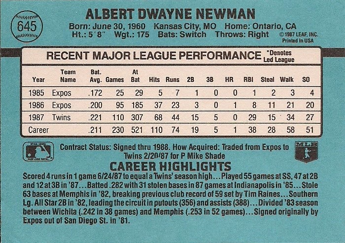
Just basing it on the font choice on the name and the "recent major league performance" line.
PACK 2

#83 - Jose Altuve, Houston

#87 - Hunter Pence, San Francisco

#84 - Edwin Encarnacion, Toronto
Fun fact: Edwin's middle name is Elpidio.

#5 - Breakout Pitchers, Hisashi Iwakuma, Seattle

Iwakuma hot pack.

#120 - Jon Lester, Boston

#182 - Starling Marte, Pittsburgh

#139 - Shelby Miller, St. Louis
Is everyone making up their own rookie card logo now? I've lost track.
And that's all the packs of 2014 Donruss that I am buying.
If you've been following the news on this set, you know that out of the 200 cards in the base set, 45 of them are shortprints (the Diamond Kings and Rated Rookies).
That is the saddest news of all. That's atrocious. I don't understand how a company who is still trying to get certain collectors (me, for one) to take them seriously on a baseball level, would short-print almost one-quarter of their base set.
Even if I could get past the no logos or the massive white borders, that would end all thoughts of collecting the set.
I mean come on. It's Donruss.
I'm still trying to get someone to take my 1991 Donruss off my hands.
(Cards will be distributed to respective team collecting buds).
Comments
Maybe in the future Panini should make up logos for the teams that are their own exclusives so that these guys don't look like they are either wearing pajamas or are playing in the "I'm over 50 and far too serious about softball" softball league.
Then again, they'd have a team name if they were in the softball league.
http://www.gettyimages.com/detail/news-photo/starling-marte-of-the-pittsburgh-pirates-bats-against-the-news-photo/173174705
Not that bad looking. Panini is getting it good without licenses.
PLEASE JUST GIVE 'EM A FRIKKIN LICENSE MLB!!!! STOP THE MADNESS AND THE USELESS PRODUCTS. These could be much nicer if they could include everything.
I wonder, do newspapers have to pay royalties to the teams every time a team name appears in either the standings, or in the report of the previous night's game?