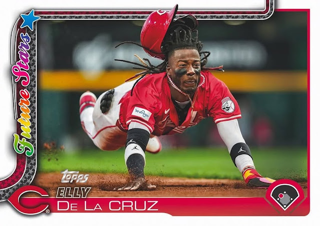
If you collect cards and have been on your favorite social media site today, you know that 2025 Topps flagship images made their debut.
The first images are appearing about a month before flagship's scheduled release, which is Feb. 12. This is the new pattern for Topps, it seems. The 2024 design dropped a month before release date, too.
Aaron Judge is the cover boy for the box and for the design debut. I knew the second after I saw the 2024 design that I would be underwhelmed by the 2025 design. It's difficult to match 2024, which is my favorite flagship look in the last 40-plus years.
Overall, the design is fine, an everyday kind of design. It's not offensive (see 2016, 2017, 2020, 2021). It's very much in line with several other reasonable designs, such as 2013, 2019 and 2022. The swoosh reappears after making a major return in 2019. And it's another reminder of 1982.
Here's the original swoosh, although the 2025 swoosh travels nicely from the bottom of the card to the top as if the team name is traveling along a track.
The plusses I see for this design are:
1. The color coded swoosh and more color-coded bordering along the bottom.
2. The player image is allowed to break through the design as it did last year.
3. The fonts used. They are bold and readable.
4. The position graphic in the corner includes a bud that travels around the field according to the player's position and the bud is color-coded, too.
5. The borders are white and there is no gold foil. It's easy to forget already the plague of foil on flagship.
The minuses I see:
1. Close-cropping is going to be a thing again, so we can forget about backgrounds on most cards.
2. Not a fan of sideways writing. Topps does this a lot, most recently with 2020 flagship and with horizontal cards, it doesn't look great in a binder. What I wouldn't give for a nice bold team name across the top again.
3. Not sure how memorable it is. I won't confuse it with other years -- that isn't an issue for me -- but similarities to 2019 as well as some others means I fear it will settle into the "just OK" category, which means I'm not inspired to collect it, which brings me to ...
4. It's not 2024 Topps.
This image gives you an idea of how Topps will treat the horizontal cards and the Future Stars cards. Just like 2024 "Future Stars" erases the team name, which I didn't like last year.
But it's improvement on a similar treatment, which is 2020 Topps.
2020 was all slashy and 2025 is all swooshy. 2020 is angular '80s pop and 2025 is smooth jazz.
I know I certainly appreciate that 2025 is a lot more colorful.
(Jason Heyward will be making at least one more appearance as a Dodger on cards).
I'm actually OK with the cards not being all that inspiring to me. It will prevent me from doing what I did last year, which was collect the set and then be gifted with the same set during the holidays. It also will prevent me from chasing down two modern sets, as I did last year with flagship and Heritage. There's a possibility I will chase Heritage this year (1976 design) so it's nice to settle on one set again.
Also, I won't be in agony when Feb. 12 (a Wednesday) rolls around. As Topps has done lately, it plops release date in the middle of other busyness -- Feb. 9 (a Sunday) is the Super Bowl and Feb. 14 (a Friday) is Valentine's Day. I can handle about one big event per week, maybe not even that. Three per week is no longer doable and as I mentioned yesterday, Wednesday is the most workish day of the week for me. Remember when flagship was released in late January when absolutely nothing was on the calendar? That was nice.
Anyway, it's good that we're all doing this for another year.
Hopefully more places will stock cards this year and be able to keep them stocked.


Comments
This set design will fade with the passage of time
I was hoping for a 1965, 1985 design update
I'm most weirded out by how all the Future Stars feel like players who have been around forever already.
My first impressions are, it’s okay. I never thought a white border could be so busy, but this design proves me wrong. The position designation with the baseball diamond is also very weird to me.
Last year's design was so terrific. Unfortunately that just made it more disappointing as the rest of the card was the dull business-as-usual (boring photography, bland backs). Do we know what the '25 backs look like?
Was going to make a joke about Elly de la Cruz being a "future star". I figured he'd been an All Star 3 or 4 times already. I forgot this was his first full season. Feels like he's been around a lot longer.
I don't mind the design, I like that the image can go over the border too.