
Ha, ha, man, I just can't be trusted with this series. Every time I fall behind (this was supposed to be a once-a-week thing), I plan to get back on schedule and then promptly forget about it again. Geez, night owl, write these things down!
Anyway, we've reached -- finally -- the 1980s in the Best On-Card Element saga, and I've decided to split the decade up into two posts, now that there are multiple card manufacturers. This post will cover 1980-84 and the other one, whenever the heck that will be, will cover 1985-89.
If you don't remember what I'm doing here, and I can't blame you if you don't, I am listing the "best" or "most notable" on-card element for each major set. This can be an element on the card front or the card back, but that's all this is about.
Here is what I've got for 1980 through 1984:
1980

1980 Topps
Best on-card element: The dual flags. 1974 Topps displayed two flags, too, but each were the same size and color on each card. 1980 Topps mixes it up with two different sizes, various colors and makes them appear to "wave," by drawing a shadow. They work especially well with the action photos in the set.
Best on-card element runner-up: I know 1965 Topps had blue backs, but the first time I saw such a glorious color on the back was in 1980. And now you know why I'm always jealous of those Topps hockey card backs.
1981

1981 Donruss
Best-on card element: Not much notable about Donruss' baseball card debut on the front (unless you count the sheer number of photos taken in Chicago). So we'll go to the back for one of the few times to date that a timeline is featured on the back. I really liked reading these when I was buying packs.

1981 Fleer
Best on-card element: Like Donruss, there's not much to go on with Fleer's return to baseball cards. It's the first time a baseball design was used to display the team, that I know of anyway.

1981 Topps
Best on-card element: Team/position hats! This is how you make yourself memorable, Donruss and Fleer.
1982
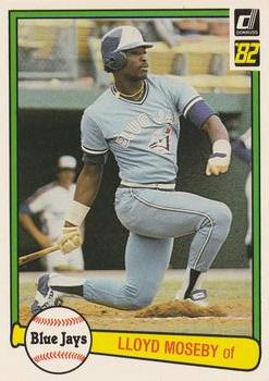
1982 Donruss
Best on-card element: As juvenile as I thought it was at the time, you can't go wrong with putting all your descriptors within a baseball and a bat.

1982 Fleer
Best on-card element: The team color-coordinated borders. I think this is the real reason I like '82 Fleer more than I should.

1982 Topps
Best on-card element: Yeah, no, it's not the hockey sticks on the front, what even is that? It's the cartoons on the back, the last time that cartoons like this (I'm not counting "talking baseball in '86) would show up on the back of a Topps flagship set for decades.
1983
1983 Donruss
Best on-card element: Contract status makes its debut in 1983 Donruss, about seven years after the dawn of free agency.
Best on-card element runner-up: A glove replaces the baseball on the front of the card. I actually think this is the weakest element of '83 Donruss, but some people like it.

1983 Fleer
Best on-card element: The team logos. I believe this is the first time team logos showed up on the front of players' cards since 1960 Topps.
Best on-card element runner-up: A second photo on the back, a black & white mug shot, similar to 1971 Topps.

1983 Topps
Best on-card element: An updated picture-and-picture design with color photos across the board and two-tone borders.
Also, are you ready for this first sentence?:

In 1983! How did Topps know?
1984

1984 Donruss
Best on-card element: The Rated Rookie designation is promoted to the front of the card and that's where it will stay for the next dozen-or-so years.

1984 Fleer
Best on-card element: Even though I like this set a whole lot, there isn't much unique about it. The most distinctive thing I can find is that the photos appear to be sharper in this set than in the previous three Fleer sets. Fleer struggled a bit in that area until '84.

1984 Topps
Best on-card element: The comic-book frame design. This is mostly in reference to the inset mug but the '84 cards all have the feel of a comic-book page (something Topps would go all-in on for 1990).
One thing that would've helped illustrate that feature of '84 Topps is if the set didn't show so many grainy photos, like this example.
And that brings us to the middle of the decade. 1985-89 is up next with even more sets to analyze. Even if I do remember to do this series again, I'm pretty sure you won't see it until 2022.
Comments