
The arrival of Sandy Koufax's 1958 Topps card not only allowed me to complete his Topps run of cards, but it also finished off the 1958 Topps Dodgers team set, too. Koufax was the last card I needed.
This gives me a nice run of completed 1950s Dodgers team sets, the 1956 through 1959 sets are done. I probably should get to work on that 1955 set.
The '58 team set is an odd one and one I've never enjoyed greatly. As I said when I did the Topps set countdown, the '58 set has a DIY feel, which should be admirable but considering you're paying money for the thing, is a little disappointing. Great subject matter of course -- it was the 1950s -- but they look like scrapbook cutouts pasted on colored construction paper.
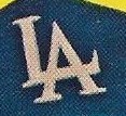
The '58 Dodgers set adds to that inconsistency and slap-dash feel because this set marks the dawn of the Los Angeles Dodgers. While the '58 team card above pays homage to the 1957 Dodgers, the last Brooklyn team, the rest of the set is about the Los Angeles Dodgers. And Topps went through each Dodgers card and scrawled an L and an A on the player's cap. (Well most, they didn't bother with Koufax).


At least the logo is drawn fairly consistently, better than the Blue Jays logo on those 1977 expansion year cards that I pointed out a long time ago. Of course, that Jays logo is much more complex.
The questionable part of the L.A. drawing is the wild proportions on the images.
To get a better look, here are all the Dodgers in the set:


This is a transition team, containing legends of the Brooklyn '40s and '50s squads, like Hodges, Reese, Newcombe and Erskine and players who would bring new success in Los Angeles, like Drysdale, Koufax and Roseboro. Then there were guys who did both, like Snider, Gilliam and Podres.
OK, now for the obvious yellow theme.
The drawn logo never stood out that much for me because of the overwhelming YELLOW of the cards. Yellow is a running theme in the 1958 Topps set and it is notable that all but one of the 16 major league teams at that time featured at least one yellow card in the set. The Kansas City A's is the only team that doesn't.
But while the Cubs enjoy an array of orange, green, red and pink; the Red Sox a diversity of blue (two different shades), light green and pink; and even teams with an abundance of yellow, like the White Sox and Indians, receive other colors, too; the Dodgers are the only team in which all of the player cards are one color and that color is yellow.
This has intrigued me for years: Why the Dodgers? Why yellow? I don't think there is any reason, but while some collectors may not think there's anything wrong with the color chosen, I would have much preferred the Dodgers got a mix of green, blue and pink like other teams. Or if it's got to be all one color, I don't know, how about BLUE?
Anyway, the 1958 team set is complete and I can chase other cards now.
My goal for Dodgers team sets now is to take care of the '50s and '60s sets that are nearly complete with just a few stragglers. 1955 Bowman is down to three cards. 1960 Topps is down to two cards. 1966 Topps is down to that pesky Ron Perranoski high number. As for the 1962 and 1963 team sets that contain way too many difficult-to-purchase rookie stars cards, I'm not going to think about those for awhile.
Throw in the 1954 and 1955 Dodgers that I have a real shot at finishing and I've got plenty of work to do.
But the satisfaction of completing the first Los Angeles Dodgers team set is very real. And very yellow.
Comments
Congrats on KO'ing the Dodgers in this set.
B. Your run of team sets from 1956 to 1959 is impressive.
C. Years ago, I tried to build the 1972 A's team set and ran into those high numbers. Never even thought to try and collect the A's sets of the 50's... but maybe I'll start small and build the 1956 team set.