
Today was the first chance I had to look for some 2025 Topps. The weather has been ridiculous the past seven days between a big fat snowstorm, ungodly wind for days and now sub-zero temperatures. Even the times I could get away from work, all I wanted to do was stay inside somewhere.
So, a week after release, I've got 2025 Topps to show. I'm not even going to say I'm late. Running out in mid-February for the new cards seems much more pointless than when I started this blog. And I just couldn't fired up to order any online.
I knew it would be this way though. 2024 Topps is tough to top, unless you're going to go back to real cardboard and the designs of the '70s. I've seen the 2025 cards online and they're OK. Like 2022 Topps OK. Nothing bad ... or so I thought.
I went to Target to do some birthday things and headed back to the card aisle. It's the week all the kids have off so the place was mobbed and I couldn't wait to get out, but I didn't leave without a 36-card fat pack of 2025 Topps! It's The First Cards Of The Season Post, you guys!
Let's check out my first card of the year:

44 - Brenton Doyle, Rockies
Hey, all right, it's someone I've actually heard of before! That doesn't always happen as anyone who has read my previous first-cards-of-the-year posts knows.
A quick rehash of what a lot of collectors have written about the design -- the position indicator is fine. The sideways writing is not. The design is pretty good otherwise but now I'm going to get to the annoying part:
Foil is back, you guys.
Uuuuuuuuuuuuuuuuuuuuuuuuuuuuuuuuuuugggggghhhh.
I thought we got rid of this in 2015. At first, before opening this pack, I thought that Topps was continuing the metallic ink theme from 2024, which I loved, it created that neon vibe. But this -- this looks like colored foil to me (maybe colored metallic foil), and, yes, it makes words difficult to read and it makes me feel how I feel every time I have to photograph a late 1990s card for the blog, which is "this is too bleeping hard!"
It also affected my perception of the card look from the pictures I've seen online. Look at the Doyle card up there. The colored bar behind the name "Doyle" looks brown or black.

Now it looks purple.
It's actually purple, but because it's foil, the angle at which you shoot the card, or hold the card, or have your reflection caught in the card, alters how you see it (and what you can read). My gosh, I just went through two decades of this! We had foil on cards from 1993-2014. I need more than a 10-year break!
So, not that I was going to chase this set like last year, but this officially shut any thoughts of that down. The cards are fine, but I'm disappointed about the foil.
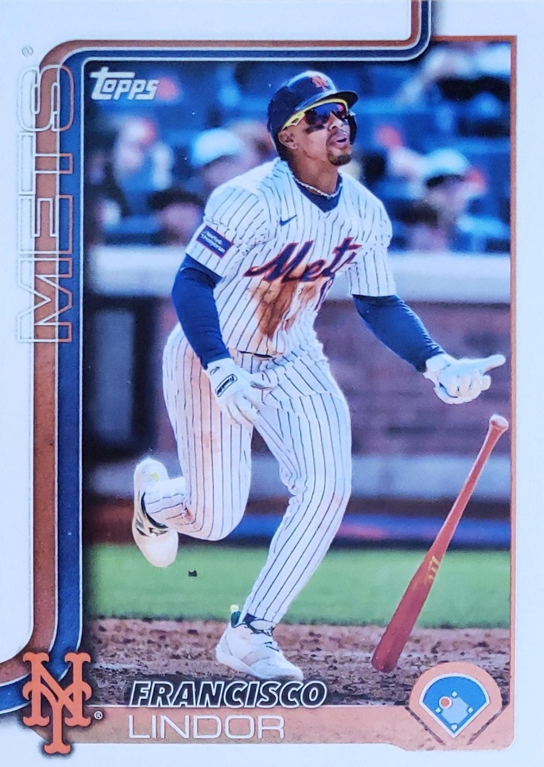
350 - Francisco Lindor, Mets
The cards in hand are shiny in the foil parts (the ribbons, the bottom last name line and the diamond outline, as well as the Topps logo). Like many have said, the team names aren't easy to read. The team logo makes the team names redundant anyway with the team logos, but if they're going to be added, make them readable for grandpa.

287 - DJ Herz, Nationals (RC)
Let's flip it over for the National I've never heard of. The card backs have been utilitarian for years now. The card number is readable. Not much else to say.

138 - Isaac Paredes, Cubs
35 - Anthony Volpe, Yankees
290 - Pete Crow-Armstrong, Cubs
312 - Checklist, "Dub & Drench", Red Sox ... or "Bos" -- the horizontal cards use abbreviations for the team names
37 - Spencer Steer, Reds
The Red Sox player breaking out of the frame on the checklist card is interesting, maybe the most extreme example I've seen since Topps started doing that again.

233 - Brandon Marsh, Phillies
125 - Jackson Merrill, Padres
83 - Anthony Rendon, Angels
341 - Ronel Blanco, Astros
338 - Mitch Garver, Mariners
84 - Cameron Misner, Rays (RC)
The sun hit the Ronel Blanco card so it's difficult to read the name -- thanks, foil. The first two cards show the City Connect uniforms are back on cards, though they didn't seem overwhelming in this pack. Also back: screaming on cards.

238 - JJ Bleday, Athletics
172 - Otto Lopez, Marlins
50 - Leody Taveras, Rangers
189 - Luis Robert Jr., White Sox
321 - Luis Gil, Yankees
317 - Brooks Lee, Twins (RC)
134 - Jameson Taillon, Cubs
Zzzzzzz, pack is getting boring.

14 - Anthony Rizzo, Yankees
231 - Yoshinobu Yamamoto, Dodgers
291 - Checklist, "Hoop Dreams," Rays (These hokey tag lines have got to go, how many years will this go on?)
324 - Masataka Yoshida, Red Sox
T90-90 - Rafael Devers, Red Sox (1990-themed insert)
SMLB-9 - Yordan Alvarez, Stars of MLB insert
The first Dodgers card of the season, woooooooo!
I appreciate Topps jumping in fully with the 1990 insert, it was not a popular design. As for the Stars of the MLB insert design -- it looks like a Topps Stars card from 1999/2000, which means I'm not interested at all.

SMLB-25 - Luis Robert Jr., White Sox, Stars of MLB insert
122 - CJ Abrams, Nationals (that's a great card)
5 - A.L. ERA Leaders (Tarik Skubal, Ronel Blanco, Framber Valdez) - I don't think I could have told you the AL ERA leader until seeing this card.
304 - Raisel Iglesias, Braves
47 - Blake Perkins, Brewers
82 - George Springer, Blue Jays

294 - Rays Team Card
145 - Matt Olson, Braves
45 - Brice Turang, Brewers
That's the end. So recap:
Positives:
-- Solid, basic design
-- Solid photos
-- Allowing the image to break through the design
-- The 1990 insert design, showing just how different cards were 35 years ago.
-- Not too many City Connects or rookie cards, though that may be just the luck of the draw
-- The new cards are out!
-- The new cards are out!
Negatives
-- F'ing foil. What do the rainbow foil cards look like: foil on top of foil?
-- Difficult-to-read team names and player last names. A bolder font would have helped for the last names
-- The "Stars of MLB" inserts are pointless
-- Photo choices are samey-same. That's what happens when you don't have your own photographers and can't utilize your own creativity.
-- Lot of the same-old, in general: same-looking league leaders, backs the same since maybe 2019, mix of vertical and horizontal since -- 1990!
So that was a little more disappointing than I thought it would be, but I knew I wouldn't enjoy it as much as last year. It's like trying to replace your old love. It's never going to match up.

But I bought a blaster, too.
I'll let you know if there's anything worth mentioning.
Comments
I am not a fan of foil - wish the foil cards were inserts or something like that. The 1990 inserts seem like the best thing I seen from this set - they are nice.
The border appears overloaded because the team name is too prominent and my eye keeps following the stripes into Never-Neverland. 2019 Topps, a little bit similar to this, did a much better job with this design concept.
2025 Topps really, really looks like a subset from a 1990’s Score Set.
The blaster is running 3-0 Dodgers to Braves so far.