
A couple of weeks ago, during a weak moment, I actually thought of buying a box of 2022 Heritage.
Why not? I've always found the Heritage brand appealing and it's tackling the 1970s designs that I grew up with -- even if the early '70s is still before my collecting time. Plus, the prices of Heritage boxes were much more reasonable than any of the other boxes for sale.
Fortunately, that urge passed before I put anything in my cart, because as I started to think some more, I realized that Heritage just isn't doing it for me anymore. This year's set in particular, because it's the 1973 design, really underlined my disinterest.
I still haven't bothered to look for even a pack of Heritage, nor grabbed the team set. But I knew most of the Dodgers were coming to me, as Doug of Sportscards From The Dollar Store opened a bunch of Heritage and sent me most of the non-SP's from the Dodgers team set.
This gives me time to dissect how far the Heritage brand has traveled from its original intentions.

I cannot stress more how boring I find this set.
For those of you who think "this is what baseball cards looked like in the 1970s," you would only be right about the design. Heritage still gets that mostly correct. Topps apparently thinks this is what passes for a baseball pose from 1973 but let's dispel that notion.
I counted the number of cards in the 1973 Topps set that show players with a bat on their shoulder. I came up with five total. The Dodgers match that alone in the above picture. I don't know where this "bat-on-the-shoulder-pose-is-the-'70s" came from.

I'm going to call this "The Simpsons phenomenon," as the '73 Yaz, in which he is holding the bat on his shoulder, is a prominent part of a Simpsons episode in which Millhouse seeks that particular card "with the big sideburns."
But Yaz is just one of 5 players to prop a bat on his shoulder because the actual thing to do during the '70s was to pretend you were really batting.
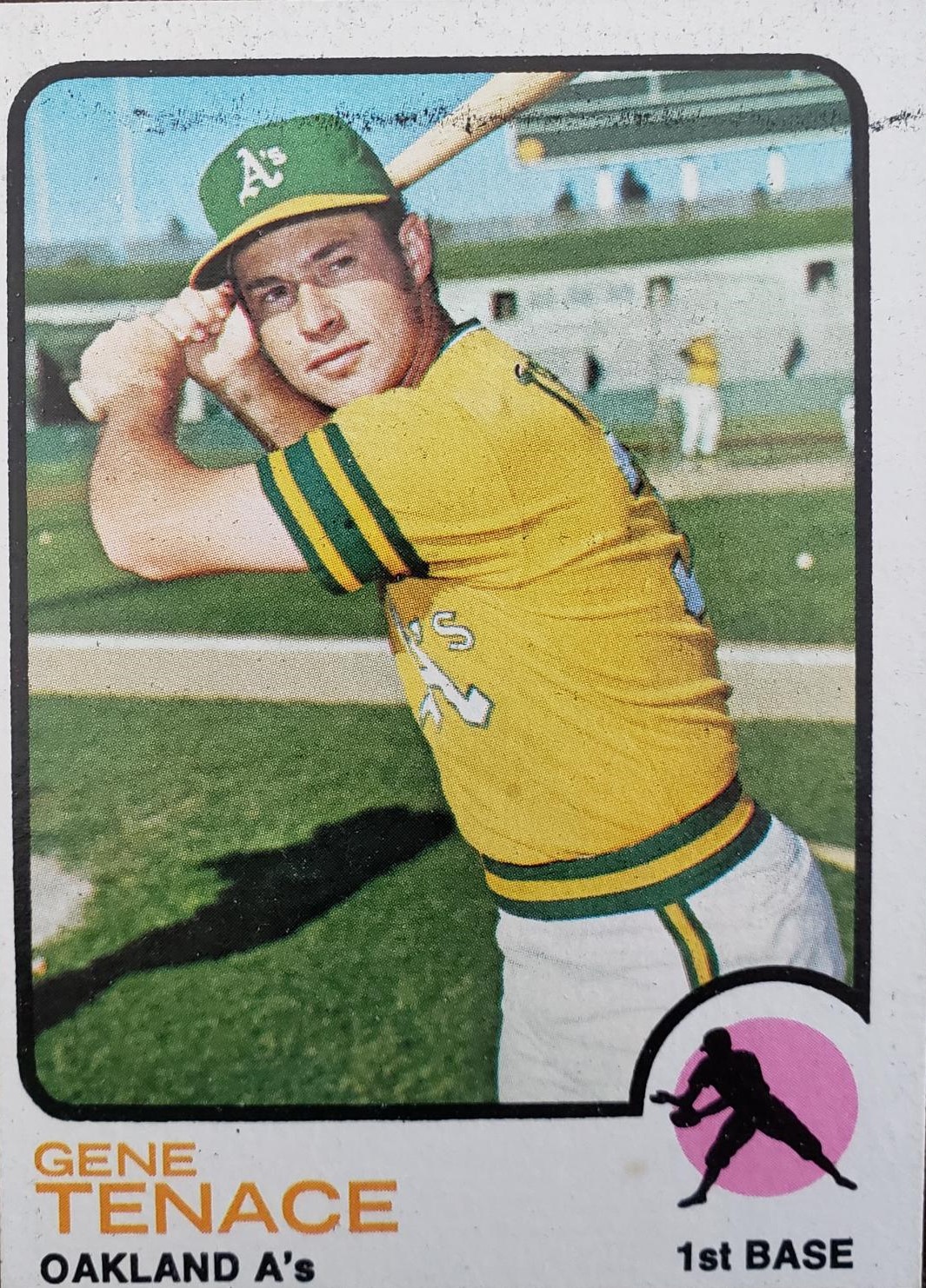
Like so. There are hundreds and hundreds of this particular pose in '70s baseball cards. It's not that difficult to replicate. Just pretend you're batting, actually prop the bat behind you, not on your shoulder, and I'll be happy.

Yes, that's all you gotta do. Not difficult. Doesn't anyone know what a 1973 baseball card looks like?

Here is another thing that '70s ball players did all the time -- pretend to swing. Yet, Justin Turner is the only one of the Dodgers doing this. I'm sure I could find 50 players doing this in '73 Topps.
There are still five short-printed Dodgers that I need to obtain, but I've gotten a look at those and none of them replicate the memorable Wes Parker horizontal card from the '73 Topps set. In fact none of the Dodgers cards are horizontal with the exception of these:

Heritage seems to be moving farther away from replicating the famous images of cards from whatever past set it is focusing on, and that's a damn shame with the '73 set because that's what 1973 was known for! Funky images!

I demand something like this! George Scott! Luis Alvarado! Terry Crowley! Freddie Patek! They could be out there, but I haven't seen much.

This is the best that the Dodgers set could do -- three distant pitchers shots, which indeed was a thing with 1973 Topps.
Now, let's return to that original six-pack of 2022 Heritage Dodgers for something a bit more insidious.

You'll note that each card features the same empty background as it appears each of the players have been told to stand in the same spot, do virtually nothing, and then wait for them to be told they're done.

These generic backgrounds have become rampant in Heritage. It's something that I started noticing with the 2017 set, which paid tribute to 1968 Topps. But others have noticed it going back even further, at least 2015 Heritage if not earlier.
But 2022 Heritage was going to be the litmus test because unlike many of the other recent Heritage designs, the '73 Topps design is rather plain and showcases the photo a lot more. The '73 design allowed us to see so much in the backgrounds.

OK, not Ross Grimsley here. He would've fit right into 2022 Heritage.

But this is what 1973 Topps looks like. See all the people in the background! Working out! Wearing purple jump suits! Bat boys! Tractors! And the players! Actually acting like they're playing!
With 2022 Heritage, there is the same kind of photo territory and it is more apparent than ever that not only are the backgrounds all the same and damn dull, but the backgrounds are likely not even there! Players are merely posing in front of a green screen!!!
That is terrible.
If you haven't seen the gif of the 2022 Heritage Giants set from a SABR Cards post, check it out. It demonstrates better exactly how much Topps is mailing in Heritage than all these words can.

This is just brutal. Once again, NONE OF THIS HAPPENED on cards in the '70s!
Why did anyone think this is OK? Is this because everyone is so used to all-action-all-the-time and the backgrounds being wiped out of cards (see: the late 1990s) that no one can differentiate between an image of a player pretending to throw a ball and simply standing with his hands over his crotch?
(By the way, the 1973 set was the last one that included a high number series -- let's see if Topps continues with the High Number Series in 2023 Heritage and how it's excused).
Many will say Heritage hasn't been "Heritage" for a long time. With the action-image variations, the color swaps, upping the number of shot-prints, etc., Heritage has been doing things that never happened back in the '60s and '70s in order to appeal to modern collectors. It's turned off the audience it originally sought in order to attract box breakers and the like.
But I've clung to the Heritage myth because we've now reached the '70s and these are the designs I love. I've been looking forward to 2024 Heritage for a long time, but now I'm discouraged and scared about what's going to happen to that wonderful '75 design.
A bit about the backs (I know, nobody cares about the backs):

Firstly, I really would like for the type to be as large and bold as it was when I was a kid. I know the legalese is taking up more territory (do we really need all the logos?) but there has got to be a way to make them as readable as they once were.
I don't like thinking that my eyes aren't as good as they once were -- I know that's true -- but it's not helping when Topps and Panini are shrinking the type so I need a magnifying glass. I am not 78! I should be able to read a card back!
OK, one more thing about the cartoons:

These are some cartoons from some random Dodgers cards from the 1973 Topps set.

These are the cartoons from a similar number of Dodgers cards from 2022 Heritage.
Note, from this example anyway, that 2022 Heritage avoids one of the most interesting aspects of 1973 Topps -- the fascinating topics and often personal history of the players in the cartoons. The 2022 cartoons are all baseball exploits. I don't understand what's so terrible about allowing collectors to see that players are humans, too.
I know, I know -- there are a lot of collectors who don't know why this is a big deal. Even as myself and a few other collectors were discussing the downfall of Heritage yesterday, I was aware that these folks were mostly people who collected in the '70s. We're old fogies, the only ones who remember what it was like then, and why it is wrong.
Topps has its hands tied a bit because it doesn't use its own photographers and must rely on Getty images and such. Replicating original images like the Steve Garvey shot might be difficult. But with a little more effort it could be done.
Green-screening photos is not fooling anyone and merely feeds the belief that Topps doesn't care about the set collector or the base card and is looking only at what those who spend the most on their product want. And those people certainly don't care about time-accurate photos. I know of collectors recently back in the game who have opened some Heritage and were immediately disappointed because there were no significant hits or parallels-- they don't know what Heritage's M.O. is, or at least used to be.
Some diehard Heritage collectors, those who quit collecting Topps' flagship set because Heritage reminded them of what sets used to be, are now leaving the Heritage brand, because it's not Heritage anymore.
I plan to stick around a little bit (but it's not like I'm buying boxes). I like the '70s cards too much. But I'm pretty sure that once Heritage does the '78 design in 2027 or the '79 design in 2028, my interest will be gone.
It's not Heritage anymore and I can't deal with a card company that won't remember the 1980s.
Comments
What would make any or all of the sportscards released in 2022 interesting is a little personality. Stadium Club has been consistently doing that, and while the results are much more miss than hit, the online exclusives have had some hidden gems in recent years too.
I agree with Billy that the pandemic limits what can be done, but I also think it has been an issue going back for more than just the last two years. Now that the designs are squarely in the "action shots" era, I had been hoping for a little more variety. I'm still working on the 2020 set (1971 design), and it has some character to it, but it has a similar background issue on the majority of the cards.
https://www.espn.com/mlb/player/_/id/35001/conner-greene
Disappointing about Speier--I looked up that card number (#273) and it's not horizontal, not a Giant, and not anything like that picture. It's Hoy Park of the Pirates (really Park Hoy Jun, but don't get me started.) Looking up Tommie Agee (#420), Mike Andrews (#42), Willie Stargell (#370), all iconic odd actions shots--nothing. Just two years ago they DID get this right with cards such as Thurman Munson and Bud Harrelson from 1971 Topps. Were they thinking that they were losing their license and didn't need to bother? The legendary Luis Alvarado card is #627, so if Topps is reading this we need something epic at that number in Heritage High Numbers!
A perfect example of this being done wrong: 1986 Fleer. So many of the posed shots look exactly the same, some are too dark, some are too soft focus and they all looked like they were taken quickly as if the photographer was double parked. I actually like the design, but man, the photography in 1986 Fleer makes it the cure for insomnia.
As for your Dodgers, my three favorites are the three action shots.
I am just not feeling it.
Good point. I realized that yesterday. They rarely looked at the camera in those '70s shots!