
I have a love-hate relationship with the use of yellow on baseball cards.
I realize that it is necessary. There's nothing brighter than yellow, so when you want to alert a card collector -- HEY! BUY THIS CARD! -- yellow helps. Oh, Yeah, it sure does help.
But there are other times, some very obvious glaring times -- you know how much glare yellow creates -- when it's too much. There were other colors that could have been selected, other choices that would be a little less offensive, or at least something that could be turned down a notch. (FYI: I wrote about yellow on cards a couple years ago, mentioning some of these same ideas and even doing a countdown. You run out of ideas after 10 plus years).
I find yellow not all that attractive given the choices. So when the 1959 Topps set selected yellow for many of the Dodgers cards ...

... yeah, it bothered me. There are so many fun colors in the 1959 set. Seafoam green and pink-house pink and sky blue and orangey orange and jet black. I don't really find anything fun in a yellow border.
So aggravating. That's how I find yellow. The year before, Topps had the audacity to put every last Dodger player in a yellow border.

Don't go looking for another color for the Dodgers this year. You won't find any. Besides you'll be blinded by a single view of the team set. (Other teams are similarly afflicted, but they do get one or two colors mixed in with all that yellow).
That's how it goes with yellow and cards for me, and I haven't even reached the biggest laughingstock in yellow ever created.

1991 Fleer created an entire set robed in yellow. No other color. Just yellow. I'll admit, it accomplished the buzz it sought. Collectors still talk about this set, mostly in derisive tones, which then causes a few misguided souls to profess their undying love for a set colored with a few thousand egg yolks.
(I am just noticing that the '91 Fleer design scheme is very similar to the Yello 45 sleeve at the top of the post and now I am quite conflicted).
Yet, there are times when yellow simply works on cards.

Yellow is a time-honored tradition for food-issue cards, which makes sense as yellow is a traditional color used in restaurant advertising (particularly fast-food) and food packaging. None of the above designs bother me in the slightest because I expect it. I expect no logos and the brightest possible design treatment.
I've even enjoyed yellow in Topps flagship issues, discounting those late '50s examples.

For example, I adore the yellow-bordered cards in the 1972 Topps set, most especially the Astros cards. This Cesar Cedeno card was featured in my blog header several years ago just because I've enjoyed it ever since I was a kid. The yellow backdrop works perfectly with the blue-and-orange of the team name and the Astros' uniform colors from that time bring the entire card together.

Would the 1975 Topps all-star cards (my favorite all-star cards) have the same impact if the top half of the border wasn't yellow? I think not.
As much as this now makes me envision the greatness of a blue-red '75 All-Star card, nothing ANNOUNCES a presence like yellow. And that's what you need with an all-star card.
So that little history lesson brings me to what caused me to write all this (again):

A few weeks ago, the Twitter world went into a frenzy (shocker, I know) about yellow parallels discovered in Topps Series 1 packs found at Walgreen's.
Everywhere, it seemed, collectors were scoping out area Walgreen's and announcing whether they found the yellow parallels or not. Some scolded their Walgreen's for failing to stock Topps Series 1. Meanwhile I thought I was fortunate that my Walgreen's regularly stocked repack boxes. I didn't even know Walgreen's stocked current Topps cards.
So I didn't find any yellow parallels myself. The above card was sent to me by Matt from The Summer of '74 blog (and more frequently, of Twitter).
It's ... weird.
It reminds me of -- and I'm going to go very old-school here -- the View Master projectors and reels. There was a feature (I think it was View Master anyway) where you could filter the image you saw by a color, red, blue, etc. That's what this looks like, the image viewed through a yellow filter.
It's pretty pointless. I don't mind pointless, if it looks nice or cool. This looks like, eh. Which is fitting, because "eh" describes any visit to Walgreen's.
A few years ago I'd be in a panic because this would be another parallel I would have to chase for all of the Dodgers and where am I going to find those? But I don't bother with that stuff anymore.
Instead, I gladly accept the cards that people send me. Matt added a few other needs with the yellow-themed Jansen.

A non-licensed version -- and how about this filter? -- of your starting NL All-Star outfielder.

The best of the Dodgers' 47 catching prospects.

I am a winner ... of one of the last '92 Winner Dodgers that I still needed (It may be the last one, I have so many other completion tasks to track before this one).
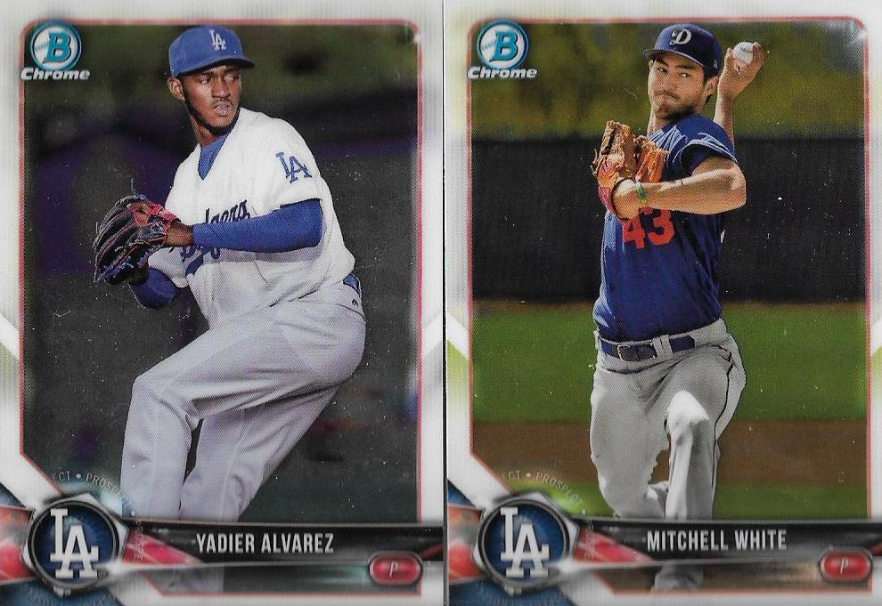
A couple of Bowman Chrome "needs" of a former Dodger prospect and one that is still working his way through the L.A. ranks.

Here's a bit of embarrassment. Matt threw a few Piazza cards at me in an image and allowed me to select which ones I needed. I picked these two.
But because my eyes repeatedly fail me and I am not familiar with cards from 2000, I wasn't aware that the cards at the left was Piazza as a Met and what the hell am I going to do with that? (Well, I know what to do with it -- trade it).
But it's nice to get that '93 Leaf one finally.

Matt also found a few early '80s Fleer needs for my collection. Look at how chill players were in 1983. Don't you wish they were that relaxed on your cards now? I know I do.

Advancing into the past one more year. There's big boy Al Holland.

And this thing. I love it and cringe at the same time. It's obviously at Dodger Stadium. You can barely see Dickie Thon's face. It looks like a card that is 37 years old. Isn't it great?
Fleer used a lot of yellow in its early sets, too, especially the 1981 "debut," which was nothing but yellow. I wasn't all that crazy about it back in '81 and I know it was because of the yellow. It's quite the polarizing color.
Because there was one more of those yellow parallels that Matt sent that I like quite a bit.

Oh, yeah.
Comments
Actually both Yadier Alvarez and Mitchell White are both still Dodgers prospects. I think you might've mixed up Yadier with outfielder Yordan Alvarez who the Dodgers traded away for *checks notes* something called a Josh Fields.
Next time I'll just battle the traffic and go to Target if I'm that desperate for new cards :/