
It wasn't easy coming up with five "busts" and five "improvements" for Donruss. Everyone seems to have a different opinion with Donruss, much more so than Topps or Upper Deck.
That's cool. More '84 Donruss for me. But on the other hand, I don't want to see how some of you dress your kids.
The choices were all over the place for both categories. In fact, there was a four-way tie for biggest improvement. So there will be six choices for the "biggest improvement," instead of five. Unfortunately, the sixth improvement to get in -- 1984 to 1985 -- doesn't have a fancy comparison picture in this post yet because J.T. cast his vote after I had already tallied the votes and scanned the cards.
So you'll just half to imagine the '84 card next to the '85 card and giggle over how anyone could say that '84 Donruss could be improved. (EDIT: I've updated the post with the 84-85 comparison)
OK, here are the candidates based on your comments. The polls are up on the sidebar. Be nice and vote, please and thank you.
BIGGEST IMPROVEMENT

1981 to 1982
You will be able to tell other people besides me are voting in this thing. 1981 Donruss was the first and it has too much sentimental value to me for me to say that there were problems with it (even if there were).
1982 Donruss is much too simplistic for me. But others like it. So there you are.

1983 to 1984
This received more votes than any other category. You can credit the '84 Donruss haters, or my mesmerizing writing. Or (*gasp*) maybe some people actually think like me. Regardless, my appreciation for '84 Donruss has nothing to do with Don Mattingly or the relative rareness of the set.
It has a little to do with Donruss finally breaking away from that stupid bat drawing.
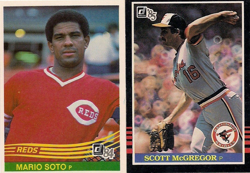
1984 to 1985
1985 Donruss IS cool. But I think people are too entranced with the black borders. It has a lot of the same issues that Donruss had for the first four years.

1986 to 1987
Despite 1986 Donruss' great Define the Design name, it still freaks me out that Donruss thought that the potential for throwing collectors into convulsions was a good idea to put on cardboard.
Anything after that would be an improvement. I don't enjoy '87 as much as others, but it's definitely better.

1990 to 1991
Makes zero sense. Moving onward.

1992 to 1993
Again, anything over the vomit-inducing '92 cards is an improvement. But I totally forgot about the expansion cards in 1993 Donruss. Add that fact to one of the better designs in Donruss history and this is a cool choice.
BIGGEST BUST

1982 to 1983
This is my write-in candidate. There were a bunch of "busts" that received one vote. I needed to include one of them to have five candidates. There is no way I was going to overlook this. You can't copy your own design and not expect grief.

1985 to 1986
Maybe not on par with the 1994 to 1995 Fleer plunge into madness, but in the same general area. Wow.

1987 to 1988
I've grown to appreciate 1988 Donruss, so I wouldn't pick this. But I can see why people would. You pull so many '88 Donruss cards and it eventually becomes your mortal enemy.

1989 to 1990
I'm not crazy about the 1990 set, but it has a certain clean design that I enjoy. I've also grown to really like the '89 set, despite all of its photo issues. So what am I saying here? I don't know. It's Donruss. I can take it or leave it.

1995 to 1996
If there is justice in the world, this will win as Donruss' Biggest Bust. The '95 set may steal from Topps, but it is light years ahead of the horrific metallic loin cloth set of 1996.
So, those are your choices.
Really, I don't know if Donruss deserves this kind of treatment. I've always treated them with a "Ho, HO! So you think you can make CARDS, little man?" attitude. (Now I do that with Panini).
But I have to go and be all completist about everything.
I can't wait until I do this for Pacific. I'll just write "no opinion" under every one.
Comments
Speaking of Donruss, I just busted a box of 2002. Where would you put that set on your list?
I actually like 1992 Donruss. Whereas I would question the judgment of anyone who thinks 1991 Donruss is an improvement over anything.
1986 Donruss just screams quintessential 1980's to me in a good way.
As for 1985 Donruss, I seem to be one of the few collectors who actively dislikes black borders on baseball cards.
I'd pick '85 as an improvement to all the rest, it has team logos and isn't as 'busy' as some of the others.