I received this card from jacob mrley of Starting Nine last week. It's from this year's Heritage set, of course, and it's flat-out ugly.
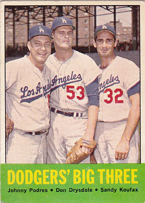
Here, I'll show you the original Dodgers Big Three card from the 1963 Topps set for comparison.
Isn't that much more purty?
Now, you may not notice much of a difference -- or maybe you think I'm whining again -- but I'm not talking about the unnecessary italicizing of "Dodgers" on the Heritage card; the lack of an apostrophe on the Heritage card; or the relegation of Clayton Kershaw's name to the second row, when there was none of that nonsense with the original card.
No, I'm talking about something much more apparent.
It's the registered trademark symbol.
Yup, it looks just about that big when I view the card. In fact, it's about all I see.
Part of this is because the fonts used with 1963 Topps were rather large, leading to large trademark symbols. Obviously, trademarks have been attached to team names on cards for a number of years now, but usually on a much smaller scale.
But because the symbols are so large in Heritage now, it's really awkward-looking.
Perhaps you're wondering why there was no trademark symbol on the original Dodgers' Big Three card.
Good question. I wondered, too. So I looked.
I'm no legal expert, but near as I can tell, registered trademark symbols popped up with team names basically because of two reasons: 1. Self-Esteem Issues; 2. Greed.
Here is a quick regurgitation of this: Originally, trademark law was meant to protect consumers from misleading labeling or manufacturers trying to pass off their goods as being from a different source. The Lanham Act, passed as an act of Congress in the 1940s, has guided trademark law for many years, particularly this phrase: "likely to cause confusion, or to cause mistake, or to deceive."
So how does this apply to sports teams? Teams produce sporting events. Are there people out there who set up a baseball diamond in Nebraska, find 9 players, claim they're the Los Angeles Dodgers, and then charge exorbitant ticket and parking fees to fans gullible enough to believe the Dodgers are playing in the middle of a cornfield? No.
The trademark symbol arose through licensing. As teams began licensing their names and images, the law dealt with any infringements under the terms of "false advertising." But this didn't have anything to do with trademarking. And teams weren't on the look out for cases of unlicensed products. They didn't try to get licenses from sports cards companies, who showed teams' players wearing uniforms featuring the teams' logos. Teams were still thought of as producing sports events, not consumer goods, so why would they need trademark protection?
Well, that changed with the explosion of the memorabilia market. As consumers demanded more and more clothing of their favorite team, with the logos included, manufacturers popped up who were making that clothing without a license. Lawsuits began and teams accused not false advertising, but trademark infringement. The courts began agreeing in the mid-1970s and that gave teams protection and the ability to pull in mega-profits based on their new rights of exclusivity. As more and more fans became convinced that they had to wear "what the pros wear," the more money teams made and the more expensive sports clothing and memorabilia became.
And now teams and leagues make sure the trademark symbol is plastered everywhere because it's a major money-maker. They would never be able to cash in as much as they have without it.
As someone who has never understood the memorabilia/jersey craze, I find this interesting. I spent my entire childhood and teenage years wearing unlicensed, "knock-off" baseball caps and jerseys. But I was happy. If it said "Dodgers" on it, that was great with me. I couldn't have cared less about whether the Dodgers actually manufactured it or not. Today, I have a Dodger cap. I've never looked to see if it was licensed by Major League Baseball or the Dodgers, although I'm guessing it has.
I've kind of considered memorabilia -- especially jerseys and uniforms -- as a scam. But I'm sure many people consider baseball cards a scam. (I've yet to reconcile this with my interest in seeing logos on baseball cards, as opposed to what you get from Panini).
In fact, I don't think there are a lot of people who think like me. Because now, on our baseball cards, we have a big, fat:
or:
Someday, bloggers may not be able to even write Red Sox or Twins or Cardinals without making sure that there is an R with a circle around it afterward.
Whatever we fans can do to help our favorite team sell us a replica jersey for a 100 bucks.


Comments
That's Stupid.™
It's one thing to protect your "brand" against people selling cheap tshirts, I can understand that. It's another thing to say that an event that millions of people watched and/or attended, is somehow immune to discussion unless the MLB deems it worthy.
Matt, I know what you mean - I have always wondered how you "own" a score?! Do local news channels have to pay MLB in order to report that the A's beat the Mariners 5-4 or something?
*Topps(R) is a registered trademark of The Topps Company, Inc(R)****
**Heritage(TM) and/or Topps Heritage(TM) is a term reserved by the Topps Company, Inc(R)****
*** The team name Dodgers(R) and any and all logos pertaining to said Dodgers(R) are property of Major League Baseball(R)*****
****The Topps Company, Inc(R) is property of the Topps Company, Inc(R)
*****Major League Baseball(R) is property of Major League Baseball(R)
...And for that matter, it only added a few hundred characters to my comment. Hardly a steep price to pay for free speech...