Even as a youngster, when my world was nothing much more than Scooby-Doo cartoons on a Saturday morning, I knew that 1971 Topps was different.
I just didn't know why.
I didn't know that the bad guy wore the black hat. I didn't know that motorcycle riders wore black for a reason. I didn't know that black made the Oakland Raiders "outlaws." I just knew that '71 Topps had black borders and they looked AMAZING.
The '71 Topps set came out four years before I started collecting. But like most sets of that time period, I would see a card here and a card there. The thought of owning one '71 card consumed me. Then, when I owned one, I couldn't stop thinking about how cool it would be to own five.
Today, I am 36 cards away from completing the set. Something that for years I thought would be an impossibility is getting closer and closer to being reality. Turning the pages of a binder filled with entirely black-bordered cards is still a thrill, believe me.
But there's something about the '71 set that doesn't get enough credit.
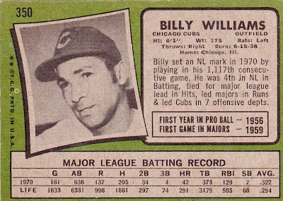
It's the card back:
The complaints about the '71 card back are familiar.
There is only one line of stats -- the first time Topps did that since 1962.
The write-ups are quite often dull. This one doesn't do what so many others do -- recount the players' American Legion and Pony League stats.
There is no cartoon. There had been a cartoon on the back of every Topps flagship set since 1953.
So, if there are so many complaints, then why is the set ranked so highly?
Of course, it's because of the photo.
There may be other sets that featured a photo on the back before '71 Topps, but for me and for millions others, this was the first time a photo had appeared on the back of a baseball card.
Considering how many sets in the last 25 years have displayed a photo on the back, this was a major innovation by '71 Topps. It is almost a necessity to have a photo on the back now.
I happen to think the back of the '71 set is very well designed. The information may not be great, but the visual is terrific. It's kind of the dumb blonde of card backs.
Plus, a lot of the cards feature floating heads on the back. That feature alone is worth No. 13 in the countdown.
Sure they are simple black-and-white head shots, not the color action photos that Upper Deck spoiled us with for so many years.
But you have to start somewhere. And the '71 Topps set is iconic, front and back.
Best of the set:
I'm going with Jim "Mudcat" Grant:
Those are some spectacular chops, no matter what side you're on.
(previous card back countdown selections):
50. 1978 SSPC Yankee Yearbook
49. 1993 Score
48. 1999 Skybox Thunder
47. 2000 Upper Deck
46. 1999 Skybox Premium
45. 1953 Johnston Cookies Braves
44. 1995 Topps
43. 1997 Fleer
42. 1992 Pinnacle
41. 1989 Bowman
40. 1977 Kellogg's
39. 2004 Topps
38. 2004 Topps Total
37. 1992 Topps
36. 1992 Donruss
35. 2008 Upper Deck Documentary
34. 1963 Fleer
33. 1955 Bowman
32. 2006 Topps
31. 1961 Topps
30. 1955 Topps
29. 1967 Topps
28. 1970 Topps
27. 1969 Topps
26. 1966 Topps
25. 1963 Topps
24. 1911 T205
23. 1962 Topps
22. 1981 Topps
21. 1981 Donruss
20. 1958 Topps
19. 1977 Topps
18. 1974 Topps
17. 1957 Topps
16. 1988 Score
15. 1993 Upper Deck
14. 2004 Upper Deck Timeless Teams


Comments
1971 Topps is the height of conflict for me, largely for superficial reasons.
I LOVE the black border ... I HATE the all lowercase names.
I LOVE the photo on the back ... I HATE the single year of stats.
I had the thrill of finally completing this set last year. The final piece to the puzzle was the Dusty Baker / Don Baylor rookie card.
I still have a few fillers in the set I'll have to swap out, but that's one of the nice things about the black border: everyone gets so concerned about finding unchipped cards from 1971 that they forget that there's an abundance of chipped cards suitable for filling out sets.