You may have noticed that not one of the card backs that I have featured in the countdown so far has displayed cartoons. That is only because those other card backs had something else seriously going for them.
Ordinarily, the lack of a cartoon is a major problem on this countdown, while including a cartoon is almost a sure-fire way to get onto the list. I like tiny drawings of funny-looking men.
Many of the card backs remaining in the countdown are rated highly because there are cartoons on the back. I admit I am biased. I prefer cartoons over photos, over fancy statistics, over slick-looking graphics. That's because one of my favorite parts of card backs as a kid was the cartoon. When I collected back then, it was a given that there would be a cartoon on the back every year. I actually learned more from card backs because I paid extra attention to facts that were accompanied by a cartoon. I also thought that anvils could drop out of the sky and hit you in the head. There are good and bad aspects to viewing too many cartoons.
But Topps began to phase out cartoons in the early 1980s. By 1983, nobody featured cartoons on the backs of cards. Cards were serious business by the mid-80s. Why would anyone put anything so trivial as drawings on the back?
Sadly, many of the card backs of the mid-to-late 1980s are some of the dullest on record. All because card companies shunned the cartoon.
Then came 2006, the year I returned to collecting modern cards. There are several reasons why I came back in '06, all of which have been mentioned before. But one of the reasons that hasn't been mentioned is because cartoons had returned to the backs of cards!
I was hooked immediately by Topps' homage to its past. Almost every card in the set featured a cartoon on the back, just like the old days.
It was about time.
Many of the cartoons reminded me of the cartoons of my youth. They featured some interesting or quirky fact about the player on the card. Sometimes, the drawing could be amusing. The ones I just displayed are among my favorites.
Some brought an updated mind-set to the cartoon. Not a lot of cartoons from back when I was a kid would mention something negative about the player featured on the card.
At least two cartoons displayed Topps' fascination with the fact that Josh Beckett and John Smoltz were born on the same day.
But one of the disappointing aspects of the cartoons in the 2006 set is the repetition of some of the images and some of the trivia questions.
It was as if the poor collation that collectors complain about had plagued the cartoons on the back, too.
All three of these cartoons mention Bob Gibson's N.L. MVP and Cy Young Award in 1968, with the same drawing, although the write-up is slightly different with the middle card.
Both of these Reds players receive the same cartoon on the back, although the wording is different on each. The second cartoon also misspells "Cincinnati."
All three of these cartoons mention Nolan Ryan's number being retired by three different teams. The first cartoon features the numbers in bold for some reason.
The repetition of trivia questions, and especially cartoons, is rampant in the set. A player holding a rake is used at least a half-a-dozen times. A "hello, my name is ..." name tag is used even more often.
Sometimes the cartoon is completely mismatched. What does watching balls go over the fence have to do with stolen bases?
And why would you show a catcher holding a target when you were mentioning an infielder moving from the Yankees to the Mets?
That sloppiness kind of ruins the nostalgia factor with this particular card back. The cartoon concept seems rushed, manufactured, and lacking in individual attention (I think I just described the problem with countless modern-day companies).
The update set is actually better. Except for a couple of exceptions, all of the cartoons are originals and the drawings are all different from the base set.
Here are a couple of my favorites:
Both of those cartoons contain facts that I never knew until I read the cartoon. Just like the old days.
Although this cartoon is rather disturbing. Even more disturbing than Bautista's career ERA.
Best of the set:
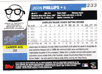
I'm going with the Jason Phillips card from the desperate Dodger days of 2005. I'm not sure if Phillips ever was "instantly" recognizable, but his glasses certainly were noticeable.
(previous card back countdown selections):
50. 1978 SSPC Yankee Yearbook
49. 1993 Score
48. 1999 Skybox Thunder
47. 2000 Upper Deck
46. 1999 Skybox Premium
45. 1953 Johnston Cookies Braves
44. 1995 Topps
43. 1997 Fleer
42. 1992 Pinnacle
41. 1989 Bowman
40. 1977 Kellogg's
39. 2004 Topps
38. 2004 Topps Total
37. 1992 Topps
36. 1992 Donruss
35. 2008 Upper Deck Documentary
34. 1963 Fleer
33. 1955 Bowman


Comments
Sadly, that's where all the comparisons to Wade Boggs end...even taking into account that I occasionally played third base.
I think that aspect may also be unique - it is a single stat brought out in more attention than hunting through the stat chart for, and I think Topps probably didn't do that very often. 2009 (I think, or 2008) was another year they did something along those lines on some of the arcs across the back of the card.