
One thing that is obviously lacking in major card companies' mass production of sets is an eye for detail.
They think they have it all covered with access to Getty Images, a solid design (in most cases) and decades of practice (in Topps' case). But obviously with the amount of sets created -- about double the amount that is actually necessary -- stuff falls through the cracks. There is just not enough people pulling down a salary to keep up with that kind of volume.
So the work suffers. The photos are fine but better ones could have been selected. Errors -- typos or incorrect facts or the wrong statistics altogether -- appear on the back. Allen & Ginter's set skips from card 300 to card 350 without even a hint of recognition that something went awry.
There is just no time for details.
This is why when I see what collectors can create -- you know, the collectors who truly care about cards, the ones who could talk about them all day and the day after that -- I think we could rule the world if we created our own card company.
You can see the signs of caring in the very cards they make. I honestly don't see that in Topps' cards.
Let's take three custom cards sent to me by Nick of njwv who I converse with regularly over at Twitter.
The first one is the Ron Cey card at the top. The design is a twist on the familiar and very popular mid-1950s Topps designs. It includes a basic, color-coded, easy-to-read design with the ever-popular logo of the pictured team.
You can see thought in the very head shot. It's a photo of Ron Cey in his prime and it's a photo I'm sure he was happy with how it came out. Nick recognized that.
Now the action shot. It's a famous one. It's Ron Cey's home run in Game 3 of the 1981 World Series against the Yankees. It's pretty much the peak moment of his entire career, the reason why he was voted co-MVP of that World Series. This is the perfect shot to select for a card of Ron Cey.

The second Nick custom is of another one of my favorites, Sandy Koufax.
Nick went straight to the best for the main photo, selecting a shot by famed Sports Illustrated photographer Neil Liefer. This was taken during a game between the Dodgers and Milwaukee Braves on Aug. 25, 1963 at Dodger Stadium (the Dodgers won 2-1 in the bottom of the ninth on a single by catcher Doug Camilli).
It's a sensational photo and sums up Koufax's delivery and power and yet we've never seen it in Stadium Club.

Final custom card and I hope you know this photo by now.
This is another photo from Neil Leifer for SI, taken in April 1965 in a game against the Phillies at Dodger Stadium. It's actually a shot of Davis being retired on a double play and you can read about how Leifer rigged his equipment to get this bit of fantastic.
The photo may suffer a bit from being cropped here to allow for the design but I am not going to argue with using one of the greatest shots ever (it appears regularly on Twitter baseball history sites).
Nick's attention to detail covers the entire card as we'll see from the backs:

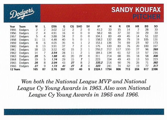

Um ... OK, so Ron Cey's stats appear on the back of Willie Davis' card. That's kinda something you'd see on Topps cards these days.
But anyway, complete stats! What else do you need from a card back?
I recognize that there are card collectors working at Topps and other card companies (although I'm still not so sure about Panini). I think there are simply too many mission statements, too many attempts to try to be all things to all collectors, and not enough people to carry it out for cards to be created that show that ultimate attention to the finer things.
But that's why there are customs and that's why there are blogs.
The collectors who really care -- and have the time -- know what makes the best cards. It's that eye for detail.
Comments
Perfect.
P.S. I received the cards you sent along as a thanks for the 75 buyback. Thank you!
I wonder what SI readers' reactions were 54 years ago when they turned the page and saw that photo for the first time.
This inspires me to think about creating a series of A&G cards to make up for the numbering blunder. What would you want to see in cards #301 thru 349?
If GCA does some Ginter cards there should be some wrestlers; Becky Lynch for the young folks and Jerry "The King' Lawler for the older crowd.