Before I get into this post, just take a moment to stare at this John Buck card. Have you ever stared at a word or a letter for so long that it doesn't make sense anymore? Sure you have. If you stare long enough at this Buck card, particularly his space-age catcher's mask, it doesn't even appear as if he's playing baseball anymore, or that's he's even human.
OK, maybe it's me.
Anyway, to continue the silliness, I've compiled a countdown of my favorite 2011 cards so far. I say it's silly because I'm not trying to complete any 2011 sets right now. That means I have just a starter's set worth of 2011 cards, and am probably missing some dandy ones.
But tradition is tradition and this blog is nothing without traditions and old, moldy cardboard that the app-loving junkies just can't understand.
In recognition of my relatively scant number of 2011 cards, I've trimmed the list to a mere top 10. I'll keep the commenting to a minimum, too, because, to be honest, I'm just not into these cards.
10. Ben Zobrist, Topps: I am always a sucker for pictures of outfielders diving for balls. If you manage to get the ball and determination in the photo, then you make the list. I'm not even going to hold Ben's nickname of "Zorilla" against him.
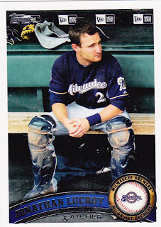
9. Jonathan Lucroy, Topps: Every time I see a dugout shot, I think of 1970s and '80s Topps cards, because there were lots of dugout shots back then. It's a cool photo that sums up The Backup Catcher, right down to the dirt on the shinguards.
8. Andrew Bailey, Topps Heritage: The background of empty seats adds to the "serious business" stare on Bailey's face. I'm aware that Heritage has photoshopped a bunch of stock backgrounds behind players this year. I don't know why, though. Did '62 Topps do this? Anyway, I don't know if this is one of them.
7. Magglio Ordonez, Topps: This is a great "point of impact" photo moment. But I find two things distracting. The Topps arch and Tigers logo gets in the way, and the Target Field backdrop is as dull as a gymnasium's padded wall.
6. Ramon Hernandez, Topps: Hernandez is living right this year. I like his Heritage card, too. Upper Deck was known for the "broken bat" photo. This is a good one. You have both pieces of the bat AND the ball in the photo.
5. Eric Young Jr., Topps: Young is starting to get a reputation of making fine baseball cards. He made this list last year, too. Yahoo! Look how high he is! Yahoo! He just retired a Giant!
4. Mr. Met, Topps Opening Day: This card is too original to leave off the countdown. It's not just a mascot card or a night card. It's all of that rolled into one and the mascot is mugging for the camera. Great stuff.
3. Brennan Boesch, Topps: This angle was featured a lot in 2008 Stadium Club. It was also featured a lot on Upper Deck sets of four, five years ago. We don't have Stadium Club this year (gee, I wonder why?). We don't have Upper Deck this year. So this is the best version of this shot that I can find. The umpire makes the whole card.
2. Adam Wainwright, Topps Heritage: It's a shame Wainwright is on the shelf, because this card says "spring/summer" to me more than any card I've seen this year. I sure hope the backdrop is real, because that is a terrific photo, right down to the ball still in his hand. That's the way they did it in the '60s/'70s, folks!
1. Casey Blake, Topps: Casey Blake is SAFE, SAFE, SAFE! Get DOWN with your bad self!!
Maybe this card is first because he's a Dodger, maybe not. Still, it's a wonderful photo.
So, there's your half-hearted look at the best of 2011 thus far. I suppose I'll do an end-of-the-year one of these. I hope I'm more fired up about the cards by then.


Comments
Sorry Dodger fans but Blake does look photoshopped to me. That or explain how he kicked up all that dirt without hitting the ground yet. Someone will have to investigate it further to see if he scored on a diving play at the plate before I am convinced otherwise. A baseball reference challenge, just what you were looking for during your busy month...
My favorite of the 2011 set has to be the flagship Seth Smith that shows him almost dancing with the ump.