I forced myself to go to Walmart earlier today because they have the right-size mailing envelopes I need and then they didn't have them and I immediately became annoyed I was there and in a fit of self-loathing for such a stupid decision I walked to the card kiosk thing.
The first thing I noticed was 2023 Bowman was out. There were blasters. But I don't buy stuff like that anymore. Outside of Bowman I saw blasters of 2022 Heritage High Numbers and Allen & Ginter and Panini Mosaic. Also fat packs of Optic and Topps team sets for just these teams: Orioles, Nationals, Red Sox, Braves and Cardinals. Come on, find me a Nationals fan here.
There was also plenty of 2023 Topps Series 1, but I'm all done buying that. It did remind me though that I need to write a Define The Design post on the set as I try to do every year for flagship.
2023 flagship is fairly easy to name. That graphic treatment at the bottom is totally inspired by today's ballpark video scoreboards.
Here is the monstrous scoreboard at Max Scherzer's home park, Citi Field:
Lordy, that thing is massive. If I played center field for the Mets, I'd be a bit concerned if I saw that start to sway.
So, anyway, I'm calling the 2023 Topps set the LED Video Scoreboard set.
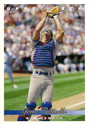
As usual, I try to name a few other sets from the past to go with the brand-new set. In my bid to pimp my 1993 Upper Deck blog (a new post will go up tonight!), I thought I'd finally name that set.
About 10 years ago I tried to name it "The Best Set Upper Deck Ever Made" but while that's true, it's not in keeping with the other Define The Design names that focus on the characteristics of the cards.
For me, the script writing of the name stands out as the chief graphic element on the cards. So to keep it simple for such a simple design, I'm calling it the Sign Here set.
You all remember paper checks, right? I still use them, although not to the degree I once did.
Let's travel 10 years earlier and name the early '80s Fleer sets, starting with 1983 Fleer.
The "gray border set" has already been taken by 1970 Topps, but that's not the watershed element of this set. The key focus, of course, are the team logos in the corner. This is definitely the Team Logo set.
1983 Fleer isn't the first set to use team logos -- 1952 Topps did it. But a mere team logo isn't going to work for '52 Topps. I'm going to have to soothe its ego by calling it "The First Set Ever Made That Mattered" or something gross like that.
1982 Fleer could very well be the "Blurry and Off-Center Photos" set, but let's be nice and try something else.
In this minimalist design, the rounded information box is the only thing that stands out besides the team-color borders.
I'm calling it the ID Bracelet set.
Finally 1981 Fleer. Pretty obvious here, too. It's the Baseball set.
I see Topps wrinkling its nose again. But Topps has rarely used a baseball in its design in an obvious way -- all I can think of is 1978 with the position baseball and 1981 with baseball featuring the Topps name, nothing that is the main element.
So Fleer's first major-set foray gets to be called the Baseball set.
I'll add these names to the Define The Design page when I get a chance. Feel free to take a look at what's been done already. You'll also notice what hasn't been done -- a number of those seem impossible to name.


.png)


Comments
The Big white stitched baseball (set)
You nailed with 1982 Fleer - now for the
rest of my life when I see that set - I will also see a bracelet.
1983 Fleer
The baseball logo gray board set.
The Mystery Color set
The Where On The Color Palette set
What the hell color is that set?
I liked the 81 fleer more with all the variations and liked their gum the best. They had to switch to stickers the next year as part of a court case that allowed only topps to have gum. Donruss switched to puzzles.
I really liked the 81 fleer stickers. Too bad that set isn't appreciated that much by collectors.
Paul t
To me, 1983 Fleer is the coffee stain set. The tan borders are so out of place compared to every other issue of its era. I've always thought it's the one set you could spill drops of coffee on and it'll just blend right in.