
First, Topps needs 50 lashes with a wet noodle for releasing a well-known product in late August.
Late August is filled with back-to-school shoppers. On a Wednesday afternoon. When I and retirees normally have the stores to ourselves. And, for some reason, around here, Canadians join the fray, and don't know where they're going, and suddenly I feel like I'm shopping on a weekend.
I couldn't wait to get out of Target. I wanted to shop for a few things for the card room but I picked up the lone Archives blaster and headed straight for the self-checkout.
So, now we're at my annual Archives post.
Anyone who has read this blog for more than a couple of years knows how I feel about Archives. It's a mishmash set, often executed half-heartedly, and usually looks like the creators only read about collecting during the years that featured the selected Topps designs.
For me, that's sometimes enough to buy a rack pack of Archives for the year and be done with it. Other times I get a little more excited, like when Archives chose the 1979 design a couple of years ago.
Design has a lot to do with how much of this set I will buy. The selection of the designs, the execution. Player content is secondary. Inserts are secondary. Autographs don't enter the thought pattern. It's all about the design.
So, that would follow that I should be buying a bunch of this stuff, right? The 1975 design is featured!
Well, I have to admit, it's got to be one of the most colorful years of Archives -- with the '58 design featured, too -- but we'll have to open the blaster to see my opinions on it.
Before I do, let's get these things out of the way:

I have zero interest in these coins. Even more annoyed that the ones I received are two people responsible for each of the Dodgers' last two World Series losses.
Also, a warning: since the '75 design is involved, I will be obsessive. One thing that I want to know is whether all of the color combinations in 1975 will be featured in this set. And for that, I have my handy list:
Brown-orange
Green-yellow
Pink-yellow
Tan-light blue
Yellow-green
Yellow-red
Red-yellow
Orange-yellow
Brown-tan
Red-blue
Red-orange
Green-light green
Purple-pink
Light blue-green
Blue-orange
Green-purple
Yellow-light blue
Orange-brown
I will be tracking as we go long.
PACK 1

#27 - Cavan Biggio, Blue Jays

#51 - Clayton Kershaw, Dodgers
With the yellow background, of course. This is the only Dodger that came out of the blaster.


#133 - Nick Senzel, Reds
#156 - Blake Snell, Rays
#108 - Catfish Hunter, Yankees
OK, we're at the good stuff, the 1975 designs. Time to compare:

A few notable differences. The fonts, of course. The most distracting thing for me is that the team name is smaller and narrower than it was in 1975. It isn't anchored to the top frame, width-wise, it's almost floating around up there (with the obligatory trademark symbol).
The player name is smaller and a little too spaced out. The colors are deeper on the Archives card and I don't think that's due to fading of the '75 card. On the plus side -- and I'm sure autograph hounds will disagree -- it's nice to see those facsimile signatures again even if no one knows how to sign their name anymore.

A quick comparison of the backs. A fairly good tribute although the Archives back is not as easily read. Also, Archives scraps full names -- BOOO! Modern ballplayers have middle names, too! They're not hard to find! Use them!!

Obviously, the name is different between the two cards, and the team, and the signature. Hunter's cap looks off in the Archives card and the faded backgrounds that appear on some of these old-timer cards throw off the whole card image.

#75M-55 - Brandon Belt, Giants, mini
My first Archives '75 mini is a Giant. But of course.

There is the comparison so you can see the mini size. The floating team name is even more apparent on the mini card. I do not like. However, you'll notice that Topps appears to have refrained from tinkering with the position listing as it has in the past. It says "1st Base" just like the Tony Perez card I just showed. No "First Baseman" or any other weird nonsense.

#226 - Steve Carlton, Phillies

#273 - Corbin Burnes, Brewers
Those are your '93s. I don't have a lot to say about these because I wasn't impressed with '93 Topps in 1993 (all my energy went to '93 Upper Deck). I will say that some pretty good photos were selected for the '93 representation, even better photos than I remember showing up on the original '93 set.
OK, time to cross off some '75 color combos:
Brown-orange
Green-yellow
Tan-light blue
Yellow-green
Yellow-red
Red-yellow
Orange-yellow
Brown-tan
Red-blue
Red-orange
Purple-pink
Light blue-green
Blue-orange
Green-purple
PACK 2

#95 - Hoyt Wilhelm, White Sox
#64 - Rosy-Cheeked Don Larsen, Yankees


#121 - Tony Gwynn, Padres
#109 - Andy Pettitte, Yankees
#172 - Steven Duggar, Giants

Here's another comparison with an original '75. Notice the font differences and the deeper colors. But overall, since it's the 1975 design, I'm pretty happy to see it come out of a pack.

The differences are more pronounced here. For whatever reason, the Yankees team name is orange instead of the '75 red. And now those phantom spring training sites are starting to creep me out.

#305 - Chris Sale, Red Sox, 1958 All-Star design

#248 - Jose Altuve, Astros

#271 - Jose Abreu, White Sox
Brown-orange
Tan-light blue
Yellow-green
Yellow-red
Red-yellow
Orange-yellow
Brown-tan
Red-blue
Red-orange
Purple-pink
Blue-orange
Green-purple
PACK 3

#7 - Roberto Alomar, Indians
#33 - Ramon Laureano, Athletics


#199 - Jacob deGrom, Mets
#158 - Richie Ashburn, Phillies
Too brown-oranges. Let's compare:

The left edge on the deGrom is ragged, which gives it an OPC feel. Weirdly, unlike the previous comparisons, the colors are deeper on the Cleon Jones card. The team name for deGrom is still too small and narrow.

#151 - Al Kaline, Tigers, parallel, 8/175
Archives parallels are strange. The differences I see here are the inner border is all black instead of white with a black line, and someone seems to have turned out the light on the position baseball. I don't know why any of this would appeal to someone.


#265 - Sandy Alcantara, Marlins
#270 - Brandon Nimmo, Mets
#284 - Nomar Mazara, Rangers
The '93 photos do grab ya.
Tan-light blue
Yellow-green
Yellow-red
Red-yellow
Orange-yellow
Brown-tan
Red-blue
Purple-pink
Blue-orange
Green-purple

#70 - Jeimer Candelario, Tigers
#30 - Robinson Cano, Mets


#197 - Andrew Benintendi, Red Sox


#247 - Bobby Doerr, Red Sox
Tan-light blue
Yellow-green
Yellow-red
Red-yellow
Orange-yellow
Brown-tan
Red-blue
Blue-orange
Green-purple

#2 - Patrick Corbin, Nationals


#132 - Jesse Winker, Reds
#169 - Zack Greinke, Diamondbacks
More spooky spring training sites. Maybe get a person in the background and I'll believe the player was actually there.
wee.


#243 - Juan Marichal, Giants
#295 - Robin Yount, Brewers
Let's compare the '93 design because there are differences there, too.

Do your eyes go right to the name like mine do? That is so not accurate. Neither is the team name but in the opposite direction.

Back comparison. Topps didn't want to fit in Yount's first five years in the major leagues.
Tan-light blue
Yellow-green
Yellow-red
Red-yellow
Orange-yellow
Brown-tan
Red-blue
Blue-orange

#67 - Goose Gossage, Padres (Padres? Come on)


#137 - Marcus Stroman, Blue Jays
#126 - Chris Shaw, Giants


#282 - Kyle Tucker, Astros
#249 - Johnny Mize, Cardinals
Tan-light blue
Yellow-green
Red-yellow
Orange-yellow
Brown-tan
Red-blue
Blue-orange

#97 - Bob Gibson, Cardinals
#88 - Chipper Jones, Braves


#223 - Jesus Aguilar, Brewers
Tan-light blue
Red-yellow
Orange-yellow
Brown-tan
Red-blue
Blue-orange
OK, that's the blaster.
Yankees - 29
Red Sox - 28
Braves - 27
Tigers - 25
Blue Jays - 25
Astros - 24
Cardinals - 24
Cubs - 24
Mets - 24
White Sox - 24
Giants - 23
A's - 19
Phillies - 19
Pirates - 19
Reds - 19
Royals - 17
Brewers - 16
Angels - 14
Diamondbacks - 14
Nationals - 13
Rockies - 13
Twins - 13
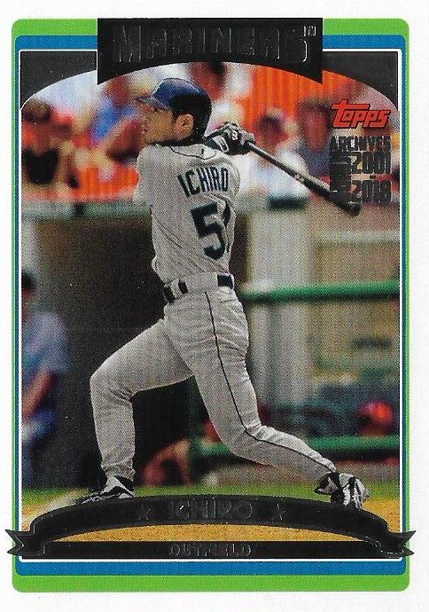
Mariners - 12
Padres - 12
Rangers - 12
Indians - 11
Marlins - 11
Orioles - 11
Rays - 10
I'm not including those stupid coins.
Overall, I'd say that either I'm warming a little more to Archives or it has improved over the last three or four years. Probably a little of both.
It doesn't hurt that Archives included a tribute to my all-time favorite set this year.
It may not look exactly like those '75s, but like queen Whitney once said:
"It's not right, but it's OK".
Comments
Speaking of distracting, I noticed something with the 1975's that I can't un-see, so I'm going to make others not be able to un-see it. The drop-shadow on the position baseball is smaller, which isn't a big thing in and of itself, but in the original version the line between the white inner border and the colored outer border goes right into the shadow while the new version... Jeez, this is hard to describe in words, I might have to do my own post about it. :-)
Oh and Canadians flock to Target because we don't have Target in Canada or any equivalent.
http://nightowlcards.blogspot.com/2012/03/its-ugly-card-but-its-law.html
Basically it's the fault of the memorabilia market. I will say that Topps seems to have made the trademark logos smaller than in the past, which makes them a little less apparent.
I'll take that lovely Springer coin off your hands, though. I know you'd like to get him out of the house. ;)
https://www.gettyimages.com/detail/news-photo/pitcher-jim-catfish-hunter-of-the-new-york-yankees-poses-news-photo/53239055
https://www.gettyimages.com/detail/news-photo/robert-p-doerr-of-the-boston-red-sox-swinging-a-bat-in-1937-news-photo/173494853
Also as I mentioned on Twitter, I do like that Topps has 1988'd the 1958 design. I don't mind them changing things but I like it when the changes seem considered rather than slapdash.