I mentioned when I completed the 1988 Donruss set that it marked the first time I had completed four major sets from a given year.
I don't see that happening for me ever again. After the '80s, it's difficult for me to find multiple sets I was interested in enough to try to complete them. For example, I've completed 1993 Upper Deck, I wouldn't bother throwing money at any other '93 set outside of a token Topps complete-set buy. (I'd take a gift of a complete '93 Stadium Club or Pinnacle set but I'm not buying them).
So '88 is a milestone, a one-of-a-kind collecting feat. I like that it's '88. That's the year the Dodgers won the World Series; it's the year I graduated from college; it's the first full year of my wife and I going out. It's basically the last great year before adulthood stomped everything to hell.
To mark the feat, I thought I'd take 10 notable players from this time and compare their cards from that year, kind of like Wrigley Wax does with his Comparing the Brands series, but, you know, without the Cubs.
These are all notable players. I tried not to repeat teams and I also avoided the card darlings from that time, the Mark Graces, etc. These are players who were big deals on the field, not just on cards.
Let's compare and contrast:
1. Topps, 2. Score, 3. Donruss, 4. Fleer
Topps time and again shows that it knows what a well-cropped photo is. Score isn't the best-cropped but illustrates the power of Clemens' wind-up. The Donruss photo took minimal effort all around. Fleer just looks kind of awkward, which is often what Fleer did best.
VINCE COLEMAN
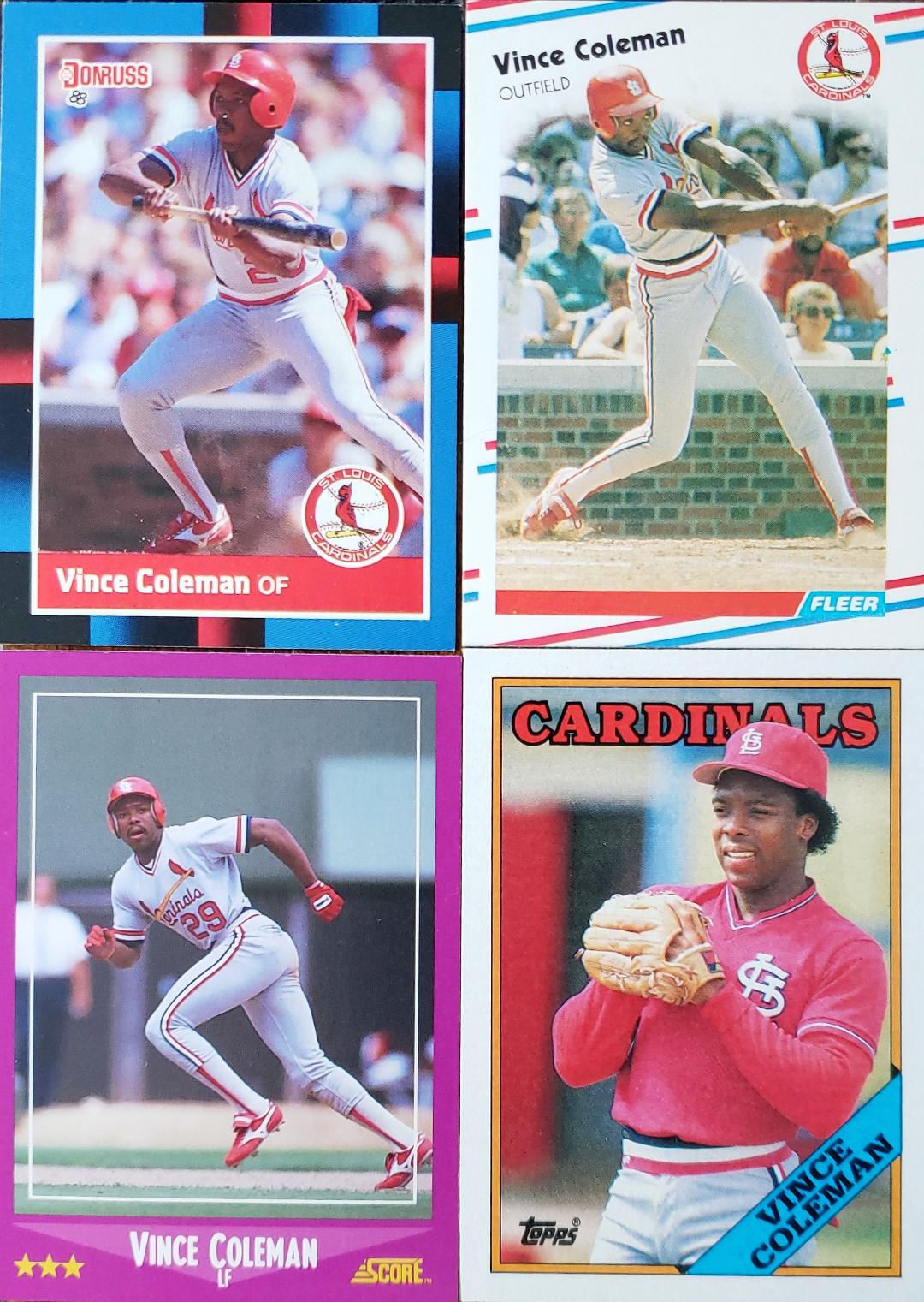
1. Donruss, 2. Fleer, 3. Score, 4. Topps
I appreciate that Score got Coleman on the base paths, I just wished they zoomed in more on him, that would've been a fantastic shot. I don't have a problem with candid shots at all but Topps' photo just looks out-of-sync with Coleman's whole speed vibe.
DWIGHT GOODEN
1. Topps, 2. Fleer, 3. Donruss, 4. Score
Topps did a masterful job with the Mets cards in '88, one of the best color-coordinated team sets of the '70s and '80s. The Score could have been great but the angle and the crop makes it plain awkward.
TONY GWYNN
1. Topps, 2. Donruss, 3. Score, 4. Fleer
Not a great year for Gwynn cards. The Score photo is too dark and I don't think I've ever seen the '88 Fleer card shown on a blog, which is saying something considering how many Gwynn fans have been bloggers over the years.
BO JACKSON
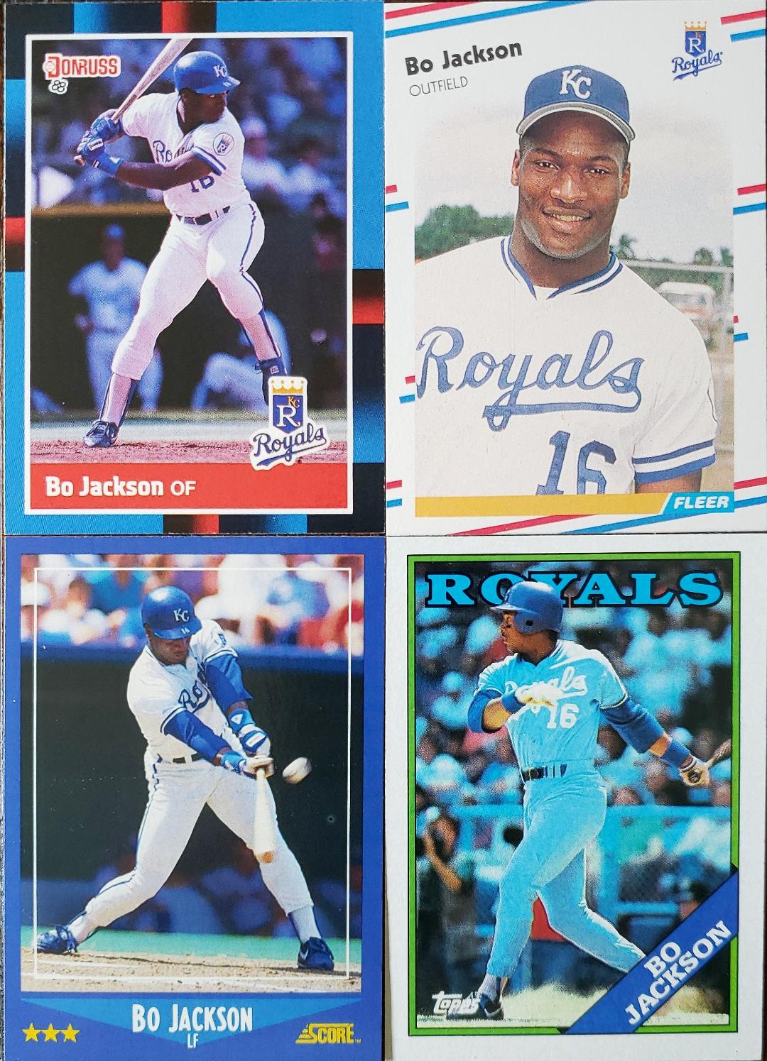
1. Topps, 2. Score, 3. Donruss, 4. Fleer
I am one of those who believes Bo Jackson never made a bad card. The Topps card was voted the No. 1 card from the set on the original '88 Topps blog and I concur, it's phenomenal after all these years. Score and Donruss also do a great job with the color matching. Fleer is simply the odd-card out.
DON MATTINGLY
1. Fleer, 2. Topps, 3. Donruss, 4. Score
All action all the time with Mattingly this year. I like the anticipation on the Fleer shot. He's got the same look with the Topps card, but I've long thought the crop is too tight. Score is a bit too faceless, which is a problem with '88 Score sometimes.
1. Topps, 2. Fleer, 3. Score, 4. Donruss
The man set a rookie home run record the previous year, I think Topps does the best job of reflecting that. Fleer and Score do fairly well. Donruss' shot might as well be some guy who had 38 at-bats in '87.
KIRBY PUCKETT
1. Donruss, 2. Score, 3. Topps, 4. Fleer
A lot of sameness here. Donruss and Score display the leg kick, which puts them over the Topps card, I also like how it appears on Donruss that Puckett is getting his leg out of the way of the Twins logo.
NOLAN RYAN
1. Donruss, 2. Topps, 3. Fleer, 4. Score
Ryan was nearing the end of his Astros days, which is a shame because I remember him mostly as an Astro or an Angel. The Donruss close-up works for me in this case. I enjoy the bank of lights on the Fleer shot (is that a night card?). Score just has too much air up top.
MIKE SCHMIDT
1. Fleer, 2. Topps, 3. Score, 4. Donruss
Mike Schmidt was not treated as well as he could have been by the card companies. None of these are great. I ranked Fleer number one just because it's interesting but I don't think Schmidt did anything wonderful there. Score is just too tight top and bottom. Topps is OK if I'm in the right mood.
OK, let's tally them up!
Topps - 18
Donruss - 26
Fleer - 29
Score - 30
Small sample size but I'm sure if I did this for 200 players, Topps would still be No. 1. 1988 will always be an underrated set, one of the best of the '80s.
So there you go, 1988 is in the books as far as cards, unless I want to chase Topps Big or Sportflics. There's always the 800 box sets issued that year, too.
But for now that's all you'll see from me from '88 for awhile.


Comments
1988: Topps, Fleer, Score
1989: Topps, Score, 30 short on Donruss
1990: Topps, Donruss, Fleer, Upper Deck, Sportflics
1991: Topps, Donruss, Score, Upper Deck
Surprised me how poorly Score rates on this post but a large part of your grading is in the color matching (which frankly Score never does well in).
I'd say Score's issue with these 10 are its cropping and darkness of photos. Also as much as I like to trumpet '88 Score over '89 UD (They were FIRST), the sameness of every action photo kinda hurts it.
In 1988 and 1989 I would have thought Topps was easily the best set - then a few years later I thought it was junk wax - then in 2008 I found the 88 Topps blog and it opened my eyes at how nice the set is.
However, I think Fleer is a close 2nd. Posting the pictures on your blog makes 88 Fleer really stand out with the crisp photos - compared to the other 3 sets which have blurry faces.
Clemens does look a little weird on his Fleer card but I would have had Topps number 4 (is it Clemens)
Coleman's Donruss would be a 4 too much dark shadow around his face. Look at the lady with the sunglasses on the Fleer card.
Gooden agree either Topps or Fleer
Too much shadow on Donruss and Score - but look at that clear photo of Gywnn on Fleer and that Brown warmup jacket - not sure if any other Padre cards has someone wearing this (maybe a Jack Clark)
Again too much shadow Donruss Score - Look at that Picture of BO plus the red white and blue feels like a 1976 tribute for Fleer.
Mattingly agree
The McGuire rookie cup just blows the other cards away.
Fleer Puckett is a strange one - I don't see the shadows on Donruss and Score - I think - I would probably agree on this one
The blurred background on Ryan Donruss is so distracting - Fleer makes Ryan look about 25 but it is Probably 2nd to Topps
Schmidt agree but I would tie Score and Donruss.
Great Post.
Never realized how average the '88 Gwynns are - really not anything special in there. The Fleer one is just awful.
OTOH, you're very right about how much the poor cropping hurts the Score set. I still like the Coleman, but if it were cropped better it would be fantastic. Several of the other Score ones are just ruined by the cropping.
This was really the last year where Fleer had the most interesting, unusual photos, if not always technically good.
George Brett would be an interesting one if you do a sequel to this post. His '88 Fleer is an underrated classic.
Paul t
1988 Topps has always been a strange beast. Initially dismissed because everyone was hungover from the buzz of 1987 Topps, it was since found a new legion of fans. I always liked it. I’m glad it didn’t mimic 1987 in any way except for the number of cards in the set. Its recent popularity reminds me of what happened to The Rolling Stones’ “Exile on Main St.”
But I get why you are drawn to 88 for other, more personal reasons, so I can't fault you there.
B. 1988 is my least favorite year in regards to 80's set designs. My favorite 1988 design is Topps Big. The other designs are okay... but none stand out to me. I have started appreciating the 1988 Topps set more in recent years (kind of like the 1991 Fleer design).
C. Gooden's 88T card is my favorite from this 40. The 88TT Nolan Ryan is a close second.