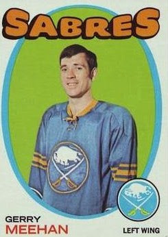
I was looking at the 1971 Topps football cards posted on A Penny Sleeve for your Thoughts yesterday and admiring just how fantastic the design was for those cards, when I remembered that I had meant to make a post about this some time ago.
The '71 Topps football design is not my favorite of all the Topps football designs. I need to have an emotional connection to a design and I was too young to be collecting in '71. However, I do think the design is brilliant in its simplicity and in its ability to reach its target audience: kids.
In fact, I think that all of the Topps designs for the big four sports that year -- football, baseball, basketball and hockey -- achieve the above goals. The cards issued in '71 across the board were:
1. Simplistic
2. Colorful
3. Fun
4. Got kids to notice
That is why I think 1971 was the best design year Topps ever had.
The football design is as enjoyable as opening the colored funnies on a Sunday. Each card displays a cartoon figure representing that player's position. Each card features bold red or blue borders, sometimes two-tone red and blue borders. The team name is big and colorful. The card announces the player's name as a banner in bright, large letters. You cannot miss anything with this design. It is all right there for you.
The '71 basketball design -- my goodness, the '71 basketball design -- may be the brightest element ever committed to cardboard. I see these NBA cards and even though my knowledge of NBA history is atrocious, I fall in love with them and try to suppress that rising urge to collect the set.
What's not to love? The brightly colored and LARGE bubble letters for the team name. The player's name with initials colored. The bright, BRIGHT background in pink or yellow or green or blue, you name it, just make it colorful and bright! I also adore the 3-D effect.
The 1971 hockey design also used bright colors for its player backdrop. It also used large, colorful bubble letters for the team name. It added a mirror frame with a colorful border and a large team logo that Fleer swiped a decade later.
OK, 1971 baseball, you may say -- that's not colorful -- and you would be ........ WRONG.
There is nothing more eye-catching than presenting bright colors on a black background. It's one of the few card sets to use the "neon lights" effect and is it ever powerful. Yes, I can't help but think that kids thought this was totally awesome -- if they said things like that in 1971.
Topps also produced a very bright and catchy, kid-friendly baseball design the following year, in 1972:
And the NBA's 1972 design certainly made some colorful noise:
The NFL 1972 Topps set was also bright and loud:
Only Topps' 1972 NHL set strayed from the early '70s formula with that boring burlap holdover from the late 1960s.
But for me, Topps reached the pinnacle in 1971 for the big four sports.
For me cards have always been fun. They've never been an investment or an innovation or any of those very adult ideas that infiltrated the hobby in the 1980s and '90s. The best way to convey fun, for me, is to make the cards colorful with all kinds of splashy, funky, amusing graphics.
The 1971 sets were fun. They probably will never be as fun as they were then.
Really makes me wish I was a kid collecting then.
But at least I had the mid '70s.


Comments
Oddly enough, baseball was the one set I didn't buy in 1971.
As a collector I don't think you will ever see this type of run again
Fall 1971 - Topps Football (the most words/write up on the back for any set ever)
Fall Winter 1971-72 Topps HK and BK
Summer 1972 - Topps Baseball
Then the big let down 1973. Topps baseball (ugh), Basketball and Hockey dropped and so did football.
There would be some bright spots like 1975 Topps Baseball.
It would not be until 1977, that you had a pretty good year all around, Baseball (good), Football and 77-78 BK (very good), 77-78 HK (OK)
Then the bright spot come few and far between for me.
1979-80 Topps Hockey
1983 Topps Baseball
1987 Topps Baseball
(though as time goes on those late 80s junk wax set look better and better - like 86 and 89 Donruss)
In the last 30 years only 2008 Topps tickled my fancy.
And Today I think the Gypsy Queen cards give some umph to designs. (2015 Classy looking and 2018 Fun looking)