
Uh oh, Topps is doing neon

 
I was worrying about how I'd squeeze a post in today. Yesterday there was no power, like in a lot of places, so I couldn't post then.

But Topps was there for me. In fact, I think it's coming after me with today's release of the 2024 Topps flagship design. Gracious, is that NEON? On the day after I went 18 hours without electricity???? Give. It.

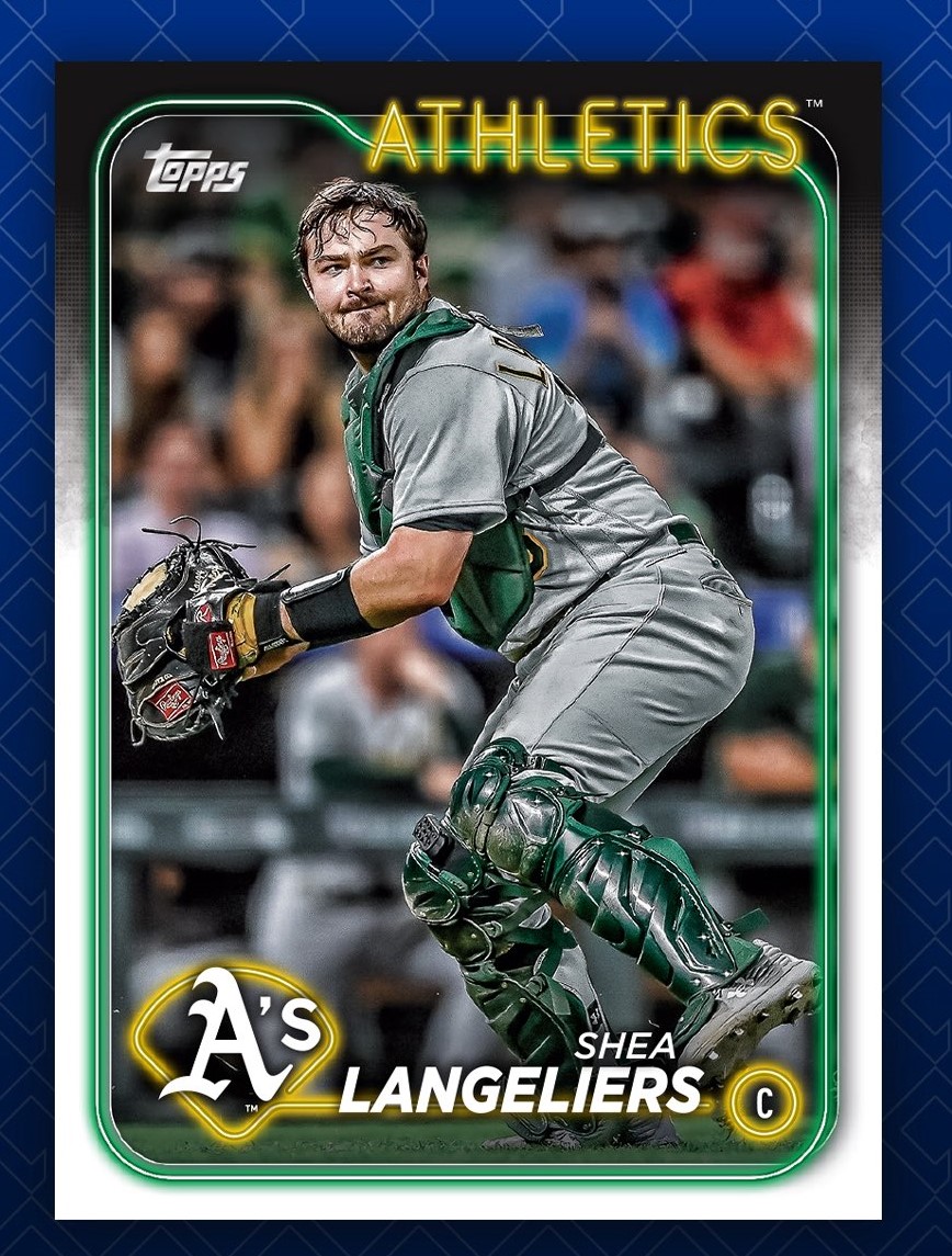
Never mind the massive borders on the De La Cruz sample above, they don't seem to be quite that big. Here is another look of what seems to be more typical from the MLBPA account.


As a known lover of neon-looking cards, of cards with black borders, of 1986 Topps, of a blog look that's white-on-black, this design seems made for me. They are night cards without being necessarily having to show a picture of a game at night!

It does present a problem though, as I had intended not to bother with 2024 flagship this year, mostly to pursue Heritage. I still don't think I'll attempt to collect this set -- too many players I don't know on a design that doesn't go back to childhood -- but there may be a few more pack buys for this.


I know these cards won't be as bright and back-lit when they actually show up in my hands, but that happens every year. I know that I'll still like them better. It makes 2021 Topps -- and especially 2016 and 2017 Topps -- so far away. This could be my most favorite recent design, even surpassing 2015 Topps! But we'll see what happens after I let the news settle for awhile.

I was sort of hoping that the design wouldn't be revealed until the first packs were opened, like during all those days opening packs in the '70s, '80s and '90s. But, hey, bloggers have posts to write.


The design gurus are picking apart what they like and don't like about it and I appreciate it. I'm not nearly knowledgeable about that stuff so I learn things. But the jumble down in the bottom right is certainly obvious. Maybe zoom out on the image a little and this isn't an issue.

Maybe it's the day without power talking (still monitoring neighbors' situations), but overall all I see is the brilliant theme of Neon and that will help me ignore whatever weirdness Topps has in store for the rest of the set.

It's a good day! The 2024 Topps design is out, the set is scheduled to show up Feb. 14 and I like it!

Comments

Jason Presley said…
I like it. Hopefully the names are left white and not ruined with foil.
Crocodile said…
18 hours without power? That's harsh. It is crazy that here in MN we've barely had winter while the coasts are getting battered. And I do like that new design. I'll be picking up that set when it's available.
RJ Sahl said…
Nice and very different design. I'm about 50 miles from Crocodile and totally agree that 18 hours without power is harsh. The real winter starts today and goes for at least the next ten days. The furnace is getting a workout for sure!
Doc Samson said…
First, love the fact this design has a border. Second, I like neon when it’s done correctly. I could not agree with Night Owl more — this might be a case where internet makes this card look better or worse.

2010 Topps looked good when first revealed on the internet, and then we know what happened. I have to see it in my hands. But, as of now, I’m really digging this. Hopefully your power situation gets worked out, Mr. Owl.
Matt said…
My first thought was that 1986 Tops had a baby with one of the modern Bowman designs. I really like the use of team colors in the neon, and I especially like that baseball diamond behind the team logo.
night owl said…
Power returned late yesterday afternoon. There's another similar wind storm coming Friday night so hopefully it's not as bad.
GCA said…
The Topps logo definitely belongs in the top left - no exceptions.

Not a bad design, and yes, it blows 2021 out of the water, but late 80's Donruss does that too. Bonus points for team colors and black.

I still won't likely get many or any since like you mentioned, I don't know who these guys are any more.
Anonymous said…
It is eye-catching.
It is looking good for now.
Jimetal7212 said…
Hopefully they keep up the theme of the inside border and team name being in the team's primary colors.
bbcardz said…
Love the originality, creativeness and especially the attractiveness of the new Topps card design! I'm really impressed. Being a Topps flagship set collector, I was going to buy a bunch anyway but I gotta say, these look really good so far--even better than most insert sets.
Nick said…
I really like the 2024 design for the sheer fact that it's, well...a design. Too much of what Topps has been doing lately is generic stuff that seems to blend together in my memory after a while. Neon lettering is fantastic and the black borders really pop. It's early, but I'd say 2024 has the potential to be an all-timer as far as modern Flagship sets go.
beefman said…
Chrome & Chrome Refractors are going to look fantastic!
Matt said…
It's a meh design, but the Chromed look should be spectacular
Jafronius said…
My power went out as I was reading this! Could be a good design, we shall see when we get our hands on it.
Fuji said…
It's definitely growing on me. Got my first glimpse a few minutes ago on Nacho's blog and wasn't a fan at first. But the more I look at it, the more I like it. My favorite things about it are how Topps made the team colors glow and the combination of the team nickname on top with the team logo on the bottom. It helps that all four backgrounds on these samples match the teams' colors too.
Bo said…
I love it! As a fan of old signs, how could I not? It's fresh and new, such a contrast to the last 15 years of designs. The last one I particularly like was 2008, and that was mostly for the retro feel. Finally a base set that doesn't look bland (at least design-wise).
Michael D said…
I like the design. I think Topps Chrome will look really good, that being said I will probably stick to the flagship and just pick up the players I like from Chrome.