
When the first cards of the season hit store shelves, I like to have a story to go with it.
It's a big event in my life -- whether you view that with pity or not, I don't care -- and I like to absorb all that goes into buying those first packs so I can remember what it was like at the start of the card season each year. That's also why I document it on this blog.
Some think I carry on too much -- I can tell, and again I don't care -- but I can't be one of those people who buys a few packs at the start of the year and forgets about it as if it wasn't any kind of experience. IT'S THE FIRST CARDS OF THE SEASON, PEOPLE!!! GET EXCITED!!!!!!!
So ... I started with all that to say, I don't really have a story this time.
Just nothing that interesting happened this time. No weird exchange with the checkout girl, no wild weather to drive through (fortunately I bought my cards yesterday rather than today when there's a full-blown storm going on outside). Just a simple trip to Target, a direct line to the card shelves in the back, being the first one to grab a blaster off the new display, through the self-checkout, and off to work, where my blaster sat in the car waiting for me to be done.
It was all very satisfactory. Granted, I did this all with a sinus infection that I've been dealing with for three weeks now, but you can even achieve satisfactory in a drug-influenced haze.
And that's how I'd describe 2020 Topps. It's satisfactory. That's about it. I'll get into why later in the post (oh, no, watch out, it's another Design Whine®). Some militants who hate everything about modern cards will think I'm being too lenient and some who love the bazillion rookies in this set will think I'm being too harsh. But it's neither. I think this year's set is Just OK. I don't plan to buy much more than the blaster that I bought. But if I do, I won't beat myself up over it either.
This year's blasters feature seven packs. There are 14 cards in each. Previous flagship blasters, from what I can recall, had 10 packs with 10 cards in each. So you're getting two less cards this year.
OK, I scanned every last card in this blaster. But I'm not going to show them all. And let's get to it before I lose the ADD crowd.

PACK ONE

#242 - Alex Young, Diamondbacks
The first card of the year is a rookie card (of course) of a player I have never heard of. Gonna be a long year, isn't it?
Let's look at the back:

Unlike the last three years, the backs are almost devoid of color. I don't like that. But it's the back, so all I'm looking for is basics: readability and factual accuracy. It's clean, it's functional. I do wish Topps would return to putting the card numbers on the left again. So much more accessible when putting cards in a binder.

#320 - Austin Hedges, Padres
Unlike previous years, I've viewed quite a few openings of this set already and have seen many of the cards. This is a highlight.

#252 - Austin Hicks, Yankees
Another good shot. No complaints with the photo choices ... for the most part.

#258 - Max Scherzer, Nationals, World Series Highlight
Max Scherzer looks like he's in his pajamas. And if you'll look at the first four cards, you'll notice an awful lot of gray, both with the uniforms and the design on the side. This is something only I would notice, but I don't like gray in general. I don't like it with uniforms and I really don't like it with card designs. It makes the set look generic. I mentioned this when 2017 Topps came out. Remove the color and it ceases to stand out.
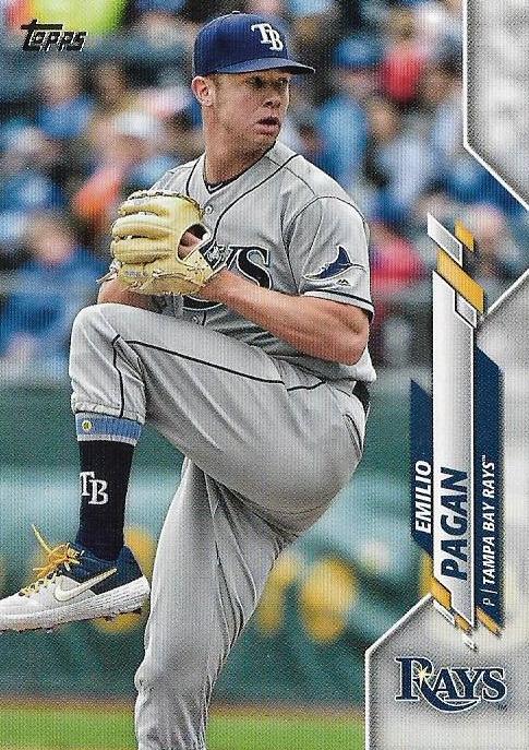
#22 - Emilio Pagan, Rays
Fifth-straight gray-themed card.

#232 - Justin Verlander, Astros, League Leaders (AL wins)
BOOOO! BOOOO! (I'm booing all the Astros cards this year).
Sixth straight gray-themed card.

#90 - Brock Holt, Red Sox
COLOR!!!!! ... Now that's a nice card. Color in the photo makes the color in the design stand out. The horizontal image allows for more flexibility with the design. You also don't see rain a lot on cards.

#179 - Ramon Laureano, Athletics
More color. Keep it coming.

#171 - Kole Calhoun, Angels

#110 - Jesus Luzardo, Athletics
I'm told he's good. OK, I'm going to hold you to that.

#85-38 - Aristides Aquino, Reds, 1985 insert
I know this guy is good. ... I've never been a big fan of the 1985 design, but pair it up with most of the back half of the 2010s designs and it blows those away. How do you not want a colorful card? What is with the obsession with gun metal gray??

#TR-92 - Marcus Stroman, Mets, Turkey Red insert
Turkey Reds are back for the first time in 10 years. I'll always appreciate those. They're not textured like some of the previous tributes but they're nice enough. They're also plentiful at almost one-per-pack. They better be as it's a 100-card set.

#32 - Brandon Woodruff, Brewers

#281 - Nelson Cruz, Twins
That's the end of the first pack. Let's dissect the design.
Generally, not a fan. Aside from the gray, it's a jumble of slashes and geometric shapes. It doesn't look like anything, which is very Bowman-esque and annoying. Nobody wants to do pennant flags or baseballs or hats anymore. Everything has to look like Tetris. No offense, Tetris, but you're not baseball.
The sideways writing doesn't bother me much, I know some don't like it. But I do think the design is confining. It reminds me of this:

And this ...

2020 Topps does a better job of allowing the photo breathe with its design than 1992 Fleer or 2007 Upper Deck did. It doesn't feel quite as claustrophobic. But it does limit what you can do with the vertical cards. All of the vertical cards in the first pack, with the exception of Hicks, Hedges, Scherzer and Laureano, had a sameness about them that is repeated throughout the blaster. That gets boring after awhile.
The design on only one side of the card makes the various parallels (gold, etc.) rather uninteresting to me. You know what would make them interesting again? Oh, yeah, borders.
Also, I have a hunch that this design was selected because it allowed for closer cropping on players so those evil backgrounds wouldn't pop up as often.
OK, enough of my words. The rest of the packs. I'm only going to show what I found interesting from here on out.
PACK 2

#5 - JaCoby Jones, Tigers

#214 - Trea Turner, Nationals
#139 - Jose Quintana, Cubs
#68 - James Paxton, Yankees
#140 - Trevor Bauer, Reds

#154 - C.J. Cron, Twins
I didn't pull any Pirates or Orioles (and, of course, no Rangers) but I did pull both Cron brothers! I'm going to credit my recent post about their father.

#190 - Aaron Nola, Phillies
Horizontal cards kicking vertical's ass.

#349 - Carlos Correa, Astros
BOOOO! BOOOOO!
#273 - Bryan Abreu, Astros
BOOOO! BOOOO! I don't know who you are. BOOOOO!

#336 - Miguel Cabrera, Tigers

#320 - Austin Hedges, Padres, Independence Day parallel 74/76
Nifty. I've pulled one of these in back-to-back years. Last year's Max Muncy was a bit more meaningful to me.

#TR-11 - Dustin May, Dodgers, Turkey Red insert
I love this thing. Right now, it's my Card of the Year. Somebody has 10 months to knock it off its throne.
#129 - Yoan Moncada, White Sox
#17 - Franmil Reyes, Indians
PACK 3

#326 - Dylan Cease, White Sox

#318 - Omar Narvaez, Mariners
#109 - Reese McGuire, Blue Jays

#148 - Willy Adames, Rays

#338 - Cubs team card
#85 - Tim & Yolmer (White Sox's Anderson and Sanchez), checklist
#285 - Tyler Alexander, Tigers
#116 - Daniel Murphy, Rockies
#40 - Bobby Bradley, Indians

#VGJ-8 - Vladimir Guerrero Jr., Target-exclusive insert
I'm going to send these Vlad Guerero Jr. inserts to Mike of Not Another Baseball Card Blog because he collects Jays but lives in an unfortunate country with no Targets. I feel bad about that.

#DB-95 - Jacob deGrom, Mets, Decades' Best insert
I was a little bit interested in this Decades insert set just because I like yearly retrospectives like this, plus I enjoy the design/color treatment of the decades. I happened to pull what's probably the dullest one of the lot. More of that gun-metal gray for the 2010s logo and deGrom practically looks like Tom Brady up there. Zzzzz.

TR-41 - Nico Hoerner, Cubs, Turkey Red insert
No idea.
#233 - David Dahl, Rockies
#340 - Adbert Alzolay, Cubs
PACK 4
#115 - Matt Thaiss, Angels

#99 - Dan Vogelbach, Mariners
I think he's slimmed down some.

#86 - Hyun-Jin Ryu, Dodgers, League Leaders, NL ERA
My first Dodger card is a Blue Jay.
#76 - Stephen Strasburg, Nationals, World Series highlights

#149 - Orlando Arcia, Brewers
I really dig the Brewers' old-school round logo. More teams need to return to that.
#293 - Wade Davis, Rockies

#267 - Joey Votto, Reds
#66 - Andrew Heaney, Angels
#251 - A.J. Puk, Athletics
#71 - Sandy Alcantara, Marlins

#296 - Whit Merrifield, Royals, foil parallel
It's possible it's the billboard ad in the background or the Royals' blue uniforms, but that foil parallel doesn't look as lame as the past ones. Don't make me like you foil parallels!

#TR-44 - Walke Buehler, Dodgers, Turkey Red insert
Doing very well with the Dodgers Turkey Reds. Just three more to go.

#289 - Yuli Gurriel, Astros
BOOOO!! BOOOOO!!! (It wouldn't surprise me if he wanted to hear the trash can bangs more than any of his teammates).
#162 - Michel Baez, Padres
PACK 5

#241 - Mike Clevinger, Indians
#312 - Billy Hamilton, Braves
#339 - Hansel Robles, Angels

#43 - Leury Garcia, White Sox
#128 - Steven Matz, Mets

#202 - Mets team card
J.D. Davis, calm down, the Wilpons will move on eventually.

#213 - Twins team card

#201 - Francisco Lindor, Indians
Like this! Teams! Put color in your uniforms again! Like this!
#124 - Jose Berrios, Twins
#215 - Luke Jackson, Braves

#85-28 - Willson Contreras, Cubs, 1985 insert
That's a nice, old-school card.

#TR-37 - Yordan Alvarez, Astros, Turkey Red insert
BOOOOO! BOOOOOO! (*looks to see how much this is going for on ebay*). BOOOOOO!
#141 - Roberto Osuna, Astros
BOOOOOO! DOUBLE BOOOO! TRIPLE BOOOOO! BOOOOOOOOO!
#108 - Josh Rojas, Diamondbacks
PACK 6
#3 - Nicky Lopez, Royals

#36 - Sean Doolittle, Nationals
#176 - Brandon Belt, Giants
#104 - Marco Gonzales, Mariners
#97 - Lewis Thorpe, Twins

#219 - Jean Segura, Phillies
That is nice. My favorite of the non-Dodgers I pulled. Old-school. It looks like baseball. Not robots in gray playing baseball.
#301 - Michael Tauchman, Yankees

#299 - David Price, Red Sox
Come on Red Sox and Twins, stop being screw-ups and get that deal done.

#256 - Roman Quinn, Phillies

#VGJ-15 - Vladimir Guerrero Jr., Blue Jays, Target-exclusive insert

#TRC-71 - Gerrit Cole, Astros, Turkey Red chrome parallel
BOOOOO! BOOOOOO! Cole's now a Yankee. BOOOOO! BOOOOOO!!! There are chrome parallels to this insert set. BOOOOOO! BOOOOOOOO!!

#TR-28 - Jose Ramirez, Indians, Turkey Red insert
I've liked my Turkey Red pulls. Good job, night owl.
#151 - Tommy La Stella, Angels
#317 - Sean Murphy, Athletics
PACK 7

#53 - Pete Alonso, Mets, League Leaders, NL HR leaders
Cute. Card #53 for 53 home runs.
#137 - Merrill Kelly, Diamondbacks
#84 - Ken Giles, Blue Jays

#218 - Braves team card. Looks like they're getting into a brawl.

#325 - Good-Bye, Home Run, Cubs, checklist

#186 - Roberto Perez, Indians
Now that there's no collisions at the plate, you get a lot of these "catchers reaching back" shots. They make for good photos. Also makes the catcher look kind of desperate all the time. But it's better than getting plowed over, I guess.
#238 - Freddy Peralta, Brewers
#93 - Alex Colome, White Sox
#257 - Joey Lucchesi, Padres
#243 - Jeimer Candelario, Tigers

#TC-9 - Ichiro (Suzuki), Mariners, Topps Choice insert set
I believe these Topps Choice cards feature "the best" designs of each decade as voted on by collectors. Best that I can tell, the designs are: 1956, 1965, 1971, 1987, 1991, 2008 and 2011. No problems with those (except for stupid 1987). Kind of grateful I don't have to collect another 1975 tribute. 2008 is a bit of an odd choice.

#TR-8 - Ozzie Albies, Braves
Like it. Don't know what's going with his cap. Is he balancing it on his glove? Or did he just toss it in the air?

#203 - Joc Pederson, Dodgers
May or may not be an Angel. Nothing is ever cut-and-dry anymore.

#48 - Jeff McNeil, Mets

OK, there was one of these things in the box. Normally, I don't buy blasters, because the manufactured medallion stuff interferes with getting more cards. But with my intention of buying few more 2020 packs, I wanted to get as much in one shot as I could. Blaster was the way to go.
Besides, these aren't too bad this year:

#RCR-AP - Albert Pujols, Cardinals, Rookie Card Retrospective Medallion
Probably the only way I'm getting the Pujols rookie card (and I likely won't even have this for long as a package for Cards on Cards is in the preparation stages).
Overall, that was a plain "C" or maybe a "C minus" as far my first look at the new cards of the season. This isn't 2015 where the design was so cool I wanted everything I could get. But that's fine, because there's so much more I want to get that doesn't involve what's on store shelves.
Still, it's always fun buying the first cards of the season. I hope I'll always say that. I'll be sad if I can't.
And I'll be sad if I can't write long-ass posts like this.
Blaster Power Rankings, 2020 Topps:
Astros - 7 (BOOOO!)
Cubs - 6
Indians - 6
Mets - 6
Angels - 5
Twins - 5
White Sox - 5
A's - 4
Blue Jays - 4
Braves - 4
Dodgers - 4
Mariners - 4
Nationals - 4
Padres - 4
Tigers - 4
Brewers - 3
Diamondbacks - 3
Phillies - 3
Reds - 3
Rockies - 3
Yankees - 3
Red Sox - 2
Rays - 2
Royals - 2
Cardinals - 1
Giants - 1
Marlins - 1
Orioles, Pirates, Rangers - 0
(Note: there were 16 rookie cards).
Total blaster rankings (since 2017)
1. Dodgers - 36
2. Yankees - 32
3. Astros - 31
3. Braves - 31
5. Cubs - 30
5. Mets - 30
5. Red Sox - 30
8. Blue Jays - 29
8. Tigers - 29
8. White Sox - 29
11. Cardinals - 25
12. A's - 24
12. Giants - 24
14. Phillies - 22
14. Reds - 22
16. Angels - 19
16. Brewers - 19
16. Pirates - 19
16. Royals - 19
20. Nationals - 18
20. Twins - 18
22. Diamondbacks - 17
22. Indians - 17
24. Mariners - 16
24. Padres - 16
24. Rockies - 16
27. Marlins - 12
27. Rangers - 12
27. Rays - 12
30. Orioles - 11
Comments
Bummer that the stupid team cards with random pictures of celebrations and such are back. Please, please, please let Heritage have real team cards with full team photos. If they can't do that, do team leaders like in the 80s, or just don't have team cards.
Having an insert set of a Blue Jays player which isn't available in Canada is really stupid on purpose. Yeesh. They couldn't have put it in Wal-Mart? I mean, it's dumb enough just having one of those for a guy who has only played one year. Not that I won't look for the Alonso cards which no doubt are coming in Series Two...but it would be better if they came out in 2025 or so.
I hate colored jerseys. Powder blues are fine, but the colored top on white/grey pants just screams minor league or spring training to me. I do think you're absolutely correct about this design looking too grey and being a lot better when there's a colored jersey in the photo. Having seen some of the colored parallels I've reached the conclusion that if that grey border had been replaced by a team color things would look way better.
Also Nico Hoerner is a Stanford guy who's been one of the hot prospects in Bowman the past couple years and as such is causing my search for his cards to run into stupid prospect prices. Thankfully now that he's debuted things are calming down.
It's incredibly dumb Topps made them Target exclusive. The only ways we can get them is through trade, card sites, or if you're close to the border, cross border shopping.
I will say that on average the photos seem to be better than past Series 1 efforts (though that may just be release-day bias on my part). I know I pulled more mini-collection hits from my packs than I can ever remember getting from Flagship -- and I see a few more I didn't pull in this post! (Also, mind setting that Turkey Red Hoerner aside for me if it's not already spoken for?)
The team ratios are crazy too. I bought two hanger boxes (67 cards each) and got TEN Astros. Of course, I'm looking for the Nationals, which I got six (plus two WS) and eight Cubs. And I'll show in my jumbo box break post that there were an overload of your favorite Giants in the parallels. Also pulled the black version of that deGrom you got...