
Topps is never going to change.
For as long as I have been collecting baseball cards, more than 40 years now, Topps has been creating alternate reality on its baseball cards.
It has placed players into uniforms of teams for which they never played. It has moved an entire ball game scene from Boston to L.A. It has erased umpires and bat boys. It has pictured living players posing with dead players. And it hasn't just been Topps doing this. Fleer and Upper Deck and probably others each have their own very well-known examples.
But this is a Topps card so I'm making it an example: what the heck are the Dodgers doing wearing red numbers on their uniform backs?
This has been pointed out by at least a couple of other bloggers already, but I can't let it go as a Dodgers devotee.
Red numbers have been a part of the Dodgers' uniform since 1952. They were created for TV. Owner Walter O'Malley liked the idea of bright numbers on the front that TV viewers could see. The story goes that the new red-number uniforms were created for when the Dodgers played in the 1951 World Series. But Bobby Thomson took care of that. So the Dodgers just debuted them at the start of the 1952 season and have worn them ever since.
But they did not ever -- at least to my knowledge -- wear red on the back!!!
Come on, who do you think these are, the Cubs??? The Dodgers are all-in with the blue theme. Dodger Blue you know. The only red you'll see anywhere is on the front tummy.
Apparently whoever was in charge of colorizing black-and-white photos from Getty Images didn't know about uniform history. It would seem logical to me that if you were altering a picture like that, you'd go to Dressed To The Nines or some other baseball history site and make sure you get the image right. Contrary to popular belief, cards are not collected by 7-year-olds anymore. This isn't going to sail over the head of a 50-year-old.
Seeing red on the uniform backs of those 1960s greats is JARRING. They DO look more like the Cubs than the Dodgers. Why the hell is Koufax celebrating with Cubs??
Anyway, let's move on. This card was sent to me by Commish Bob from The Five Tool Collector. He also sent me a Turkey Red Bellinger:

What a great card. Look at him being all correct about the Astros there. Nice red number ON THE FRONT, too.
Commish Bob's envelope was part of three tidy envelopes sent to me all in a brief flurry a few days ago.
I also received one from The Writer's Journey. Sadly, I had most of the cards already except for one.
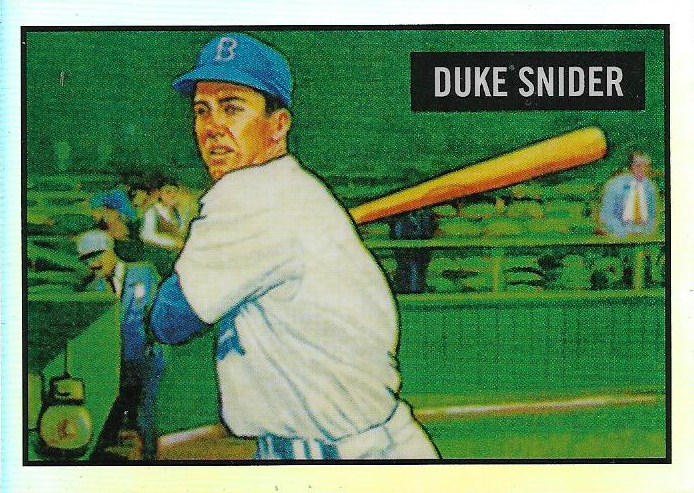
This is a 2017 "Bowman Reproduction" of Duke Snider's 1951 Bowman card. It is all chromed up and for some reason signed by an artist on the back:

I don't really get it. Is this a painting of the original 1951 Bowman card, which was also a painting or drawing or artistic embellishment. Is this a painting of a painting? This might be too arty for my brain.
OK, let's go to one more small envelope with some somewhat less baffling cards.

Greg from The Collective Mind sent me a few Dodgers including a rare new-to-me Orel Hershiser card. I seem to be able to add new cards of my other Dodger favorites quite frequently -- Kershaw, Koufax, Nomo, even Cey. But there isn't too much new on Hershiser. This is appreciated.
(P.S.: this isn't saying there aren't plenty of Hershiser cards to acquire. I could buy all those '80s Star cards of Hershiser for the next two years).

Wooo! A 1995 Archives need. This brings my want list for this set, which is huge, down to four cards!

Finally this glorious thing. I sure am enjoying getting Dustin May cards in 2020. I could get used to this. But May's going to have to live up to his end of the bargain and not suck.
Many thanks for the cards guys!
Stuff like this is going to get me through the blizzard over the next two days.
Yes, blizzard.
Winter's been pretty upset about how easy we've had it around here.
Comments
This got a big chuckle out of me. Take care in the blizzard.
Congrats on picking up some nice Dodgers cards. That black-border Dustin May is especially nice.
I never heard of this one. Which card featured this?