
I received this card and most of the rest of the Dodgers from the 1993 Topps Florida Marlins commemorative factory set from Cardsplitter at The Call of Cardboard. Topps issued a Marlins set and Rockies set to recognize the first seasons of the two franchises.
The cards are the same in every way to the regular '93 set except for a stamp with a Marlins logo for the Marlins set and a Rockies logo for the Rockies set.
I hate ripping on cards that are sent to me through the sheer goodwill of others, but I can not stand parallel cards like this. These are the definition of pointless parallels.
But back in '93 that's what parallels were, mere foil stamping. I am sure collectors ate this up back then. I was on my way out of collecting in 1993 so I don't know if I thought anything about them at all.
Since then, parallels are all growed up. Some of them are so fantastic that it makes you forget that it's a fancied-up duplicate of the base card. Some of them are garbage. And it's time that someone establish the difference between the two.
I thought I'd set up a meter that demonstrates the spectrum of parallels, from the worst to the best. This is totally subjective according to my tastes, so take that under advisement.
Also, I know I've missed many, many types of parallels. Some, like Bomwan International of the late '90s or this year's Topps diamond parallels, I couldn't conveniently categorize. Some, like Chrome, Opening Day and First Edition, are basically set parallels. I ignored those. But feel free to mention any missing ones. If I have cards of those parallels, I'll update this post.
OK, on with the meter:
Level 1 - Card back parallels
Card back parallels are junk. Useless, frustrating and a cynical money grab. The Heritage back variations that you see here at least had some basis in history. But the A&G and other tobacco retro back variations need to exit ASAP. Their connection to history is tenuous at best.


Level 2 - Silver/Gold-foil lettering parallels
Perhaps this had its place in the 1990s, but in the 21st century it's the height of ridiculousness. I almost always end up throwing cards like this in the dupes box. If I'm lucky, I realize seven months later that it's a parallel. The sign of a good parallel is it smacks you in the face with its parallelness. But these gold-lettering things are way too wimpy to smack anything.
Topps Stars was an entire set based on different colored lettering. I do not like that set at all.


Level 3 - Stamped parallels
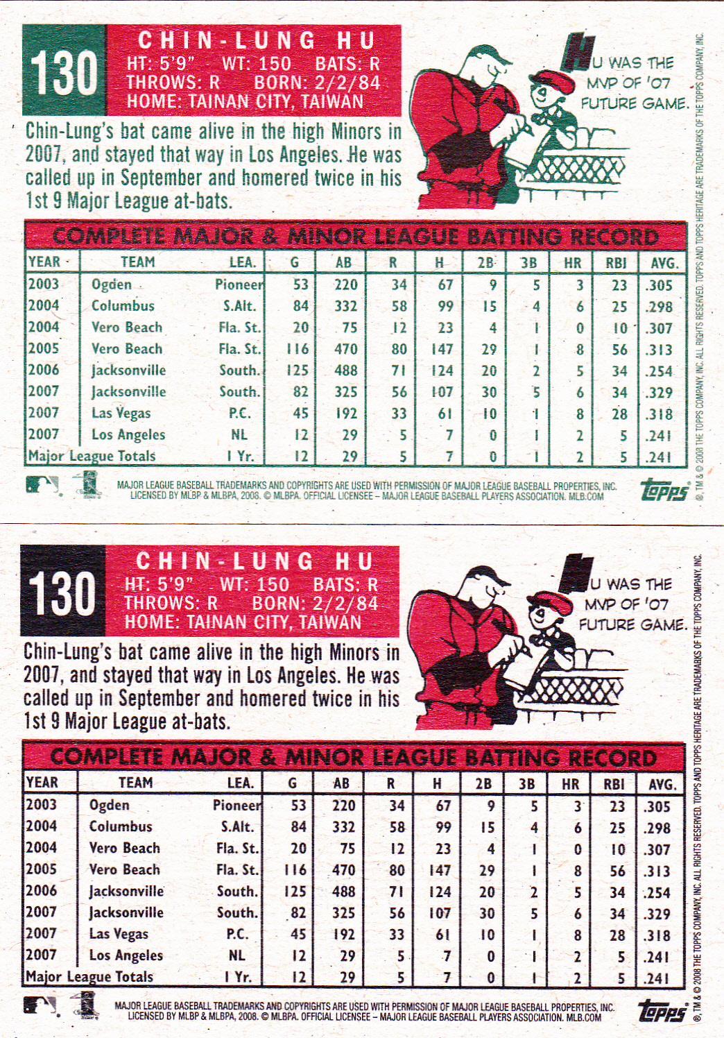
This covers the 1992 gold-stamped cards, Stadium Club First Day Issues, Postseason commemorative cards of the '90s, the Marlins/Rockies sets mentioned above, etc.
I'm sure these were fantastic back then. But, today, when I see them, I can't help but think how much money was wasted on a simple foil stamping. Part of my viewpoint comes from the fact that I wasn't collecting much then, so I totally missed the craze. But really, even those of you who got caught up in it have to admit it is pretty lame in hindsight.

Level 4 - Photographer's Proof/Press Proof parallels
Just the name "Photographer's Proof" lends an air of exclusivity. And, of course, most of these cards are numbered on the back so they are somewhat exclusive. But I never understood the connection to an actual "proof" that a photographer would make. Maybe if I understood the connection, I'd rank this higher.


Level 5 - Diecut parallels
These aren't the greatest examples. There are a lot better versions. But at least the Hudson Ticket to Stardom card demonstrates why diecut parallels are in the middle of the pack. That deckle edge thing might be the worst parallel ever.

Level 6 - Bronze bordered parallels (sent to me by Things Are Funner Here).

Level 7 - Foil parallels
I'm sure these were very sweet at one time, too. But now they look as cheap as anything that card companies manufacture. Very dated.

Level 8 - Walmart black and Topps throwback parallels

Level 9 - Gold bordered parallels
This used to be the king of all parallels. Ten years ago, every set was covered in gold and silver. But, like the last days of disco, people are starting to realize that taste is important. As sad as it is to say, I think it's time for gold bordered parallels to be taken off the respirator.

Level 10 - Refractor and xrefractor parallels
I've never fully understood the refractor and xrefractor. But at some point I realized that they weren't made to be understood. They were made so people could look at the pretty colors bouncing off the card. Woaoaoaoaoahhhh!!!! I have no problem with that. Rock on, refractor!

Level 11 - Chrome parallels (sent to me by Lifetime Topps project)
Ooooh, who doesn't love chrome? Only communists. I like chrome so much that I'm willing to see it on vintage style designs of the '50s and '60s. Normally, such a combination would make me tear out my eyes with salad tongs. But it's too beauteous to ever do such a thing.

Level 12 - Mini parallels
I know, I know, you'd rank this a lot higher. People flip out over minis. It's the main reason why Allen & Ginter is still chugging along five years later. I like minis, too. They create a mild storage issue, but once you hold them in your hand, you cannot deny that the mini parallel is here to stay forever.

Level 13 - Black bordered parallels
If you ask me, everything looks better with a black border. Everything. It is the instant cure for a dull set. Black borders are so cool that Topps has convinced collectors to collect a parallel (A&G black border minis) of a parallel (A&G minis). Diabolical.


Level 14 - Colored bordered parallels
Possibly the most successful parallel of all-time. How many collectors are out there collecting Masterpieces border variations? Meanwhile, I absolutely love all chrome colored refractors. They are among the most fantastic modern day cards ever made. The Kershaw is still one of my favorite cards.


Level 15 - Color parallels (Loney sent by Thoughts and Sox)
For me, color parallels, or rainbow parallels, are the best parallels of all-time. They're even better than the color border parallels because the color covers more of the card. These kinds of parallels make me forget completely that there is a base version of the card. And if you can make a collector forget that, then you've hit the gold mine.
The Upper Deck Baseball Heroes is probably the most successful version of this parallel, just because the base card is so achingly dull, it would never succeed without parallels. But people are collecting the set to this day because of them.
So, that's the meter. Use it for good, not for evil.
Parallels really are the life blood of many a card set. Some are well-executed and some are miserable.
And it all started with some gold stamping.
(Or maybe with 1989 Donruss).
Comments
Or maybe that is why it is a proof; "see, I told you I could photoshop the ump out and no one would notice."
I would get fired for something like that.
I like parallels, except figuring out how to spell the word.I just wish there wasn't so many of them. Do we really need 5 parallels of every base card in 2011 Topps?
(diamond, gold, black, wal-mart, target- did I miss any?)
I'm not a big fan of parallels in general. Rarely is there any thought, creativity, or personality to them. There are some cool ones, like the Target throwbacks. And I will eventually (maybe this year) do a rainbow of color parallels (or borders). I agree those are the best if I have to choose. But they're still the same as the base card, just with a different border.
Oh, and I love the Baseball Heroes sets, going all the way back to the originals with Reggie Jackson, Ted Williams, etc. I'm glad they never changed the design. Okay, they did in the mid-90's, for a few sets. But I agree that the color parallels look great.
2.) The Masterpieces (and early-mid 2000s Gridiron/Diamond Kings sets, and I guess Gypsy Queen) framed parallels should probably be their own thing, since the border is noticeably raised.
3.) When Heritage gets to 1975, the chrome refractor parallels are gonna blow people's bippin' minds. I hope they introduce X-Fractors/Atomic Refractors/Superfractors/or the old Fleer/Skybox Warp Tek into Heritage by then, or just for that set, because it would be the most epic thing in the history of this great hobby.
I think they should cut the colored parallels to 2 per card. You have the base, the team color 1, and the team color 2. Ex: the Giants would have base, black, and orange. 3 versions makes for great binders.