There was a lot of buzz about new baseball cards yesterday, and of course I didn't have time to weigh in on it myself.
But what I did want to say is "I like it". Yes, I actually like the 2015 Topps baseball design that you see here. The fact that it's not the same old white border is welcome. The gradient format is always cool. And I'm happy that the border color will change depending on the team. That should be mandatory with each year's design.
New set designs always remind me of old designs, even if I can't quite place them all the time. This one reminds me of the cards that appeared in 2001 Donruss, the "Cards That Should Have Been" inserts from the mythical 2000 Donruss (Donruss didn't actually put out cards in 1999 or 2000). Here is a look at one of them:
Not quite the same, but there's a resemblance.
But actually what I wanted to focus on was a set that is actually already here. It's 2014 Finest.
Yeah, I know. What do I care are about Finest? Night Owl doesn't have access to hobby-only cards.
And it's true. I've probably gone about four years without buying or even discussing Finest. But that's because the last few years haven't really drawn my attention.
Then, a day or so ago, I was innocently wandering the internets when I saw what 2014 Finest looked like and, wow, it's beautiful.
OK, so that's a little unfair. That's the refractor, which are always so much more fantastic. But I even like the more muted base card.
It's got color. It has an electric-rainbow-in-the-dark feel, which I love. And the refractors look like watercolors. Which I also love.
And it dawned on me that Finest is really where a baseball card gets a chance to show off. I think the best designs are not in the base set or, god forbid, in Gypsy Queen or Triple Threads, but in Finest. If I were a card designer, I'd want to design Finest.
I was so jazzed with this year's design that I went through and found a Dodger representative for each year of Finest. Here they are:
 |
| 1993 |
 |
| 1994 |
 |
| 1995 |
 |
| 1996 |
 |
| 1997 |
 |
| 1998 |
 |
| 1999 |
 |
| 2000 |
 |
| 2001 |
 |
| 2002 |
 |
| 2003 |
 |
| 2004 |
 |
| 2005 |
 |
| 2006 |
 |
| 2007 |
 |
| 2008 |
 |
| 2009 |
 |
| 2010 |
 |
| 2011 |
 |
| 2012 |
 |
| 2013 | |
 |
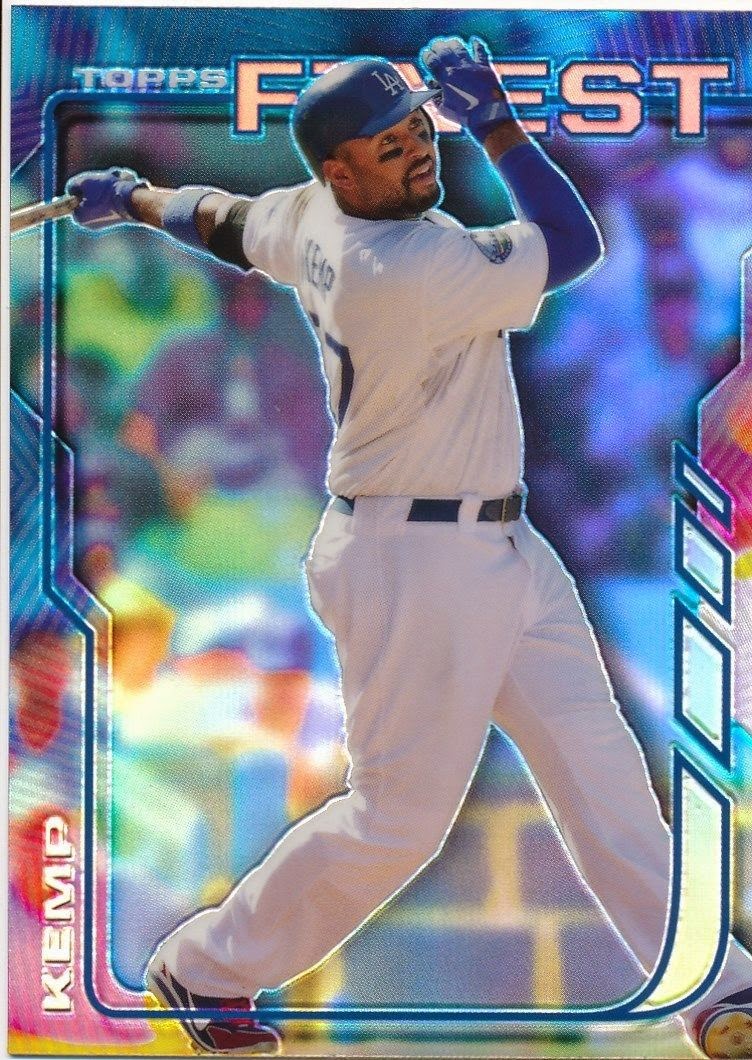
| 2014 |
Not all of those designs are my favorites. I really dislike all the lettering and browness of the 1996 set and the more metallic the set, the less I enjoy it. But the 1994 set has always been a hoot, and I curse Beardy (remember him?) to this day for hooking me on 2004 Finest. That might be in my top 10 of all-time best-looking sets.
To that end, Topps has added a whole bunch of '90s tribute inserts into the 2014 Finest set in the hopes of hooking '90s collectors. Since I'm not one of those people, I have no interest in the inserts and probably would be disgusted if I pulled one instead of one of the snazzy base cards (the parallels, meanwhile, are another matter. They're always welcome -- because I'm addicted).
But it's nice that Finest has lasted long enough that we can get an idea of the interesting design work over the years.
If I was in a little less stable place, I'd hop online and try to complete this set, but I won't do that.
I'll probably just try to gather up a few more Dodgers than 3 or 4 Finest Dodgers I manage each year.
Yup, that's me. Throwing money at something purty.


Comments