
One thing that Archives has over its second-tier set peers, like Gypsy Queen and Opening Day, is staying power.
Although I've never liked the way Topps has approached or produced Archives, you can't help but analyze it if you are a veteran collector or a fan of history. And this is how Topps gets the word out. Collectors are going to talk about the set whether they enjoy it or not, because the set is tied to history and card collectors' histories. We think we know the way the cards should be because we hold those collecting memories close ... very close.
More than most sets, Archives brings out not our love for baseball or a certain team or individual players, but our love for cards.
That explains why we want to see this set succeed or -- if it can't match our appreciation for card history -- wither and die.
And it explains why we get upset when Topps returns to the 1980 design, two years after it included the 1980 design in the first edition of Archives.
But since Topps is going back to 1980, again, well, dammit, let's go back to 1980.
You remember that year, right? The Miracle on Ice, Howard Cosell fawning over the Astros, all in all you're just another brick in the wall?
(If you don't remember, like I always say to the smug youngers, you missed a lot).
I know 1980 Topps well, because it's the first set I tried to actively complete. I became very familiar with the cards, particularly certain duplicates (I'm looking at you Buck Martinez). But one thing that 1980 Topps didn't have were Tampa Bay Rays cards. And because of that Topps had to pick a specific color scheme to go with the team in the Archives set, since each team in the 1980 set had the same color scheme for all players.
In the 2012 Archives set, Topps picked these colors for the Rays:

The orange and purple flags and red border match the colors used with two teams in the 1980 set:

It's the Pirates and the Twins, although as you can see, the purple flag is PURPLE in the 1980 set (and now I have that paint commercial in my head). It's not a true match, though, as the name line for Jennings is red while the 1980 namelines are black.
By the way, I am just noticing now that Bill Madlock is airbrushed into a Pirates uniform.
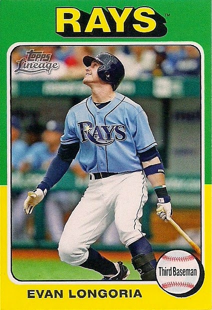
But, as you probably realized a few moments ago, Topps changed the color scheme for the Rays for 2014 Archives:

Instead of orange, purple and red, the Rays are now featured in green, yellow and blue.
This matches more with the Rays' actual uniforms, but if you know anything about 1980 Topps, you know that it didn't give squat about matching the design colors with the team. The Royals got yellow flags, the Braves got orange and the Reds -- you guessed it -- got blue.
So, Topps really made an unnecessary switch here. But since they did, which teams does this color scheme match up with in the 1980 set?

Well, it's kind of a combination of teams. The yellow and green flag and blue borders match the 1980 Padres and A's cards. But the white lettering-on-a-green flag matches the Blue Jays cards. And the black position lettering in the yellow flag doesn't match any of them.
The Rays cards in this set are actually a color scheme unto themselves.
It's kind of like what happened in Archives' predecessor, Lineage, in 2011.
For the 1975 mini insert set, this card did not match any color combination in the 1975 set (the green-yellow border existed, but with red team names, not yellow). It is a color scheme unto its own.
Now, since Archives duplicated the 1980 set two years apart, let's help beat this into the ground and compare the backs:

2014 Archives is on the top, 2012 Archives is on the bottom.
Right away, you can see that the name heading was converted to all caps. Also the team name is now italicized. The typeface used for the cartoon is different, and the team name used in the stats has been changed from the city name to the team nickname.
Also, the white portion of the card has now been changed to gray, which I guess is supposed to mimic actual cardboard (faux cardboard, who would have imagined such a thing?).
Now, let's see whether the 2014 or the 2012 back is closer to the actual 1980 back:

It appears that Topps has taken a step forward and a couple steps back with the 2014 card back.
First the forward stuff: Topps changing the stats to reflect the team nickname instead of the city name matches the 1980 style. Also the typeface for the cartoon seems a little closer to what was used in 1980, although in 1980 the typeface was all caps, which is a lot easier to read than what Topps used in 2012 or 2014.
As far as taking a step back, Topps has the name line all in caps in the 2014 set and that never happened in 1980. It also italicized the team name at the top and that also never happened.
Now, I'm not really one of those collectors who thinks "Topps you EEEED-I-OT, you can't even get your own design right!" I used to think that way and I still do think there isn't as much attention to detail as there could be at headquarters. But I also think that Topps is trying to differentiate the cards from the actual 1980 set (or whatever set to which they're paying tribute) for legal or other reasons. After all, Topps has shown it can do a pretty faithful re-creation of past sets with Heritage.
And it just may be that Topps knows that nerdy collectors like me are going to analyze each card to infinity, thereby creating more publicity for a set that actually doesn't deserve as much talk as it gets.
There's a lot more I could do here -- show all the 1986-style cards that don't match the colors used for the team names in the actual 1986 set, point out that the team names are much larger in the 1989 design than they were in 1989 -- but I think I'll shut up now.
But if Archives ever selects the 1975 design for one of the base designs (not as one of the SPs as it did two years go), whoa, get ready.
That will be Some Publicity.
Comments
Incidentally, I like the 2014 color scheme for the Rays a LOT better than 2012...