
One thing that this exercise has taught me is how differently people perceive the exact same thing. It's a simple piece of cardboard with various shapes, colors and lines. But depending on the collector viewing it, it is either the best piece of cardboard ever devised or a train wreck.
For the first time in this "biggest improvement/biggest bust" series you will see a certain combination on each list TWICE. That's right, according to your comments, people think that 1982-83 Fleer and 1994-95 Fleer is both the biggest improvement and the biggest bust.
I'm tempted to think this is just people trolling or being contrary, but I don't think it is. As my grandma used to say, "that's why there's vodka and beer" (OK, really she said, "that's why there's chocolate and vanilla."). People just like different stuff.
So without further babbling, I will present to you the candidates for selection as Fleer's "Biggest Improvement" and "Biggest Bust." I've altered the sidebar -- something I'm loathe to do -- just so you can vote. So don't let all that effort go to waste. Be a dear, and vote (channeling grandma again).
The candidates:
BIGGEST IMPROVEMENT

1982-83: Here is one of the finalists that appears on both lists. My personal view is that this is not an improvement. I don't like the 1983 gray borders. But there's logic to this. 1982 Fleer had a whole lot of blurry and mis-cropped photos. 1983 didn't have as many. And it had a team logo on the front.

1983-84: You're seeing the divergent opinions already. 1983 Fleer was already an improvement! How can it be improved upon? Davey Lopes wants an answer! Well, if you're asking me, I think there's a lot to improve upon with '83 Fleer. And 1984 Fleer did it. The '84 Fleer set might be my most favorite Fleer set.

1991-92: Pete Incaviglia looks like he's trying to get away from 1991 Fleer. I don't blame him. It's unhealthy to be that close to the sun. I'm not crazy about '92 Fleer, but I understand the sentiment here, too. Anything is an improvement over '91 Fleer.

1993-94: I'm surprised this didn't get a few more votes. Gray/silver borders always suck. ALWAYS. Meanwhile, 1994 Fleer is one of the few understated sets of the '90s. Flashy collectors may not like it, but it has a definite following.

1994-95: You might need therapy if you consider this an improvement. But that's me being judgmental again. Sorry.

1995-96: This received the most nominations. I'm not a big fan of Fleer's matte-finish era, but I think a lot of collectors were happy that Fleer's psychotic era had ended and the company was ready to return to civilized society in 1996.
BIGGEST BUST

1982-83: You just saw this on the "biggest improvement" list. Crazy, huh? I like '82 Fleer better than '83 and remember being disappointed when I pulled those first 1983 Fleer out of packs. But I don't know if I'd call it the biggest bust in the Fleer era.

1987-88: Don't really get this one. I consider both sets to be fairly respectable and better than what Fleer put out in 1985 and 1986. 1987 is kind of cool in a way that '88 Fleer never will be so maybe that was the thought here.

1988-89: I agree. If I could find someone to take all of my 1989 Fleer cards, it would be the best day ever.

1990-91: I've mentioned this before. I didn't buy any Fleer in 1990 (I didn't buy more than a few packs of anything that year). When I was at a card show a couple years later, I saw '90 Fleer for the first time and said, "Ugh. Why would anyone collect that?" Then the following year, I bought packs of '91 Fleer and I find out what "uncollectable" was really about.
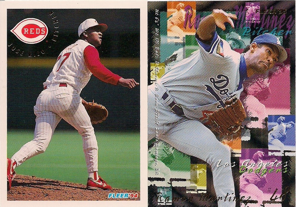
1994-95: Far-and-away the most cited example. 1994 is your brain. 1995 is your brain on drugs.
But as we've found out. Some collectors like being on drugs ... sorry, judging again.
So those are your voting options.
The poll is on the sidebar. I'll link to this post so people who don't visit every day (what's wrong with you?) can go to this post and vote at their convenience.
As usual, thanks for playing.
Comments
The 1994 Fleer set is just a gorgeous set - clean fronts, nice photos and a well-planned, color coordinated back. Some of the foil stamping has chipped on my '94 Fleer cards, but I can live with that. When the 1995 Fleer set came out, I honestly thought it was a practical joke. Sadly, it was not.
For a similar reason, I didn't go with 94-95 as the biggest bust, though I understand why it's dominating the voting. But I think 88 was a nice set, and 89 is pretty hideous.
I can't remember even seeing the '95 set until you put it up on the blog the other day. I thought you were joking at first. Did anyone lose their job over that one?
Biggest Bust: 87 to 88
I stopped in '84 and started again in '05, so I missed the pain that is '95. Would hate to have to sort that one, either in number or team order.
Always liked the '83s. It's not quite grey to me, but a slightly more exotic pewter or something. They're much more elegant than the surrounding designs.
I think '82 to '83 is the biggest drop off.