
The most consistently difficult task to perform in my line of work is writing a headline.
Newspaper readers bag on headlines all the time. They mock them. They deride them. They call up enraged, like any idiot can write a headline.
They're wrong. You have to be a semi-idiot to write a headline.
It is no easy task to write a few words that make sense together, that is accurate enough to sum up the copy below, that is interesting enough to get someone to read the story, AND that all can be crammed into the proper amount of space, using the properly sized letters in the proper font.
I struggle with it daily. Some people have a talent for it. I don't. So usually I produce a workmanlike headline and move on. I count the clever headlines that I've written on one hand.
When Miami and Virginia Tech announced they were leaving for the Atlantic Coast Conference, I wrote: "They ACC-ept."
When a referee called a basketball player for a controversial traveling call that led the team to lose and begin their playoffs on the road, I wrote: "Ref calls travel, JCC will"
When fuzzy, furry Johnny Damon left the Red Sox to sign with the Yankees, I wrote: "Hairs Johnny!"
That's about as clever as I get.
So I know how difficult it can be to write headlines -- even in this world where no one cares about newspapers or writing, where teenagers are spelling uncle with a "K" in their English classes (ask my daughter), when every excuse is "but that's how I TEXT it." There are still expectations placed on headlines.
Headlines are such a part of our culture that they are constantly mimicked in myriad ways, including in baseball cards. There are abundant examples of headline-style designs in cards.
For my purposes, I'm going to focus on the Topps Traded cards of the '70s.

The 1974 Topps Traded set was the first time that a traded set used a newspaper-style theme. No, it wasn't on the front.
It was on the back:

As you can see, Topps tried to be creative with its headlines, riffing off the name in most cases. Playing off a person's name in a headline is now considered passe -- borderline childish -- in the "serious" newspaper world today, but I've always liked it.


"Juanderful." Isn't that wonderful?
It's fun. I like it.


A play on General Sherman's famous Civil War march to the sea through Georgia. Not the same spelling, though.


This one made me smile. Until I thought of what my boss would say if I wrote it. Not smiling anymore.
Not every headline in the 1974 Topps Traded set tried to be clever. A few went the straight-ahead route.
When the 1976 Traded set came around, the headlines moved out front.

Most of them were very straightforward.
But a few tried to be cute.

Alliteration is always fun.

Playing off of George "Doc" Medich's nickname.
Even in these days of rapidly declining newspaper circulations, and newspapers migrating to the internet, where headline-writing is less confining (there is almost unlimited space compared with an actual paper), Topps continues to go back to the headline/newspaper style.
There was that massive 2008 insert set, with a newspaper card for every day of the baseball season. I gave up on that one fast.
And then, when the 2012 Update set came out, I found out that there would be a newspaper-style insert that would cover big deals in baseball history.
That got me very interested. You can't take the newspaper out of the man, no matter how often he blogs or tweets. I couldn't wait to see them.
But then I did:

Meh.
The design is all right, but that stupid, unnecessary trademark symbol destroys the whole thing.
And then I read the headline: "Dodgers Get Ramirez."
OK, that's about as boring as anything you could write. Even I try to make it more interesting than that when I'm writing headlines.
However, there were instances in 1974 and 1976 when the headline simply said "Team Gets Player." Topps just mixed it up a little more than they did this year.
As you can see:

I pulled this card out of a pack the other day. At first I thought they put some other image on Manny Ramirez's card and there was an error version. And then I remembered that Hanley is actually ON the Dodgers.
But the same headline? For someone with the same name?
That's weak.
Little did I know how weak.


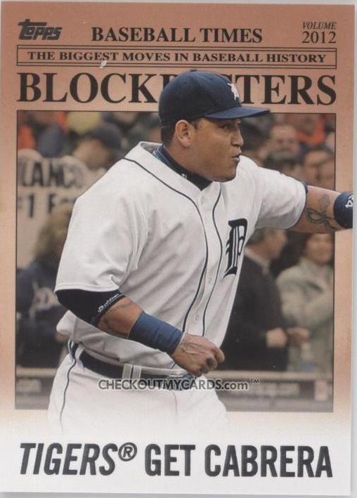


Sense a theme?
"Topps Gets in a Rut."
I think I'll try to get away with that at work and see if anyone notices.
I expect my voice mail to be full the next day.
I suppose it's not the worst thing in the world. Especially now, when everyone cares about the pretty pictures a lot more than what is written.
But I notice it. And I can't help but think that's it's another case of not trying -- or not trying hard enough.
Yeah, it's a little thing.
We editors notice little things.
Comments