
That is a statement that you would have never heard me say 10 years ago or even five years ago. I mean, come on! Yesterday's designs are fantastic! They're waaaaaaaaay better than today's designs!
But that's how much of a hot mess Topps Archives is. It's changed my entire card view.
I was at the local Target yesterday, scrambling for a Father's Day gift (I hope others in my family are doing the same), and I turned up both Archives and Topps Series 2 rack packs on the shelves (there were loosies of Series 2, too).
This was an excellent opportunity to see which package I would enjoy more, given that I had seen neither except on the blogs. Of course, I knew full well which one I would like better. You don't pick up a thin pack of Archives -- 18 cards for $4.99 -- and a fat pack of Series 2 -- 36 cards for $5.99 -- and not feel the resentment growing already.
Before opening the Archives pack, I checked out the odds:

The "Base Card Short Print odds" (by the way, the term "base card short print" makes me feel like I'm standing in line in 1960s Communist Bulgaria waiting for bread) are 1:20, which isn't the horrific 1:70 of hobby packs, but it's still pretty galling. Twenty of these rack packs at 5 bucks each -- $100 -- will get you a short-printed base card.
That reminded me of how irked I am at Archives all over again, so I'm afraid I didn't care much for what came out of the packs. Here they are separated by design:

1983

1957

1976
There was one fewer '76-designed card because of the insert, which I'll show in a moment. I would have preferred one fewer '83 card or '57 card because of how much nostalgia I have invested in 1976 Topps, but whatever.

The backs are pretty faithful to the originals (actually the fronts are, too). But I am reminded that despite the inclusion of three of the better Topps designs, these are also three of the most awful backs that Topps has ever made.
As for the cards themselves, they're the same as Archives has been since it was resurrected in 2012 in its current mutant form. Same thinness, same feel, same "I suddenly don't care about these and want them to go away" feeling I get when opening Archives in the past. I won't buy another pack.
But I am glad I bought this pack, because this was my insert:

I have a sense that nobody's going to be sending me Joc Pederson cards pretty soon so it's good to get this one crossed off before people discover that he's at least as good as that guy in Chicago that Topps keeps pushing as wonderboy.
So ... I opened that pack first in full anticipation that I would need a pick-me-up afterward.
Which is why we're moving on to the Series 2 pack. This pack is supposed to a continuation my quest to complete the flagship set this year. Whenever Series 2 comes along, I evaluate whether the completion idea is still a good one. I'm a little uncertain at this point, but I think I'll stick it out.
And now on with 36 cards of Series 2, which I'll drag out because I like it better than Archives:

#678 - Sam Freeman, Cardinals
It's odd seeing that number after so many recent years of 660-ish cards.

#544 - Travis d'Arnaud, Mets

#578 - Ender Inciarte, Los D'backs
His name is close to "incendiary" and I don't like it. The Diamondbacks are like a kid playing with roll caps on the sidewalk (remember those?). Just shut up, the Dodgers are trying to get something done here.

#438 - DJ LeMahieu, Rockies
LeMahieu turning two.

#530 - Chris Heston, Giants
The no-hitter guy. I miss the days when Giants pitchers would get bombed every start.
#393 - Danny Salazar, Indians
#368 - David Robertson, White Sox
#619 - Kevin Gausman, Orioles
#363 - Avisail Garcia, White Sox

#651 - Andrelton Simmons, Braves
The horizontal portion of the package.

#478 - Los Angeles Dodgers

#545 - Clayton Kershaw, MVP, Dodgers
Weeeeeeeeee!

#563 - J.J. Hardy, Orioles
Hardy staying in his running lane, like a good modern ballplayer.

#570 - Jarrod Dyson, Royals
#489 - Jeremy Hellickson, Diamondbacks
#558 - Patrick Corbin, Diamondbacks

#564 - Jose Quintana, White Sox
#529 - Ryan Flaherty, Orioles
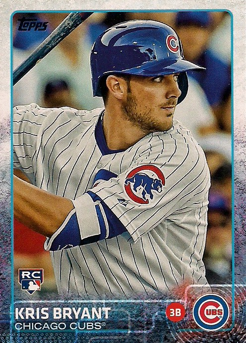
#616 - Kris Bryant, Cubs
OMG, it's Wonderboy! Should I phone Topps? What'd I win? WHAT'D I WIN? I HAVE A KRIS BRYANT CARD EVERYBODY. I AM AN ACHIEVER!

#422 - Prince Fielder, Rangers, gold
Hmmm. I think I do owe Play At the Plate some cards.

#H-35 - Babe Ruth, Yankees, Highlight, 1934 insert

#HOR-4 - Ken Griffey Jr., Mariners, Heart of the Order insert
This is one of the new inserts for Series 2. It doesn't do anything for me, although I think Topps did an excellent job of making bats look like loaves of bread in a deli.

#FHR-34 - Alex Gordon, Royals, First Home Run insert

EH-9 - Derek Jeter/Lou Gehrig, Eclipsing History insert
Another new insert. This one recognizes Derek Jeter surpassing Lou Gehrig for the career team record in singles. Nowhere on this card is the word "bloopmaster" used. I'm disappointed.

Hey collectors! Spend all the free time you don't have collecting cards that don't exist!

#526 - Will Middlebrooks, Padres
The new Padres same as the old Padres.

#671 - Gerrit Cole, Pirates
#352 - Jaime Garcia, Cardinals
#395 - Chris Taylor, Mariners

#507 - A.J. Pierzynski, Braves

#439 - Kenley Jansen, Dodgers
Yay!
This photo looks exceptionally dark.
#374 - Nick Martinez, Rangers

#626 - Hanley Ramirez, Red Sox
Photoshopping in action -- there's an insert set for you.
#435 - Mike Fiers, Brewers
#606 - Ian Desmond, Nationals
#579 - Jason Hammel, Cubs

#604 - Jordan Schafer, Twins
Last card, and, wow, it's a great one, too.
Even though everyone knows what flagship is all about at this point in the collecting season, this still was more interesting to me than Archives.
As I've said before, that's a shame, because there's no way today's players on yesterday's designs should produce that feeble of a reaction.
Perhaps it's time for a "How To Fix Archives" post.
Look for that next week.
Meanwhile, I'll take your Series 2 dupes.
Comments
I'll be stopping on the way home to see if I can get some and I'm sure I'll pull lots of Dodgers. I always do.
Odds of an Archives SP are 1:20 retail JUMBO packs (with 18 cards somehow constituting a Jumbo). Among standard 8 card retail packs, the odds for an Archives SP are 1:47.
Look, I can't help it. I LOATHE modern Topps. Modern Topps makes me throw up in my mouth a little. Even though this year's is generally (if marginally) better than the other Topps issues since 2000 or 2001, it still exhibits everything I HATE about modern cards. Primarily all action photos. I don't like action photos on cards and I don't want action photos on cards. I find action cards--by and large--disgusting. It takes away the whole point of collecting baseball cards, in my opinion, which is to actually see what the players look like and imagine yourself as one of them. Give me the faux pitch pose and the faux batting pose and the faux fielding pose any day of the week and twice on Sundays. I can do that. I can stand there with a bat on my shoulder and a look of concentration. Don't show me diving catches I could never hope to make myself even when I was younger or pitchers grimacing mid-delivery or tiny little stick figure Jordan Schaefers where you can't even tell if its really Jordan Schafer or some computer generated crash test dummy. God, I hate that. I've hated it since '71. And then there's always that attempt to be "high tech" with the borders. Its like they're trying too hard. "See kids? We're cool and hip and just as into video games and all that other electronic stuff as you are". It's like your smelly 85 year old Uncle Percy telling you he loves listening to that "Jay Zee feller". This year's design would be so much better (IMO) if it were a solid color fade without all that CSI crap.
The old designs are classics. They're simple and "clean" and they don't make my head hurt like meaningless, made up statistics like "WAR". They're colorful without being annoying and trendy. You see any Topps card from the 50s into the 80s and you know exactly what year it is. You see a modern Topps design 5 or 10 years later and you haven't got a clue. Even at their best, modern Topps are utterly forgettable.
Now this SP business is unconscionable and I won't give them any more of my money buying it because of that (having bought the box I did before I knew the SP odds). But, other than that, give me Danny Murphy posed on a '76 design any day rather than "in action" on modern Topps' designs. I just wish they were making some new retro-looking simple card designs instead of retreading the old ones all the time.
Now it might be I'm the only one who feels this way (though, if that were true, my guess is Archives and Heritage wouldn't be around anymore). But I can assure you of one thing. I bought a box of Archives and a box of Topps series 2. And I very much enjoyed ripping the Archives more than ripping the Topps. It wasn't even close. I open Archives excited to see what's next. I open Topps knowing they're all going to look pretty much the same. Opening Archives was a joy. Opening Topps was a chore.
Could Archives be better? Absolutely. But Topps flagship has been crap for decades. Advantage Archives.
And Heritage blows them both away.
Archives committed the unpardonable sin. Sorry. Topps flagship wins.
I haven't seen any Archive packs here yet, but I'm not a fan of the designs this year, though I do like the Pujols card. I'll probably pass on them this year. I am liking the Heritage cards more as usual.