
I've never been a star-chaser. I don't stand in lines for autographs or thrust balls at famous people to sign. I don't go to Broadway shows, tour Hollywood homes, or even watch many movies. As for cards, I think I established the kind of collector I am way back when.
I don't need a map to the stars. Star cards are only slightly more interesting than "common" cards, and I'd rather have a card of that forgotten long reliever than a second card of an all-star.
But we don't live in that collecting world anymore and haven't for some time.
I'm going to go ahead and blame Fleer's SuperStar Specials.
OK, that's a little unfair. Fleer didn't activate the star-worshipping that we now know all by itself. It had partners in crime in Donruss, Upper Deck, Topps, Sportflics, Score, etc. And before I get too high on the horse, I'll remind everyone that my beloved Kellogg's 3-D Super Stars was almost nothing but star players.
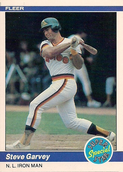
But this is about Fleer and the SuperStar Special.
The genesis of the SuperStar Special, which from what I can gather ruled from 1983-94, arrived in Fleer's return to the hobby in 1981.

Fleer issued a second photo of certain star players in its set that year. The second card would replace the position designation with some sort of title, such as "Slugger".
There was no label for these cards at the time, just an extra card. As someone who had collected since 1975 with the standard of "one card per player," this was odd and kind of unnecessary.
Fleer didn't have much of a pattern for these initial cards.

Hal McRae's "extra" card contains an orange border, while the other Royals base cards have yellow borders (meanwhile George Foster's extra card has the same border color as his base card).

Reggie Jackson's title is on top of his name instead of below it.

Whut?
But a pattern had been established, even if no one knew it at the time.
In 1982, Fleer continued with extra cards of certain star players, but then added a few extra cards at the back end of the set.

These look and feel like Super Star Specials, but that name is nowhere in sight. Just random pairings of star players.

Cropping wasn't a priority.
In 1983, Fleer decided to turn these kind of cards into a brand. It was a smart move, because random pairings of players are a bit baffling, but now ...

... there was a theme! And a nifty logo to go with it. Suddenly these cards were collectible. And searchable. And, thanks to the theme, you didn't need to wonder whether the player in your hand was a superstar. Fleer told you! It was your cardboard map to the stars.
In 1984, Fleer's Superstar Special logo changed from yellow to blue, and the lettering from red to yellow. The brand was blooming and for the second straight year, Superstar Specials came with puzzles!


Of course, it helped if the cards were cut the same way.

It was year 3 of the logo in 1985, this time with a red background and yellow lettering. Suddenly McDonald's sounds good and it's not just because of the Ray Kroc uniforms.

Back with your star maps for a fourth year, the Superstar Special logo was in the final year of its reign as a happy, round-faced, neon logo. The lettering was now red-and-black, and the stars shined as bright as ever.

A new season and a new logo for SuperStar Specials in 1987. For the first time, the logo featured a star -- novel concept, right? Also, for the first time, SuperStar Special was now SuperStar Specials -- with an "s". To emphasize the multiple players in these cards, I'm guessing.

Fleer obviously thought the logo was too big in 1987, because it shrank quite a bit in 1988. I can barely read that!

That logo is slightly larger, I believe. 1989 would be the last year that Fleer used that particular logo.

The logo took on a cartoon flavor in 1990 (I like it). It reminds me of the "More You Know" PSA blurbs from the 1980s. By the way, I have no idea whether Boggs or Greenwell are even a part of the rest of the picture.

By year 8 of the SuperStar Special, it was such an established brand that Fleer figured it could cover it up with things like Bo Jackson's head.

In 1991, Fleer did not identify its SuperStar Specials on the front of the card. Apparently banana puke borders were too sophisticated for cartoony graphics.

But if you turn over the card, then you know it's a SuperStar Special! Look at all that type.

Here is Fleer feeling guilty for the way it marginalized the SuperStar Special logo. In 1992, it was bigger than ever! The stars were now all one color.

In 1993, the three stars became an abundance of stars. And the SuperStar Special lettering was now in patriotic colors. And there was no "S" on Special for some strange reason.

In 1994, Fleer drastically revamped the logo. A giant star replaces the multiple stars. And foil replaces color (boo! The worst part of cards from the '90s). For the second straight year, the title for the card is buried on the back. The title for this one is "Batmen" (The title for the '93 card is "Brothers in Blue").
The SuperStar Special disappeared after that. I think inserts became too important at this time, and although I didn't find any Fleer insert called "SuperStar Special," it seems like it would have been a no-brainer.
In later years, Topps picked up the habit with "Classic Combos," but those didn't really work. Too many of those cards were action pictures and that's not in the spirit of the SuperStar Special or the SuperStar Special's ancestor, which is this:

These multi-player cards get better with distance, and I find myself enjoying the SuperStar Special cards -- particularly the ones from the early-to-mid 1980s -- much more now than I did then.

I don't need a map to the stars, but I'll take two dorky poses, an awful title and a glowing neon logo any day.
Comments