
The design for 2013 Topps is a very obvious one. It's a stylized baseball diamond, accented with the swooshes that the Topps design team has enjoyed rolling out the last several years.
It's simple, it's effective, it's one of the best-looking designs on a Topps card in a long time.
But now it's time to name it.
Do we just call it "The Baseball Diamond Set" and be done with it?
Or should we refine it more and distinguish it from some other set that incorporated a baseball diamond in its design?
Or we could go in a completely different direction and vote for my recent obsession that the design looks like a sea turtle (and in the case of horizontal cards, it has one really, really, really loooong flipper).
So mull that over for a little bit and get back to me in the comments, if you wish.
While you're doing that, let's go back 20 years and look at the sets from 1993. Yes, the sets from 1993 are now 20 years old. Come join me in old age everybody. I'm still trying to get used to the fact that Josie and the Pussycats would be in their early 50s now. Melody is like 53. Damn.

What do we call the 1993 Topps set? Skeeter needs a name. Besides, "Skeeter," I mean.
I was never impressed with this set. Still don't like it much. But it's got its place in history with all the new Marlins and Rockies in it.
I'm not sure what to call that design on the bottom. It looks like some sort of platform. It reminds me of the beginnings of an erector set project. This is one of those "it's on the tip of my tongue" names. I'll think about it a bit, but if someone knows a perfect name instantly, let me know.

1993 Donruss. A step up from the '92 set, which I hate inexplicably. But still not a lot to go on. The 3-dimensional diamond with the team logo in it seems to stand out. The "3-D Diamond Logo Set"?
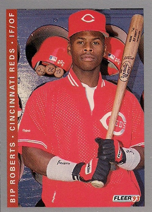
Hello, Bip.
I love this card. The 1993 Fleer design? Eh. I've never liked silver/gray-bordered sets. The color-coded name/team line isn't a lot to latch onto either. And then you have to tilt your head to read the darn thing. "The Tilt Your Head to Read the Darn Thing Set"?
I might do that just because it annoys me so.

Uh, I suppose if I name '93 Fleer that, then I have to do the same with '93 Score. What was with sideways printing in 1993?
I actually like this design much better than Fleer's. It's clean. It might be my favorite Score design ever, and it never gets talked about at all. I even like the Score backs (they made the top 50 card back countdown, you know).
"The Classy Sideways Type Set?"
That's pretty stupid.

Here's my favorite set of 1993. Probably my favorite set of the entire 1990s.
Normally, when I ask for suggestions in Define The Design, someone will offer a name that's really an opinion. That's not really in the spirit of the exercise. But I will make an exception with this set. If you want to name this set "The Best Set Upper Deck Ever Made Set," I will not object. I agree wholeheartedly.
But don't let that stop you from offering another idea. I'm sure it will be better anyway.
Those are all the '93 cards we're naming today. I've already named '93 Pinnacle. I know there is Ultra and Leaf, too. The Leaf I'm pondering naming after the back of the card, since the backs are the overwhelming positive feature of the set. As for Ultra, to tell you the truth, I don't know if any of the Ultra sets are definable. They're all the same.
So, anyway, if you have any ideas for 2013 Topps or for any of the others, let me know, either in comments or email. And I'm Twitter, too, of course. You can let me know there, as well.
I don't have any cards to offer as prizes this time. I'm still 3 weeks behind on card packages (but making slow progress), and money is tight for the next month.
But you can go down in history as an official Define The Design namer!
So, that's ... uh ... something.
Comments
The Upper Deck and Score sets are okay, but the others are among my least favorite sets.
You are right about the silver/gray borders. I think the only one I like even a little is 1985 Fleer. The only thing I like less is sideways writing and 93 Fleer has both. How about "the two strikes set" since it already has two strikes against it before you even see the card.
The bottom of 93 Topps always reminded me of the ribbon around the neck of a medal winner, but that's not a good name.
Donruss and Score I have no clue. That is actually my least favorite Score design out of all 11.
I am going to remain silent on the U.D. set. It's not that I don't like it, but others like it much more than me.
1993 Topps: The Collared Shirt Set. Continuing the theme of clothing.
1993 Donruss: The High School Computer Graphics Set. Because whoever made the little 3D shapes must have only taken that course.
1993 Fleer: This one's tough, but maybe the Sideways Time Magazine set. Red lettering, bland outline.
1993 Score: I think the one you had was good.
1993 Upper Deck: That font is so 90's, and so...like tropical. Maybe the 'Jimmy Buffet set would work. However, being the Simpsons fan I am, the first thing I thought of was the opening to 'Eye on Springfield'. So the Eye On Springfield Set is another option.
1993 Topps - 'Photo corner set' or possibly 'Scrapbook Set'. Because those things at the bottom look like old timey photo corners you see in albums and scrapbooks to me.
1993 Donruss - 'MSPaint 3D Effects set'. 'nuff said.
1993 Fleer - 'Poor Use of Minimalism set'. This goes hand in hand with 1994 Fleer's 'Perfect Use of Minimalism' set
1993 Score - 'Poor Use of Minimalism set Now With White Borders'.
1993 Upper Deck - 'The Best Set In The History of The Universe Set No Seriously They Should Have Just Banned Baseball Cards Forever After This One Because No One Has Even Come Close Oh All The Wasted Years and Dollars And Sanity Chasing After Another Perfect Set When This Was As Good As It Gets What Have I Done With My Life Why God Whyyyy Set'
While sea turtle may be cute, most of us like the design, so we outta respect it with a baseball reference in the name.
93 Topps: the big blue V set
93 Fleer: the tape measure set
1993 Topps - I thought "the scrapbook set" as well though the bottom blue strips also remind me of how I would wrap "rubber bands" around the corners of my cards when I first started collecting as a kid years ago.
1993 Score - I think it should be called the "tape measure set" because of the red square and the blue strip on the left side of the card.
1993 Score - The Tape Measure Set.
Whew!
I like the Flying Sea Turtle set. It's not an insult to the design, that's just what it looks like if you really try to interpret the shape beyond the obvious.
The '93 Topps set bands (of differing colors, throughout) remind me of those carrying straps for big heavy objects they advertise on TV. Forearm Forklifts:
http://www.target.com/p/forearm-forklift-lifting-straps-as-seen-on-tv/-/A-11043004#prodSlot=medium_1_3
The Forearm Forklift set!
'93 Donruss looks like they used the same program as 1992/3 Ultra to make a bar and then added the diamond.
Ultra in disguise with Diamonds! Sorry Lucy...
'93 Fleer - These are what you would get if the government designed cards. The Gubmit cheese set?
'93 Score - Government issue generated by teletype, therefore almost unreadable. The Anorexic typeface set.
'93 Upper Deck - I've only got a moderate stack of these, and have not been overwhelmed by the photos or design of those, but overall they might be better. The multiplayer cards are interesting but a little busy sometimes. Tough to name since it's such a simple design. Marquee Sign in Please set or the Bronze Signature set is the best I can come up with.
I'm not sure yet about 2013 Topps. It hasn't been long enough. You can't pick a name for a puppy until you spend some time with it - such is the case with a new set. I guess if I had to pick today, I'd go with "Sea Turtle." Your fault, N.O.